
Hi there! 🙂
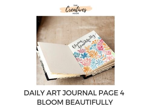
So, here I am on day 4 of art journaling and I have decided to paint some floral and foliage patterns with watercolors. The last few days of art journaling have helped me become more comfortable with the tools. I think I am ready to paint some detailed patterns. Let’s see how it goes.
Also check –
Day 1 of Art Journaling
Day 2 of Art Journaling
Day 3 of Art Journaling
Day 4 of Art Journaling
If you are someone who loves floral patterns and want to try creating them, then it helps to have an image of floral patterns that you can refer to. I have tried creating some of these floral and foliage patterns before and I’ve found out that they look great as long as there’s some consistency.
For example, if you choose a particular tint of blue to draw a certain kind of foliage pattern, then it using the same tint of blue for that foliage pattern throughout the artwork looks good.
But then again, there are no rules to follow as such, excect – go have fun!
So, here’s how I started painting foliage patterns. I am just playing with colors and trying to make the foliage dense by drawing patterns close to each other. I am also using contrasting colors instead of using just usual shades of green.
I am particularly enjoying bringing out different shades of the same color in the different leaves, by simply varying the amount of water I pick on my brush. Notice how I’ve brought out those shades in the blue foliage I painted next.
Some more playing with blue, and then I went back to a lovely orange to draw one big leaf pattern and crimson to draw another. Drawing bigger patterns is useful in filling up space but don’t overdo it and leave enough space for smaller and more intricate foliage patterns.
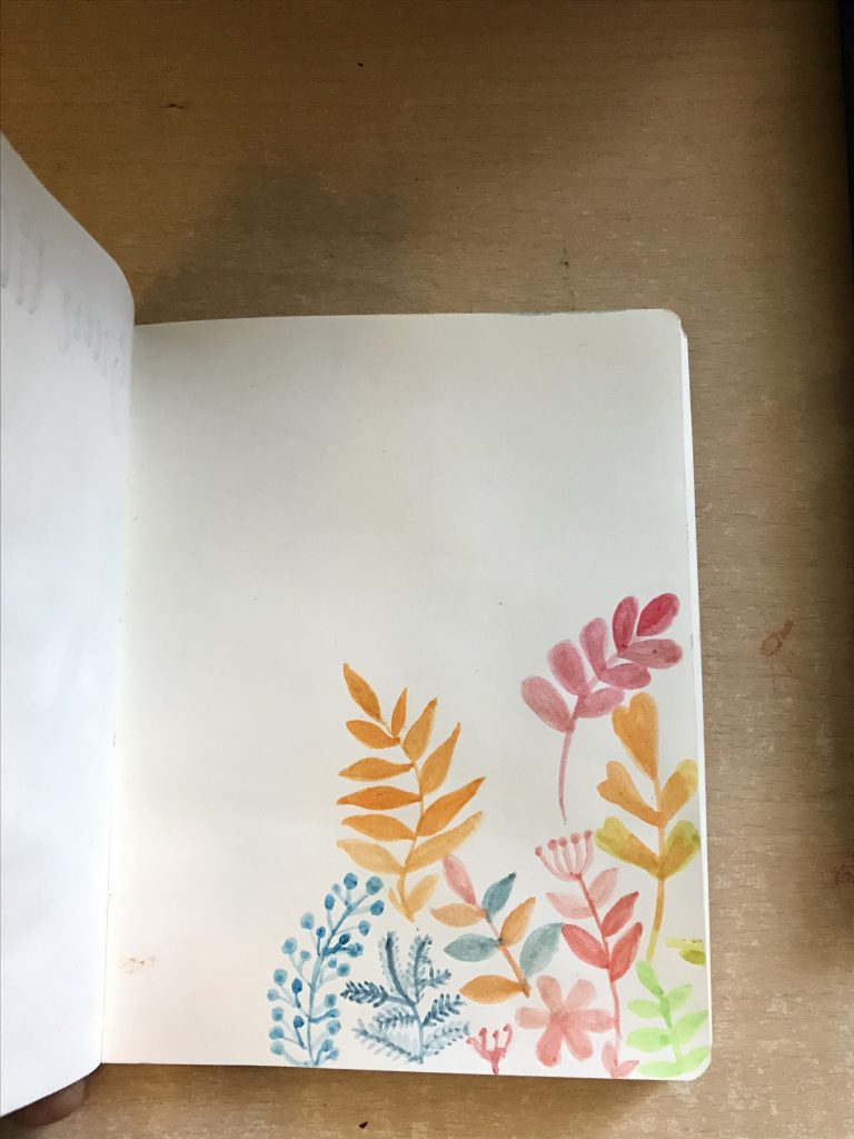
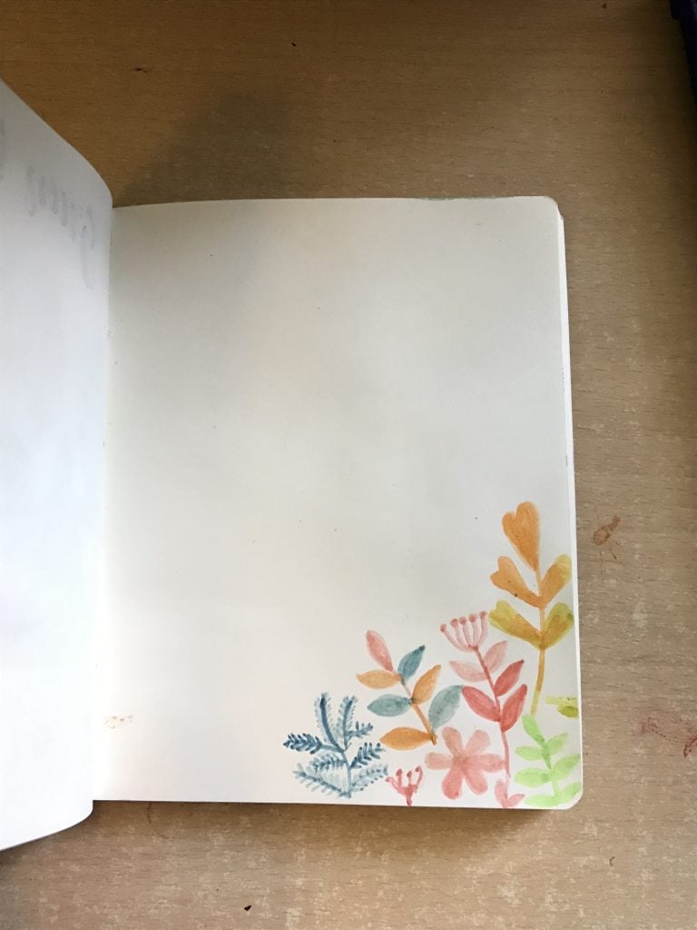
Drawing such patterns becomes really fun after a while, you start getting some empty spaces here and there and you need to think of creative ways to fill them up. Notice how I drew a completely different blue leaf pattern to fill in space between orange and crimson foliage. I also drew a small pattern in the empty space on the right.
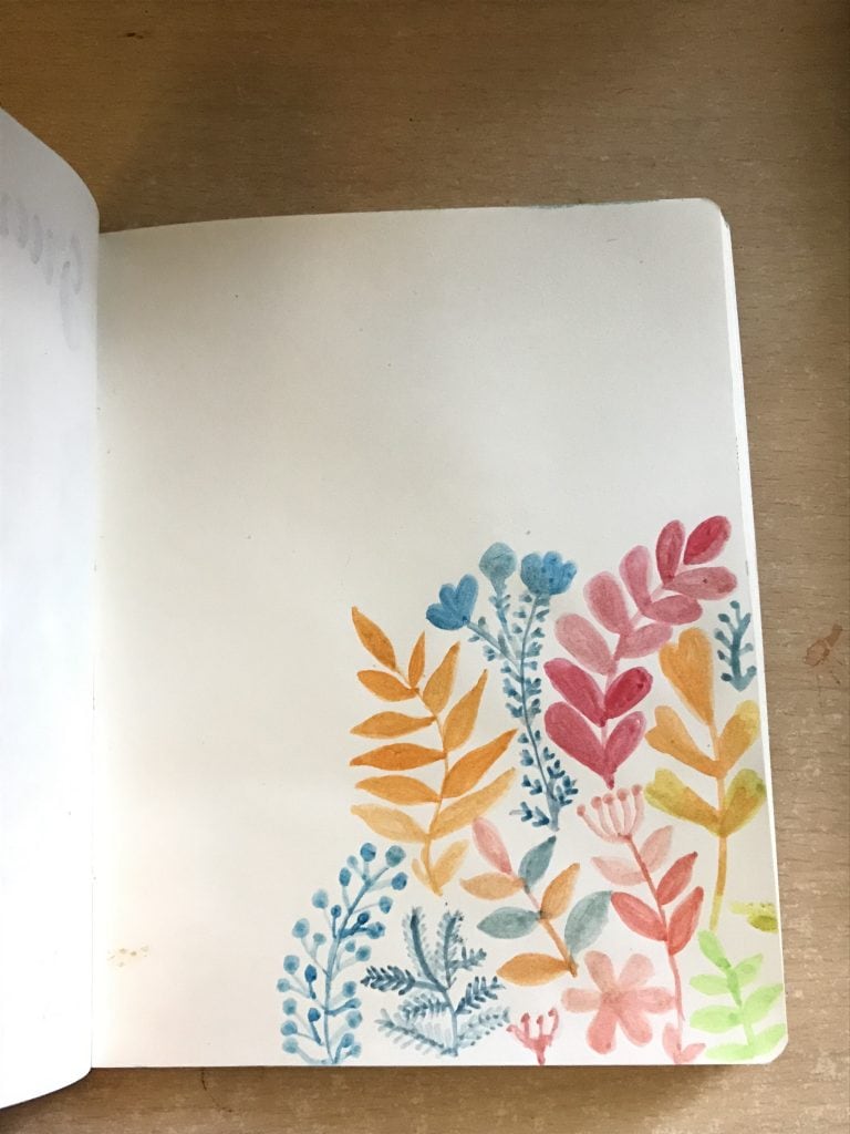
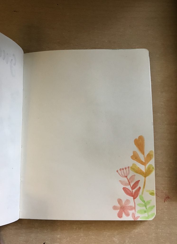
I painted a nice orange flower on the bottom left. And a beautiful vermillion hue foliage. I love how the different shades of the leaves turned out. You can see my very messed up watercolor cakes in the next image. They are very old and I clearly didn’t know how to use them properly. I still don’t.
And there you do, another flower, but this one is in blue. I think space there was ideal for a flower placement so I just went with it.
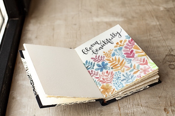
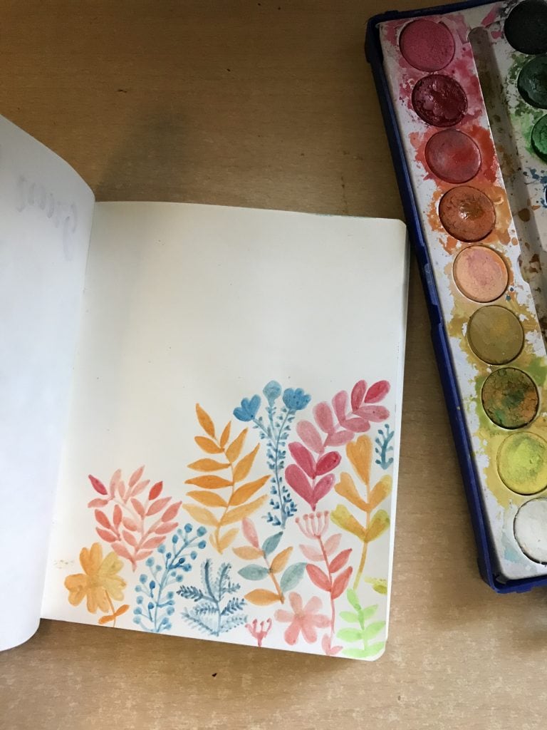
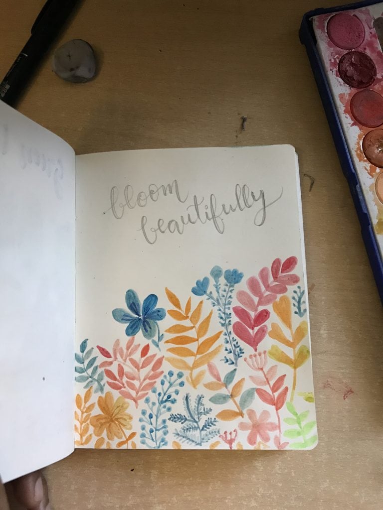
Next, I just filled up the remaining white space on the bottom left by drawing some more foliage patterns in blue and yellow. I had decided to letter a two-word quote – ‘bloom beautifully’ for this artwork. To ensure that the lettering comes out as I desire it to, I tried using the faux calligraphy technique. I wrote the quote with a pencil and outlined the thick downstrokes.
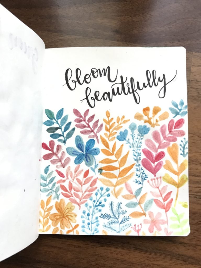
Then, I used a pen to fill in the quote and erased the pencil outline. You can decide to leave your quote like this if you’re not a fan of faux lettering.
![]()
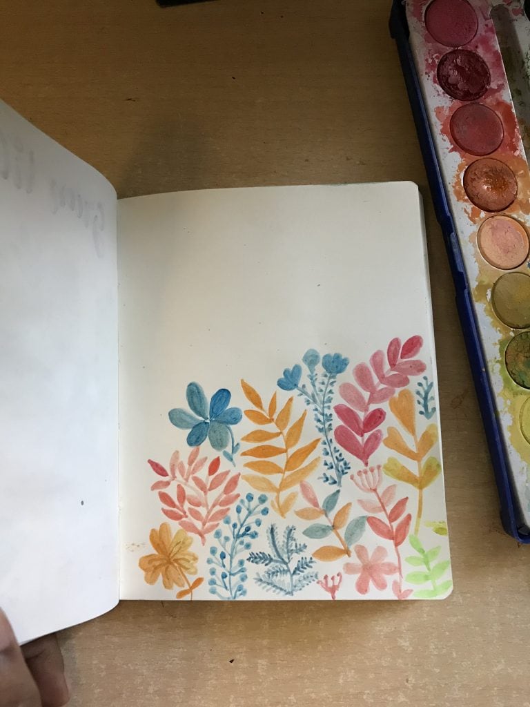
I filled in the downstrokes and then I painted some more foliage as I didn’t like the remaining white space. Here’s how the final artwork looked. Beautiful, right?
About the tools used
I use a simple 18 color watercolor set. But if you’re just getting started and thinking to order a watercolor set, I’d say don’t be afraid of buying a larger set. For instance, this 36 color watercolor set by Artist Loft is not only affordable but also has some very unique and amazing colors. I am planning to order a bigger palette for myself as soon as the lockdown gets over. But till then, I am making the most of what I have.
Also, I use a water brush instead of the usual bristle brush to paint with watercolors. In a water brush, you can fill in the water and squeeze it out while trying to pick the color from the watercolor cake or while trying to mix two colors in your artwork. I find water brushes so much fun and convenient to use.
I used the Tombow black brush calligraphy pen to write the quote but you can try using a thinner micron pen as well.
What I loved about creating this design?
I loved that I drew small intricate patterns with watercolor for the first time. I didn’t follow any rules as such. As you can see the patterns, as well as the colors, are totally random. I tried to not choose too many colors, so there are clearly a few shades that stand out. I think these colors look good together.
Did I mess up?
Again, I feel like the lettering could have been better. I need practice with drawing letters that are consistent in their style. I also messed up in filling the downstroke of m in ‘bloom’, made it too thick, and didn’t it the downstroke where I was supposed to.
How can you make this design your own?
I think this is one design that is of the kind that even if you trying copying it as it is, you’ll end up with your own version of it. Play with the colors, play with the patterns, fill in the white spaces in your creative ways. And of course, feel free to choose any other quote of your liking.
How did I feel after filling in today’s page in my daily art journal?
I felt really good and accomplished after making this one. It felt like taking a step further. I learnt a few more things like drawing smaller patterns and developed some more patience. I also loved creating different shades by adding more water, So yes, this one was quite fun. 🙂
If you try this, do let me know how it goes for you in the comments below. See you tomorrow with my next entry!
Love,
Shreya