
So day one of art journaling was super fun for me. And that got me excited to come back to my journal on the second day. If your first day or any day of trying out a new creative habit doesn’t go as expected, it can be hard to come back. But let me tell you this, it has always and always helped me to show up and just make something – anything.
There’s this lettering artist whose works I really love – Stefan Kunz. I love his all-time favorite quote – ‘Create Something Today Even If It Sucks’. I try to remember it on the days when I don’t feel like creating anything at all.
Especially in these times of perfect Instagram grids, it can be hard to get started. It can feel like what you create doesn’t even matter. It’s this thought that served as an inspiration to me to start sharing my messy not-so-perfect journey.
Before we delve into page 2, I want to share again that I am no professional. This is just me playing with my art journal, my pens, and paints.
About Today’s Art Journal
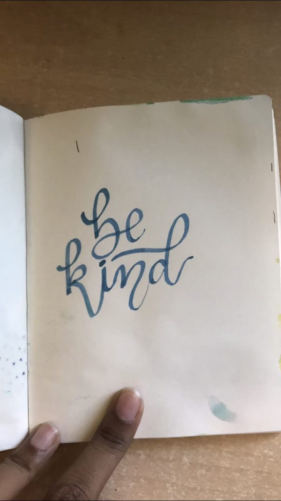
I realized that starting from a completely blank page is always intimidating. What helped me on the day one was that I had already written the quote using a simple pen.
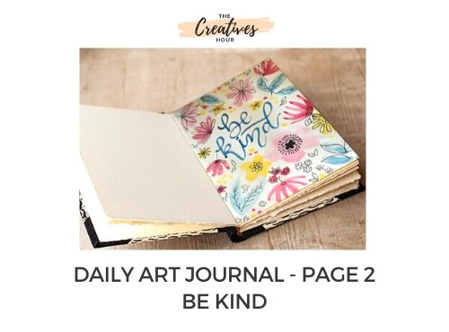
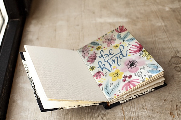
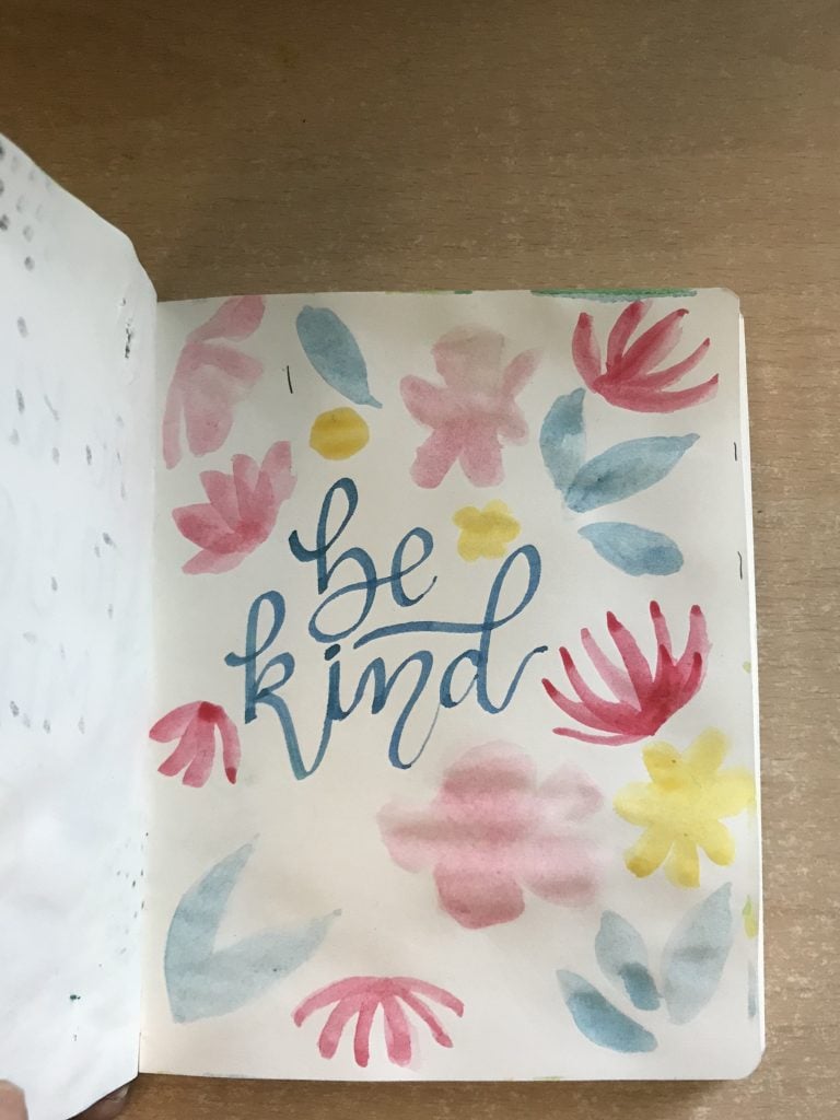
I replicated the same idea and started out by writing the two-word quote – ‘Be Kind’ using a simple calligraphy flat tip pen.
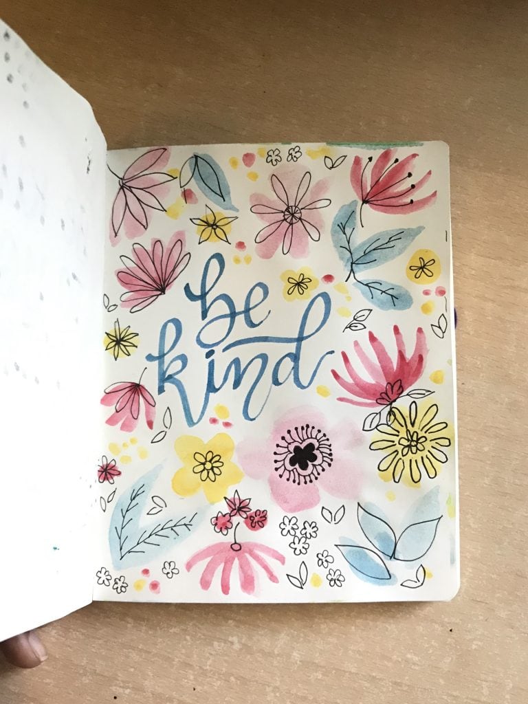
Note – The colors appear a tad bit dull as I’ve converted all PNG images to JPG to reduce their size. The final image is the one with the original colors.
Next, I decided to draw some flowers around the quote. I mentioned in my previous post about how much I love loose watercolor patterns. So, I tried to draw some loose flowers and petals in hues of pink and blue. I tried to use more water and I loved the color that it brought out on the paper, even if it looks a bit messy.
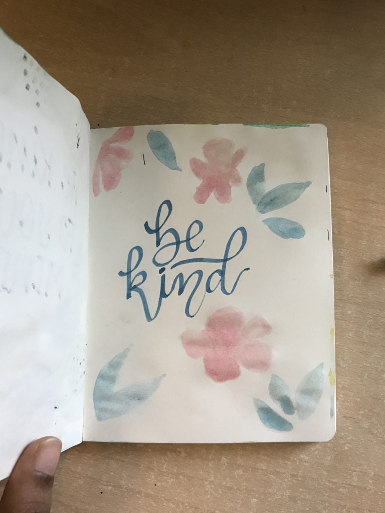
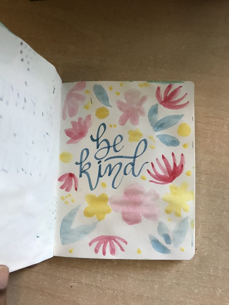
I’ve never learned to use watercolors. But from experience, I am learning a bit and falling a little more in love with them every time. Next, I picked up some crimson and yellow to draw some more loose watercolor flowers.
I experimented with adding some pops of yellow color all over the page. I am liking how the combination of bright yellow and crimson is blending well with relatively less bright hues of pink and blue.
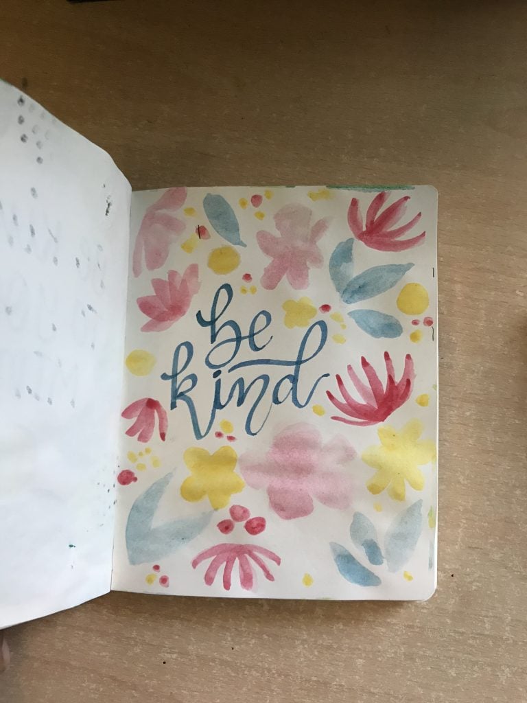
Next, I added some crimson pops as well and got done with the water coloring! Here’s how it looked finally.
Next, I added some doodles with my pen. I intentionally draw the doodles in a way that they appear free instead of using the pen to simply draw borders of the watercolor flowers. Such free and loose doodles give a very joyful and free vibe to the artwork. I just loved how this one turned out finally. 🙂
About the tools used
I use a simple 18 color watercolor set. But if you’re just getting started and thinking to order a watercolor set, I’d say don’t be afraid of buying a larger set. For instance, this 36 color watercolor set by Artist Loft is not only affordable but also has some very unique and amazing colors. I am planning to order a bigger palette for myself as soon as the lockdown gets over. But till then, I am making the most of what I have.
Also, I use a water brush instead of the usual bristle brush to paint with watercolors. In a water brush, you can fill in the water and squeeze it out while trying to pick the color from the watercolor cake or while trying to mix two colors in your artwork. I find water brushes so much fun and convenient to use.
Finally, I use a thinner micron pen to make other doodles and dots.
What I loved about creating this design?
Even in this artwork, I love how the colors turned out. The lighter shades of pink and blue look beautiful with bright yellow and crimson. The overall feel is joyful. I also like that the lettering is clean and simple. It’s a simple message with a simple background.
Did I mess up?
The one part that I wish I could have done better is the doodle of the veins inside the blue leaves just toward the right of the word ‘be’. They seem very haphazard to me. There’s always a scope of improvement but I still like how it turned.
How can you make this design your own?
If you liked this design, there are so many ways you can make it your own. Like always, you can choose a different color palette. You can even reduce the number of shades used to just two. I’ve used four different colors here. Your loose watercolor flowers can definitely look different from mine. And you can choose a completely different two-letter quote. If you don’t have watercolors, then you can draw flowers with light-colored sketch pens (perhaps pick yellow and light pink).
How did I feel after filling in today’s page in my daily art journal?
Honestly, I feel that this one turned out pretty great. I am thinking two-word quotes are the best as it’s hard to go wrong with lettering them. Whenever I choose bigger quotes, I tend to mess up. Haha! I am already googling quotes for tomorrow. And yes, just liked yesterday, I created a time-lapse of the process and put it on Tik-Tok just for fun. 🙂
See you tomorrow with my next entry!
Love,
Shreya