When it comes to building a website, Squarespace has been a name that has carved a niche for itself within the past decade by offering its customers a wide range of aesthetic templates and a vast array of websites that you can make on the platform, and that is seldom matched by any of its competitors.
Apart from offering great designs, it excels in social media integrations with a ton of plugins at a very competitive price but the best thing about the website remains to be how easy it is to use even for a complete beginner.
Since Squarespace offers so many features, it is not a surprise that a lot of people, organisations and brands have invested heavily on the platform to get a responsive website that can handle a lot of traffic and would give you a visual edge over other websites. Following we have a list of 65 websites created on Squarespace that serve as a great example of the platform’s capability and can also serve as inspiration for your own project. Let’s take a quick look:
01. Welcome to Winona – Portfolio

The website was created by the renowned actress Winona Ryder with the intention of trying to showcase the town Winona was born and raised in and goes by the same name as the actress. With a simple idea in mind Winona collected unique things about the town that made it so special for her and wanted to show it from her own perspective.
The minimalistic approach of the website can be said to be a homage to the small town in Minnesota which is away from the glitter of cities and mostly has photographs by the actress herself. It’s the perfect example of how much can be said without saying a lot.
02. Uppercase – Publishing
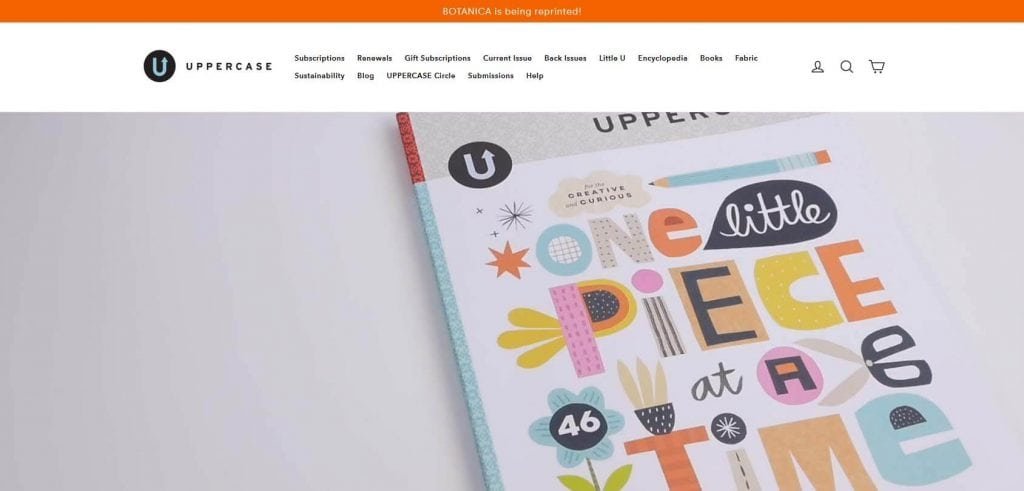
Uppercase is a creative magazine company helmed by Janine who works as a publisher, editor and designer of the magazines and is also there for you if there are any queries regarding the magazine. The magazines are of varied interests and are filled with unique illustrations that make it one of a kind website especially because of its aesthetics that are engaging yet subtle and leave a lasting impression on anyone who views the website.
The website also has an option to subscribe to the magazine and includes a blog and thus becomes an epitome of what can be done by an individual over a diverse platform like Squarespace.
03. Daniel Arsham – Portfolio
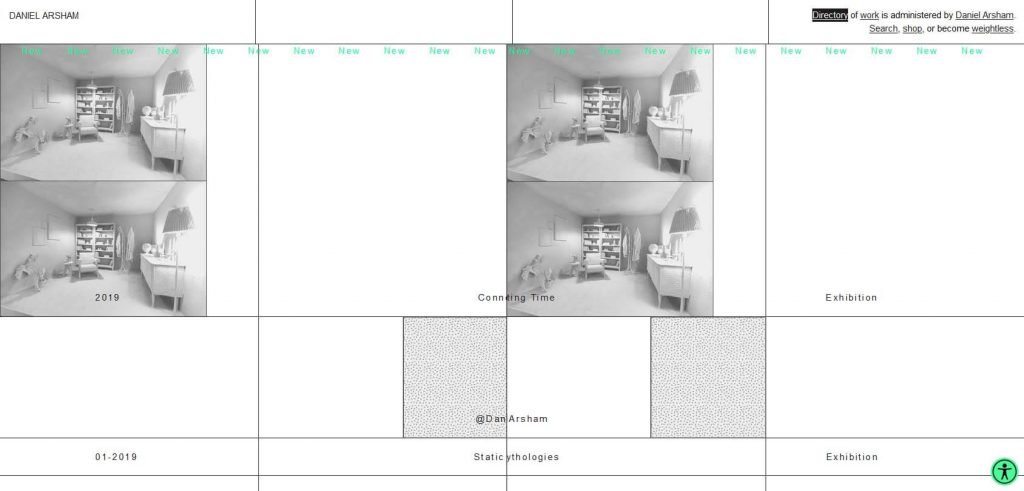
This website perfectly sums up why Squarespace remains unbeaten when it comes to design, and you’ll know too once you take a look at it. This gallery website can seem like a little complex to hover around but it’s really pretty easy. The animations and designs are so unique that rarely you will get to see another site like this even if made on code. The website brings to life Daniel’s perception of art and architecture and seems like just the right combination of both.
There is also an option to buy his products and the e-commerce store is no less than his uniquely interactive homepage.
04. Marina Abramovic Institute – Education/Institution
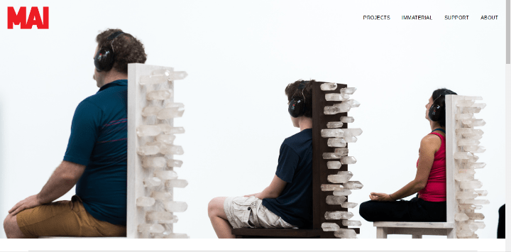
Based on the legacy made by the famous Serbian artist, Marina Abramovic, MAI (Marina Abramovic Institute) tries its best to make people indulge in the art that is so deeply followed by so many people that follow. The idea is to dissolve the gap between the artist and the audience requiring both to explore their own selves during a performance and their homepage describes just that with an image.
Through their website one can find all about their projects and workshops and a section called ‘Immaterial’ which is MAI’s digital journal and can get you a deep insight of their artistic ideologies and creativities.
05. The Welsh House – Travel and Hospitality
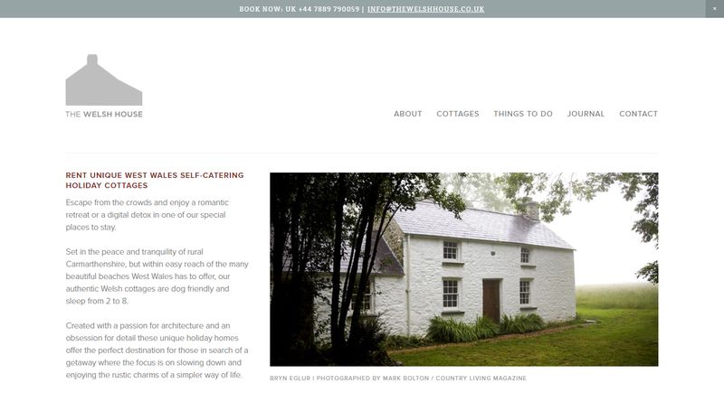
A minimalist travel website of The Welsh House is one of the most profound websites on Squarespace for all the right reasons. It serves its purpose while establishing a niche in its design that makes it stand out from most of the other prominent websites as it brings the serenity in travel right on it’s home page.
You can check out their accommodations in their photo slider while gaining the idea of what it would be like to live in it while you are on your next trip.
06. Fire & Flour Bread – Food & Beverage
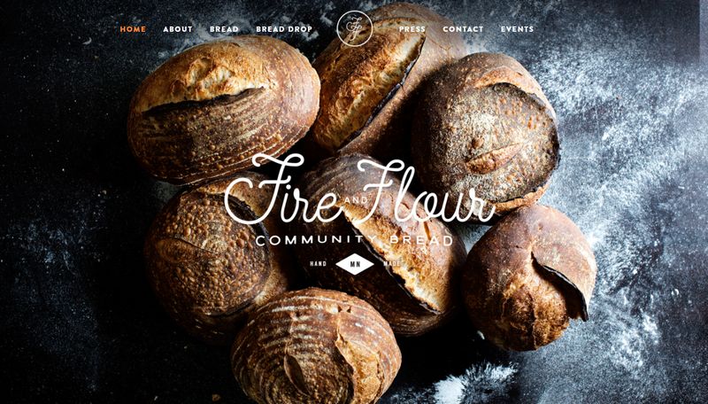
A hand-made bread brand that has a unique approach to reach to the people in one of the simplest and most authentic manner. The large background tells us clearly about what the website is related to and all of its information is contained in a single page so as not to waste a lot of their visitor’s time in loading a lot of pages. The contrasting white text against a photo with black as the dominant colour makes the brand name stand out as you first lay eyes on it.
07. Contently – News and Media

Contently is a unique and brave endeavour in the world of online magazines. On its homepage itself you see a stunning headline and image of one of their articles that you can read from the homepage itself or can scroll down below and choose to go for their photos that bring to light the ironical world that surrounds us. The website is not to glamorous and does complete justice to the kind of news that they want to present to the people
08. Darren Booth- Portfolio

An illustrator, portraitist and an award-winning Cmmercial Artist based out of Canada, Darren Booth is a big name in the world of art and rightly so. The range of his work is shown right in the first look of his website as he puts out his works in a grid based layout, and there is so much variety in it. The website correctly defines the man and his creativity, which is something you should look forward to while building your own website as well.
09. A + I – Business

Architecture+Information is a firm that pretty much describes what it does in their name. One cannot just expect creativity from them but also a well structured strategy for their clients, and nothing else shows this better than their video that gives a glimpse of how hard they work to achieve perfection.
It works as a perfect example for small to medium sized businesses who want a different approach to reach their clients and stand out amongst the large scale businesses.
10. Pica Things We Love – Creative/Art Store
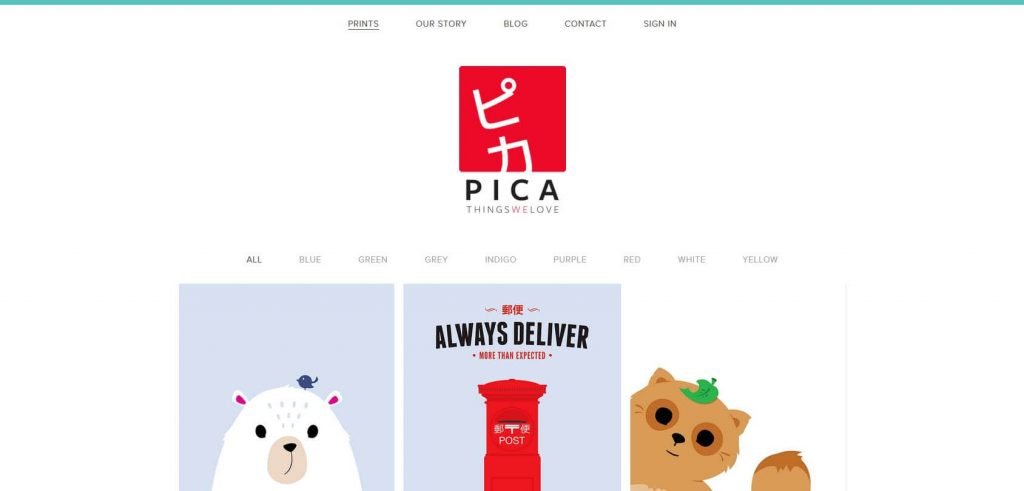
Two women set out on a trip to Japan and after witnessing the picturesque beauty of the country decide that the world is missing a lot out on the art that can be inspired from the country. Both of them being graphic designers created some interesting illustrations that told their visitors what Japanese art blended with their creativity is all about and that’s how they started selling it over their website on Squarespace
The website is one of the prime examples of focussing on the right things and not doing a lot extra when it isn’t required. Their menu is also unique in the sense it doesn’t display the usual pages like Contact us, store etc but instead gives the option of colours which basically shows the artworks that have that specific color as dominant.
11. Robbie Shackleford – Portfolio
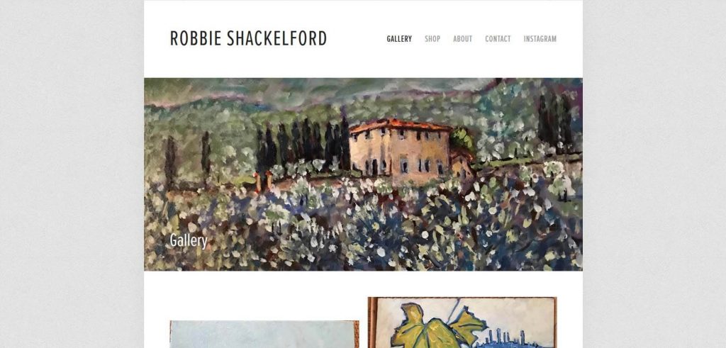
As soon as you open the website you have the exact about the kind of artist that Robbie is. His website gives its visitors the idea that this artist is unlike most others out there and how his impressionism stands uniquely tall. And if that doesn’t impress you, his Van Gogh-esque paintings are sure to leave a deep imprint on your mind.
There is not much else that his website sheds light on other than his paintings and that’s why this portfolio website is amongst the best out there with all it’s simple yet effective elements. You can also shop for his paintings or get in touch with him or his social media account that you can always find in the header of his website.
12. The Car Crush – Blog
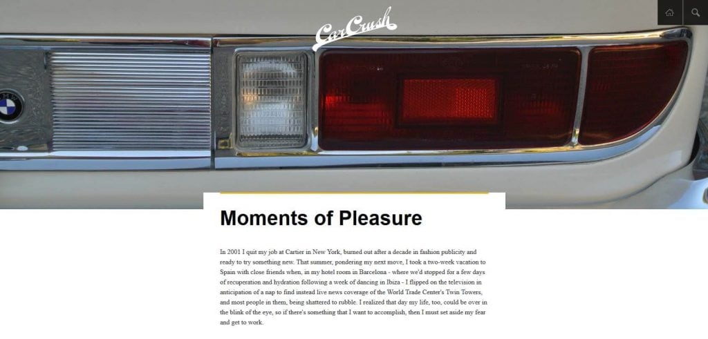
The Car Crush pretty perfectly describes what the site is about and being a lover of cars, I was pretty impressed with this website and its unique approach to knowing and reading about cars, new and old. The photos and the blogs are both pretty informative and are perfect for car enthusiasts who just want to know more and more about these beast of machines. In the homepage itself, you can see a vintage BMW and a little about the motivation behind the website.
13. Lumio – Business
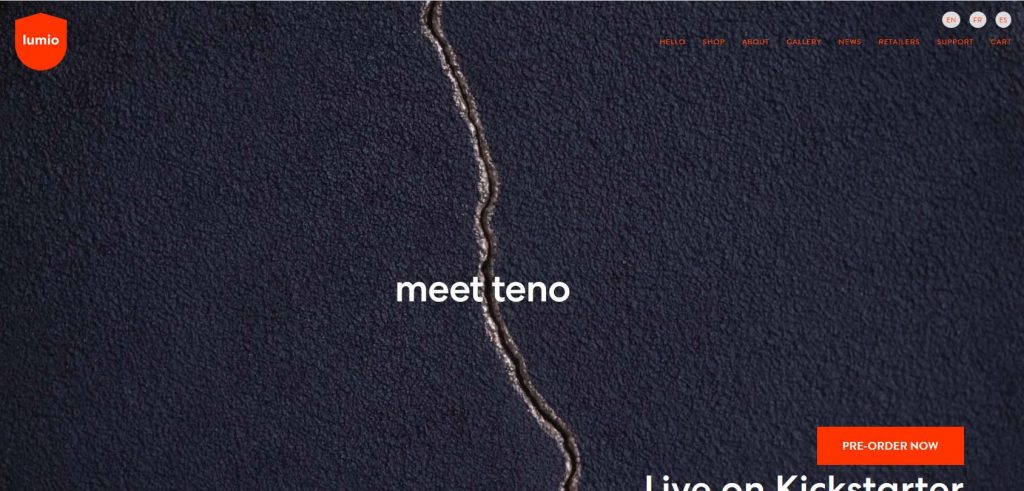
A new venture in the world of lighting technology, Lumio is presenting its customers with pretty great modern lighting innovations that you can find directly in their own store online. You can even find stores that sell these lights offlines. Not just that, if you’re an enthusiast, you can spend time on their website and read about all the new advancements happening in the world today.
The advertising done on the homepage itself is apt to grab your interest and keep you hooked to what more the website has to offer, and if that isn’t enough, the visual appeal leaves the visitors in awe of their work and dedication.
14. Seriously Unsweetened – Business
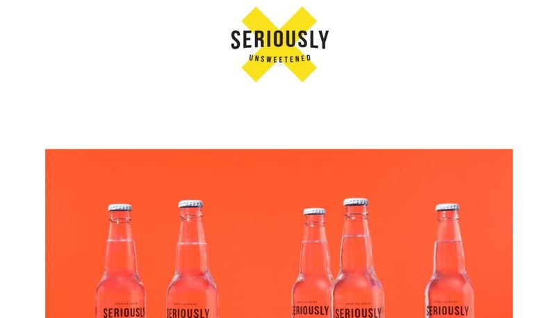
In the world of Coke and Pepsi, Seriously Unsweetened tries to do something new by taking care of your body with their approach of making beverages with no artificial sweeteners that can cause you serious harm. Their X-logo serves a lot of purposes throughout their website and works as a perfect logo when it comes to brand recognition.
The clean interface of the website offers the visitors to see more of and about the product than anything else but that doesn’t mean that takes away the attention from what all they have to share with their visitors.
15. #girlboss Foundation – Self Help
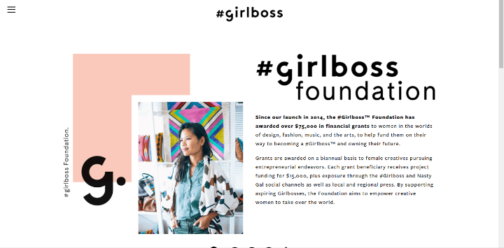
If there is one thing we need a lot more of in the world today, it’s women in business. Not just because of they have had a lower hand to misogynist people over the course of time but most women offer a unique perspective that can sometimes be missed out by the men who have dominated business till now. #girlboss Foundation is all about that, and collects money from its supporters and visitors of the website to push more and more women who have in some way faced unfair treatment in their professional career towards various kinds of industries. Their quirky website does not just inform but encourages people to be a part of something really big and significant.
16. Lyft Blog – Blog
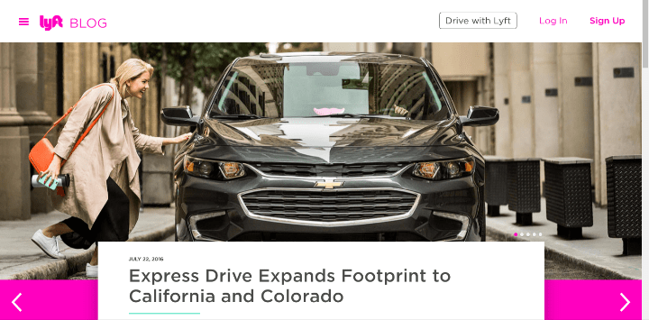
To be really articulate, this is not Lyft’s actual website, it is just the blog that has been made on Squarespace because Lyft is a huge app that has a really specific demand when it comes to making a website and a website builder is never an alternative for that. The answer to that is always coding so you actually get what you want.
But having said all that Lyft created a blog that fits perfectly on a website builder like Squarespace and is integrated with their own website while the blog still serves its own purpose, which means that while you can have your manually constructed website, Squarespace can still come to your rescue for other content related to your website.
17. TinySeed – Business
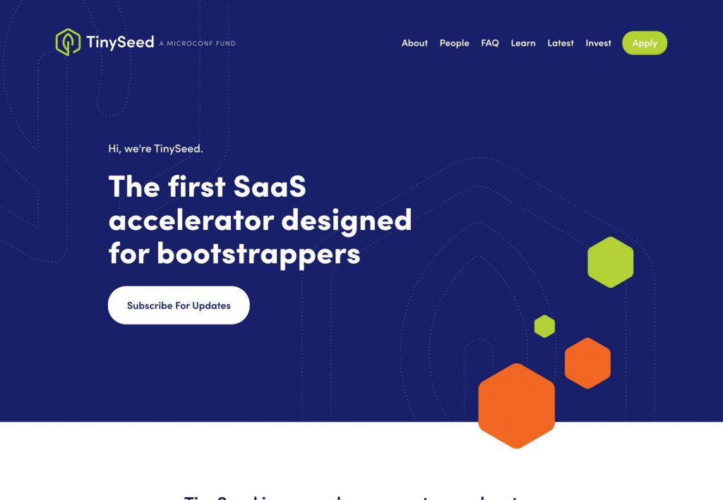
TinySeed is not a website for everyone but exclusively for the ones working on website development. The website is made for bootstrappers as you can see on their homepage. TinySeed provides a lot of solutions to their clients including funding and mentorship. You can build a site with them and get their efficient services to your avail.
18. Hodinkee – Blog
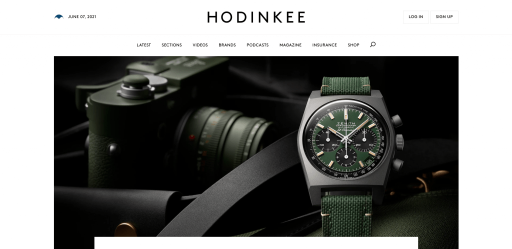
A wrist watch website that goes all out to use Squarespace features to their benefits and does it with style and glamour all embedded in their perfectly crafted website that reaches out to its customers with its wide range of products without preaching a lot. On scrolling down you can find various kinds of watches being used by people from all walks of life, from basic to premium and the various brands that they talk about. IT’s not every day that you find a website for watch enthusiasts.
19. Freemans Restaurant – Food & Beverage
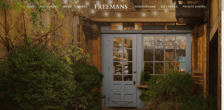
If someone is of the perception that a restaurant cannot benefit a lot by making their own website, then The Freemans Restaurant is here to prove them wrong in an instant. The site lays down the menus and the hours of the restaurant that is laid on top of the picturesque cuisines that perfectly fit with the theme and flavour of the website. Serving as the right example for anyone who is in the F&B industry, the site functions responsively and smoothly without compromising on anything that is needed for it to serve its purpose.
20. Spoken Layer – News and Media
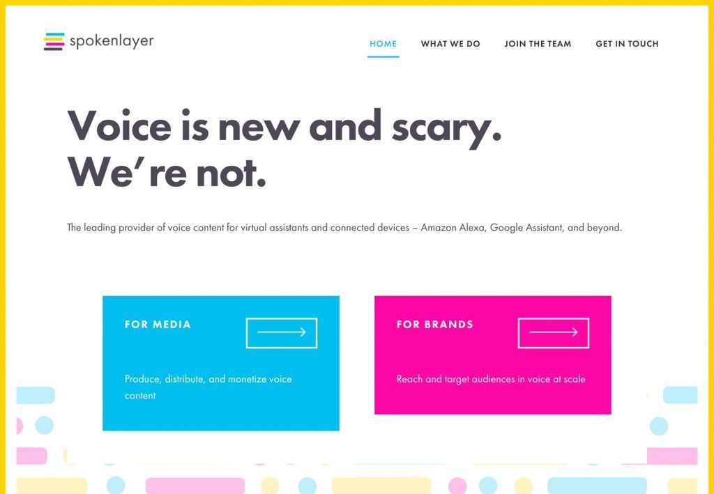
Ever wondered how the voices for Google Assistants and Alexas are really made? Well Spoken Layer is the answer to that which is in collaboration with Google and Amazon to work on their voice assistants by digitally recording and producing the sound of people and selling their vice as per the requirements of these companies. The colorful website is a means to engage you in their mission to make these assistants more and more welcoming and heartwarming, and with so many smart devices around, I’d say they are succeeding in doing so
21. Studio Joho – News and Media
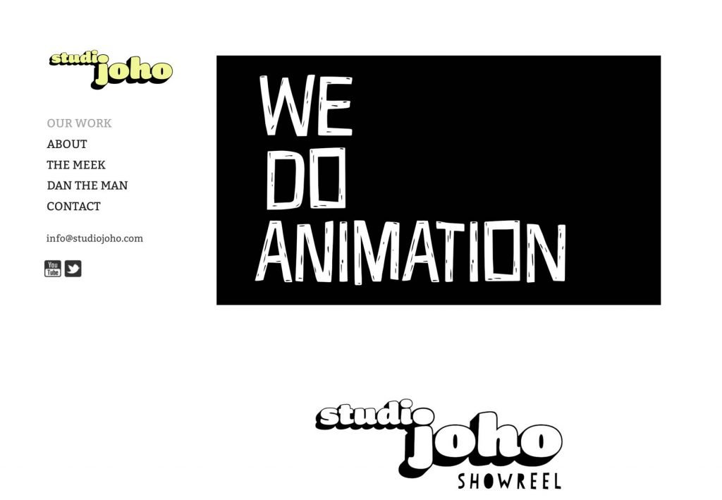
An animation company that is quite quickly making a name for itself in the market, Studio Joho knows how to keep it simple and to the point and nothing tcan say that better than their own homepage which is as straightforward as it can get with the words “We Do Animation” written in quite a bold font and in contrasting color, and you cannot miss it even if you want to. On the left hand menu you can see the option of going to their youtube or click on Studio Joho Showreels to see their work.
22. Aesop Wines – Food & Beverage
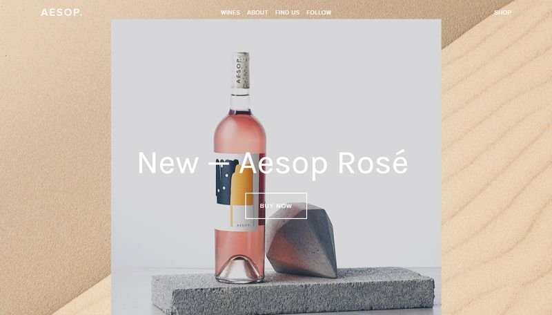
The Aesop Winery is probably by far the most creative winery when it comes to placing their products right because of how elegantly their bottle of wine is put in their homepage, and that speaks more to its visitors than any other thing about them. The site also features an elegant store from where you can get the best wines or you can just click on the About section to see their beautiful parallax that describes what they do differently, except for getting their website just right!
23. LAICALE Soho Hair Salon – Business
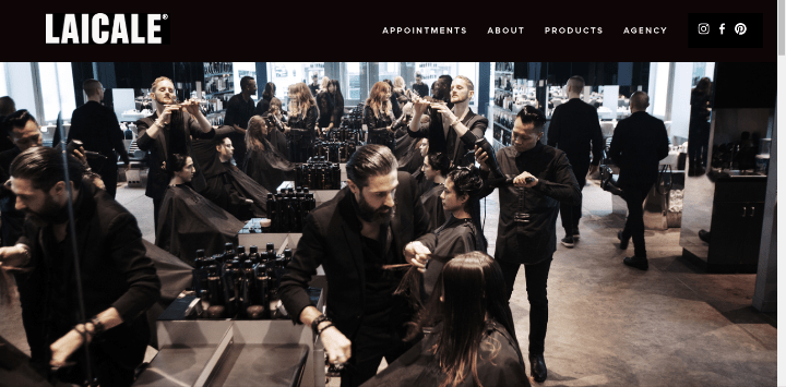
What purpose does a hair salon really have by making a website? Well Laicale has the answer to that on their exceptionally built website that displays on a parallax what you should expect when you walk into their salon.
You can find almost everything that they have to offer on their header itself but if you want to know more about their work and what makes them different from other hair salons you can also go ahead and checkout their social media accounts that are always just a click away from you.
24. Mission Chinese Food – Food & Beverage

No matter what part of the world you reside in, you either love Chinese food or have people around you who do. In any case, you should take note of this website as it correctly defines how the obsession with Chinese food can really turn into a great website.
You can order directly from the website while you’re exploring it or you can find their restaurants (exclusively in New York) but the mouth-watering photos are enough to give you an idea how you can create the best kind of website if you have a restaurant or a knack for cooking.
25. Architecture in Formation – Business
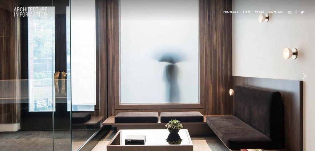
A portfolio for a group of architects who are really all about designing the right kind of structures for their clients, Architecture in Formation looks like a website that directly speaks about the kind of aesthetics that the creators would love to have. Neat, elegant and minimal, they define the present and future of the architecture in ways more than one and this is clearly stated with their list of projects that you can find by hovering on the Projects section of their header.
26. Lift Environmental Design – Business
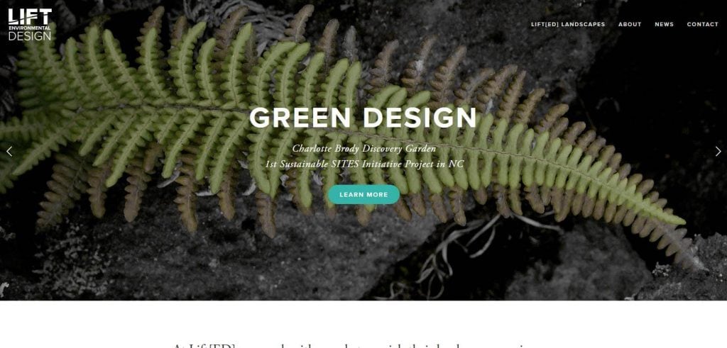
In the cities, life can be a lot cramped up, and Life Environmental design is meant to make the hectic life easier for the people by offering them Green solutions such as gardens, lawns etc in their own properties. This is neatly portrayed in their homepage parallax where you’ll find photos of people relaxing in parks and gardens and that is enough to leave you with the idea of the kind of peace you should expect when you are one of their clients.
27. Slow Travel Magazine – Travel/Leisure
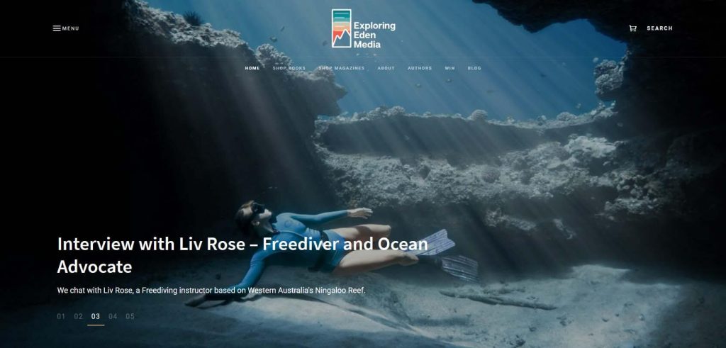
Veeryone loves to travel, or at least everyone wishes to travel as much as they can so that they can stretch their arms out to nature and bathe in its calm and peace that nothing else can offer, which is exactly the reason why Slow Travel Magazine has been able to hold a firm ground in the past several years and have an excellent customer base that not only enjoys their photographs but also the extensively written blog posts giving out travel advices and tips. This is a perfect website for the travellers at heart.
28. Altrock – Business
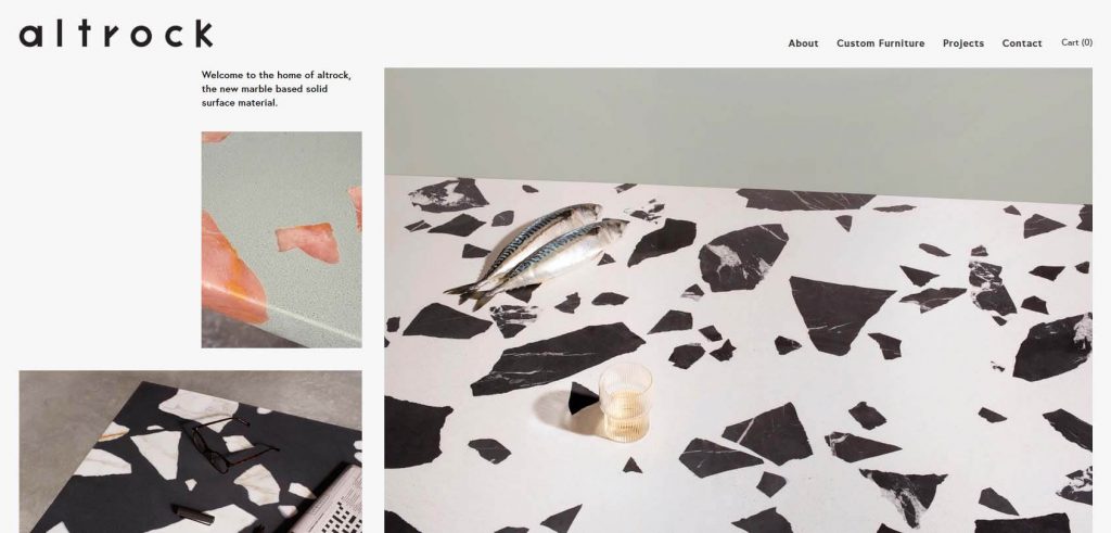
By their name they can seem to be a website made for music lovers, but that is not remotely what Altrock is about. The company is all about developing furniture surfaces in a rather exceptional way which is by using recycled marbles. You can even see their process behind developing their stuff and it is surely going to catch your eye to leave you amazed as soon as you click on their website link.
Website description: a company that produces and showcases furniture
Website type: portfolio
29. Active Schools – Education/Institution
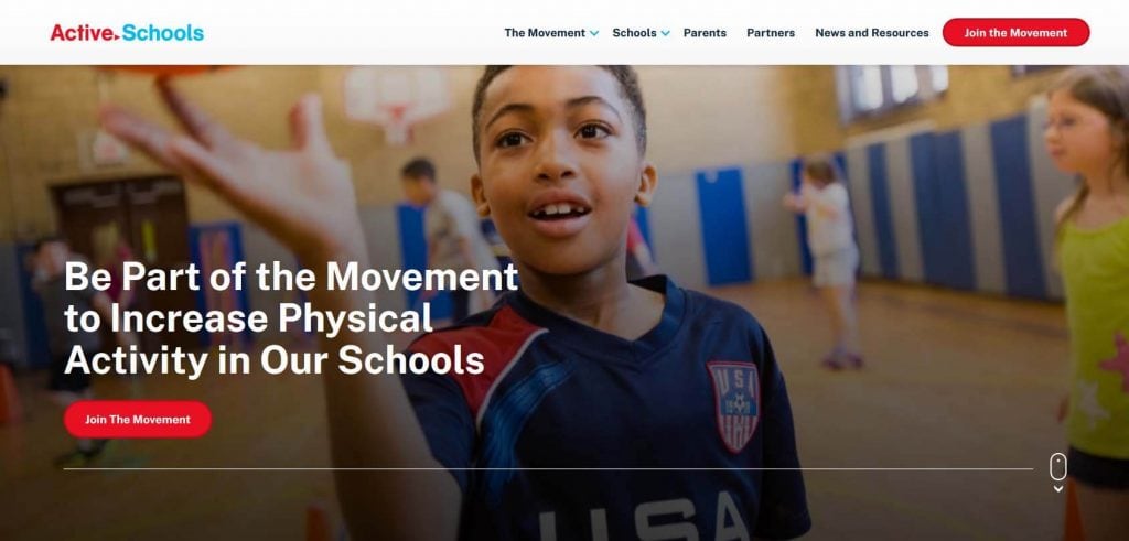
When you first visit the Active Schools website, you are sure to be amazed by the kind of approach it has taken to make the kids unique in every way, be it hula-hooping, playing basketball or doing any other activity that can make them grow not just as better individuals but also as active ones, and that’s their aim neatly described in their homepage itself with their photographs. In the education segment, this website is one of the most creative ones for sure.
30. Refinery 29 – Self Help
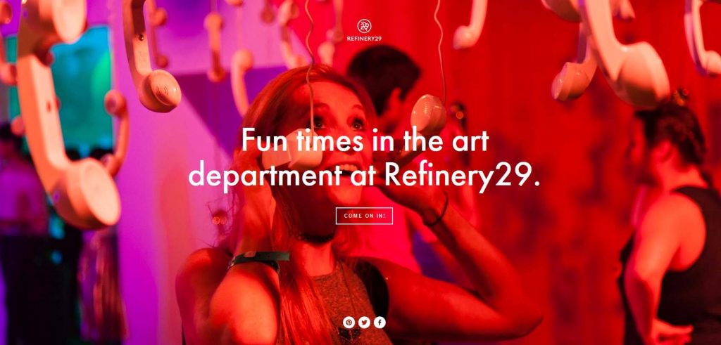
Owned by Vice Media, this website is for the women who keep on exploring and engaging in activities that make them grow. It’s a website for digital media but it would be utterly wrong to say that it’s limited to that. It’s a rather unique initiative, and one you would want to be a part of once you set your eyes on the dazzling slideshow that you’ll be able to witness once you click on the link of the website.
31. COOL HUNTING Omakase – Business
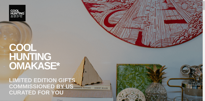
If you have for some reason not been able to get a birthday, anniversary or a farewell gift and need last minute unique solutions, Cool Hunting Omakase may just be your saviour. The brand designs limited edition products that are not too over the top when it comes to builds but do not miss out on a certain class which is why they are perfect as gifts and to save you from the trouble of thinking for one if you’re all wound up.
The site has a limited number of products but the store is responsive and quick to land you on your checkout page, apart from that it’s minimalistic design gives it an upper hand to tell just what kind of a brand it is.
32. Laura Berger- Portfolio

A ceramic artist based out of Chicago who knows how to create an elegant portfolio website and efficiently focus on nothing else but her work without having her visitors to go over a lot of her pages, Laura Berger has kept the navigation menu on the left so on the right portion of the creen we can take a look at her art at all times. Even when you go to the homepage you see a picture that is actually a scrollbar which you will only be able to notice when you hover your mouse over the photo.
33. Yellow Co – Self Help
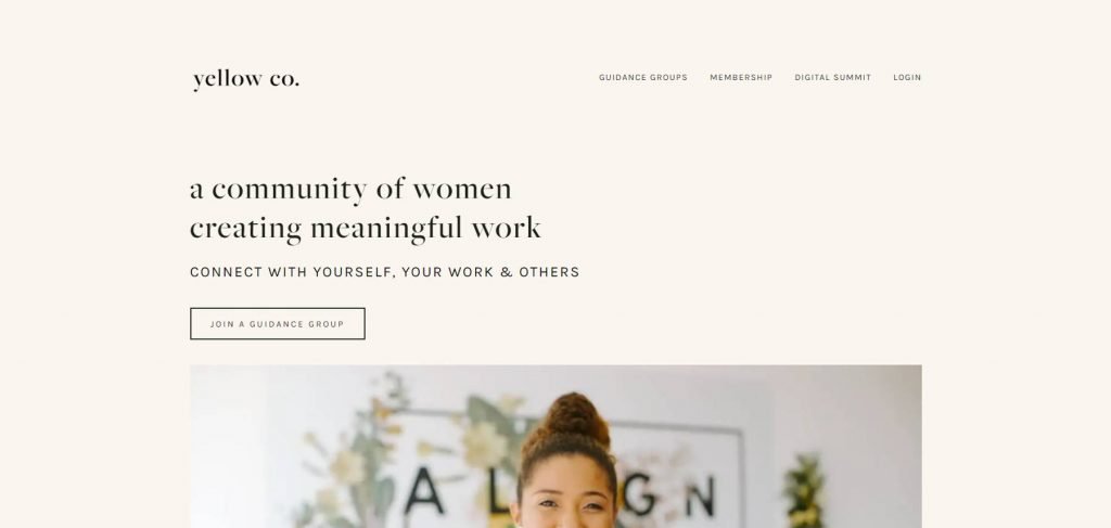
A small community platform for women that makes them align and connect a lot more with themselves, their work and the people around more, that is what Yellow co is all about. Seen on Forbes and The Huffington Post, you can find Guidance Groups yourself in their site and feel a lot more connected with people like you and ultimately your own self. You can then choose to go for their membership as well which a lot of women have done so far because of the right methods used by Yellow Co.
34. BRRCH – Business
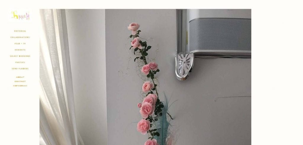
Squarespace can be used for almost anything and this floral arrangement company says it in all caps. BRRCH is one of the simplest websites I have come across so far and yet it is so detailed that one can easily find out whatever they need to know about a floral arrangement company. And the variety they bring in the floral decorative space is really enough to impress anyone. It’s not complex, and you can pretty easily navigate through all of their sections always present on the left hand pane, or just head over to their Instagram and stay updated with their current trends.
35. ARCH Motorcycle – Business
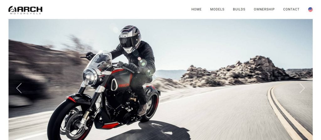
With a number of different kinds of bike models, Arch motorcycles have won the people over. They offer sleek and robust designs that are meant to take a bike lover’s breath away in a single throttle. Their website is one of the most prime examples of how a big business can still maintain their website on Squarespace and make use of their aesthetics to portray the brands own interests.
36. Indian Gardens – Business
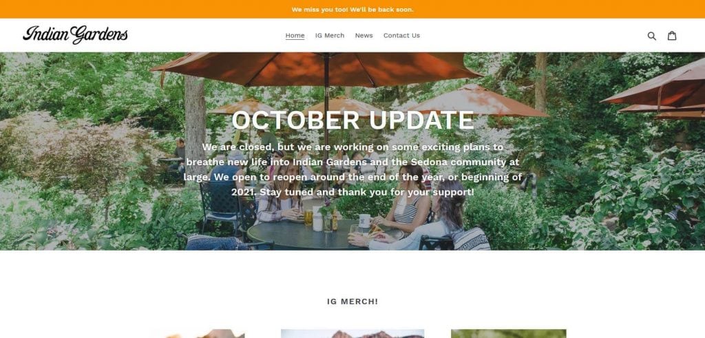
The picturesque locations of the Indian Gardens stores is what has attracted people to it for the past 50 years and with a Squarespace website they decided to up their game to a different level. By giving viewers the idea of what it is like to be in the Indian Gardens store, it is continuing to engage with a lot more people and thats exactly why it is necessary today to have an online presence.
37. Fotio – Business
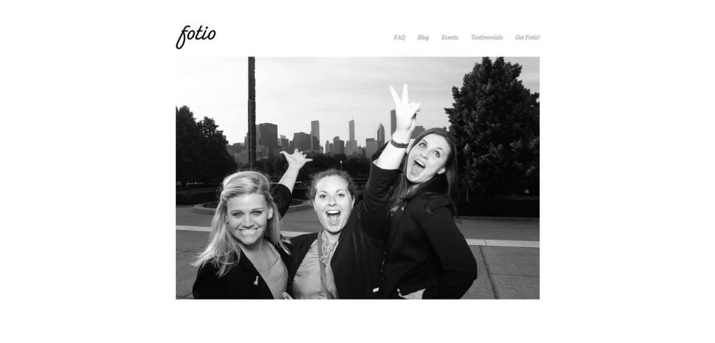
While photo booths have been a big part of everyone’s childhood, not everyone goes over how much paper is wasted whenever we visit one. Fotio does that and comes up with a solution that is eco-friendly and modern. Fotio does not print your photos out, instead generates a link for your photos that you are sent so you can have your memories saved over the internet. And the site perfectly advertises this “booth without a booth” concept with a slideshow on their homepage with more details as we scroll down.
38. MASA NYC – Food & Beverage
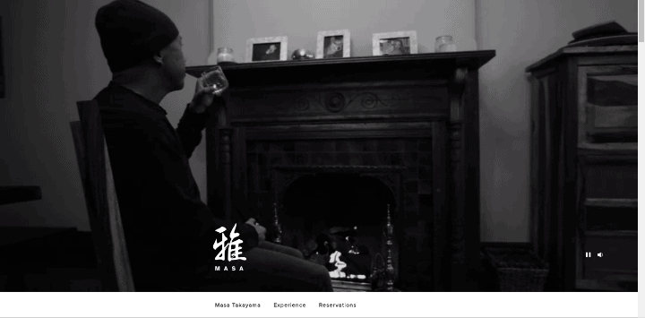
A chef with his own restaurant, Masa is one exceptional person, and the site describes him in the right manner as well. As soon as you visit the website an engaging video starts to play because of which you get a fair idea of who the person really is and how he comes to be the kind of creator that he is. People can also book tables on the site or have an option to meet with the Chef himself.
39. Werbewelt – News and Media
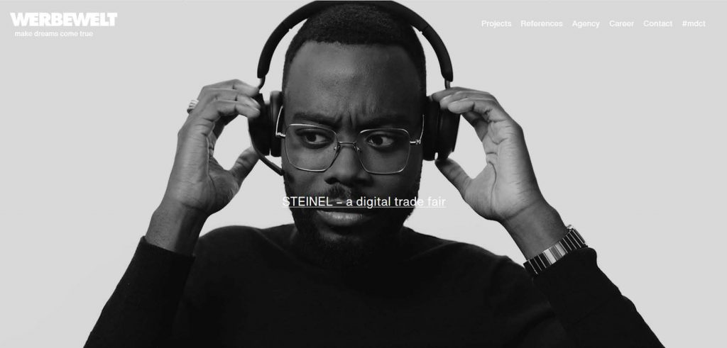
Werbewelt is a contemporary German website that serves as an advertising platform for different types of brands. The website is very hip and modern. Even though it is mostly in German, you will still grasp the idea of what it’s about when you visit. As you scroll down, the images and videos advertising products and services will appear, and you can click on the ones that you find the most appealing.
A German advertising website that has collaborated with some of the biggest names in the world like Porsche and American Express, it correctly sums up why even big names need to have a website. They have almost each of their projects and services listed in the website which is as fascinating as it is informative. You can even contact them for your own needs. At the end of the day, that is what a website is for right?
40. Rodarte – Clothing/Fashion Store
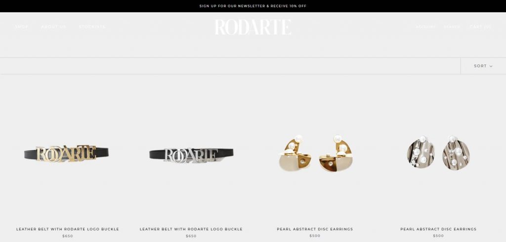
A gigantic name in the fashion industry, Rodarte is one of a kind brand that is obsessed with making the right accessories and clothing for women and it is renowned for that. On the website, though, you can check out their new designs and products that might not be readily available in the market but even if you feel like you need offline retailers, they have the list of those as well. The store is also seamless and makes the whole buying process hassle-free
41. The Sorry Girls – Business
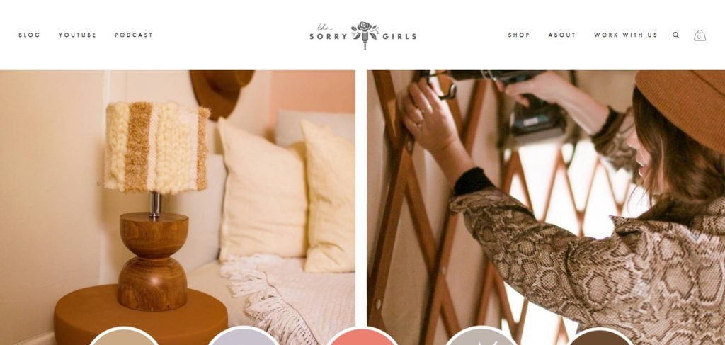
Interior Designing does not really get any better than this. With Becky Wright and Kelsey MacDermaid making quirky yet subtle designs that fit right in your home, the Canadian Duo is winning hearts all over the world. Not just that, on their website you can find their podcasts and videos that make us see their unseen side. The two started out in 2010 and soon realized the need for a website to make more and more people aware of their designs and their work.
42. A Fork & a Pencil- Food & Beverage
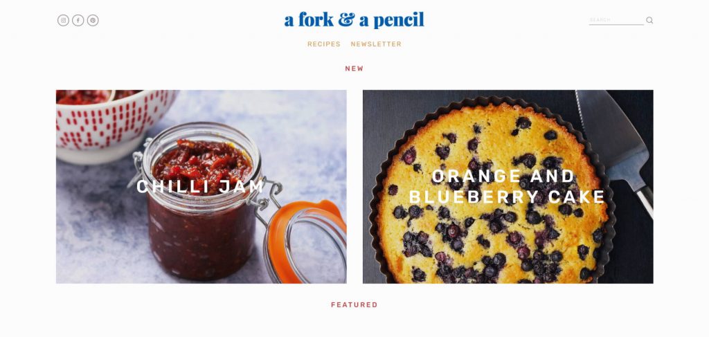
Looking for some recipes that are not going to take a lot of time but are nutritious and munchable enough to get you through? Well A For & a Pencil is your destination. There is not much to the site but whatever the creators have put on their is enough to keep you coming back to it and follow them on Facebook and Instagram to reach these recipes right on your daily feed.
43. Think with Things – Education/Institution
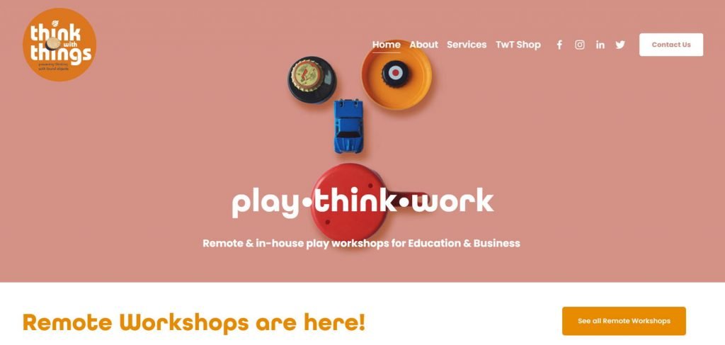
Education segment is the one that is globally becoming a little bit mundane in its methods and while it seems like that new ways of educating younglings are not coming up anymore Think With Things puts this misconception in the trash by their website that aims at the growth of education through play workshops that are meant to boost an individual’s creativity and focus among other things.
In terms of education, this method is great to see as they have also adapted so as to be able to do these workshops remotely while their website enables you to know everything about them and get in touch with them. The colors are quirky and fonts playful that make the site very welcoming.
44. Yondr – Business
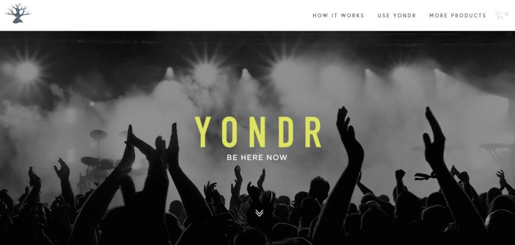
The biggest reason our generation is always a little distracted is that we cannot keep away from our phones, and while phones do a lot for us we all know how addictive they can be. Yondr provides a solution to that by creating phone-free zones for different places like libraries, schools, concerts etc, and the concept is pretty simple as well. When you’re in a Yondr zone your phone stays with you but remains concealed in a pouch and can only be used when you leave the zone. So forget about your phone and be present in the moment
The website also conveys the same idea by taking the approach of explaining how it works and how many people and companies they have so far tied up with to offer their services.
45. Fighting Eel – Clothing/Fashion Store
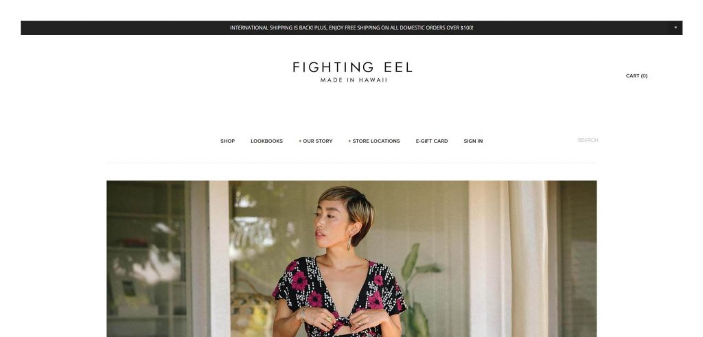
Squarespace’s E-commerce is one of the best and most convenient features of the website and Fighting Eel demonstrates how one can use it to its full potential. The Hawaiian clothing brand offers exciting products to its customers with significant discounts at times too and gives you a glimpse of the range of styles that the brand has to offer. You can then know more about the brand or just order one for yourself if going to their store is not a thing you would want to do.
46. Blue Dog – Food & Beverage
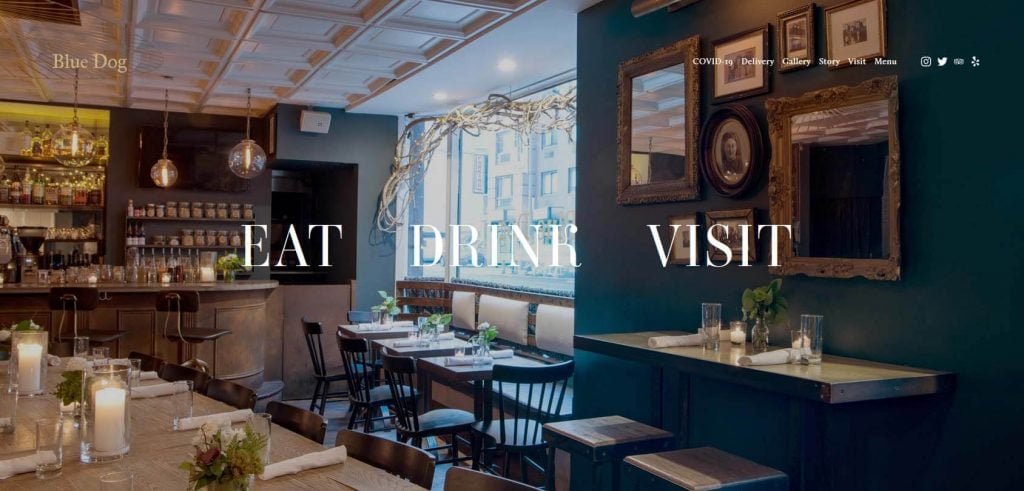
It is not a surprise at this point that an establishment as classy and posh as Blue Dog decided to put their website on Squarespace. The website conveniently describes what the restaurant is all about right in the first look while making the dominant colour of the theme as blue, referring to its name. Based out of New York the restaurant’s purpose with the website is that you know all there is to know about them and be able to get food delivered to you or get your bookings done. So much for a restaurant website!
47. Memphis Meats – Food & Beverage
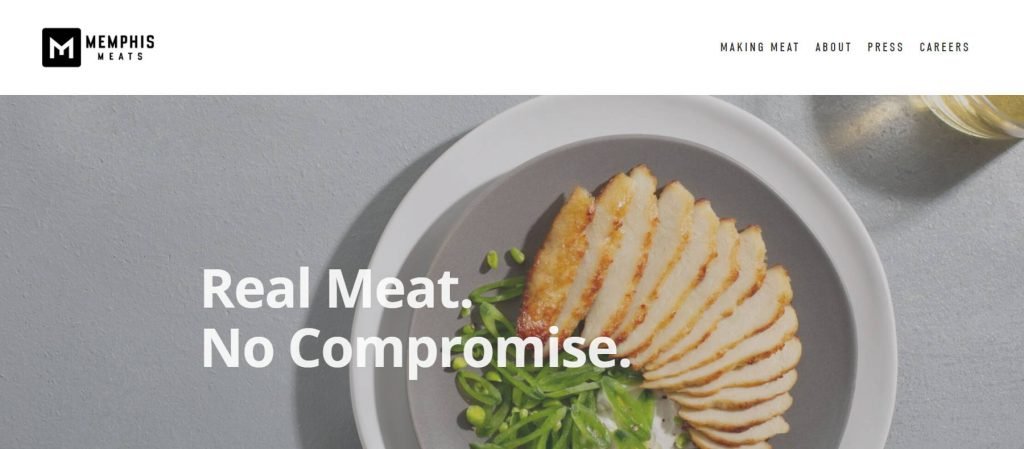
Scientists for a have been finding alternatives to meat because of the ecological footprint meat eating has had over the past several decades. But Uma Valeti and Nicholas Genovese presented the world with an alternative to it by growing a ‘cell-cultured meat’ that is not taken from animals but is grown from cells. So while the taste is indistinguishable, the two have been able to give the future generations a chance to save a lot of animal species by making them not rely on these animals. Their website talks about the cause and why one should go for alternative meat and how it is made. If it entices you enough, you can be a part of their team too!
48. Sean Casey Animal Rescue
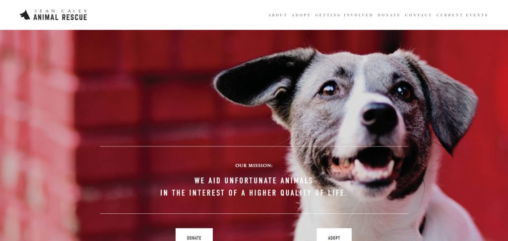
Animal Rescue is something that gives me a lot of hope that there are a lot of people out there trying to change the world not just for us humans but for the animals as well. And Sean Casey Animal Rescue has such people filled in their organization who strive to bring in animals in their shelters and provide a better life to them. From their website you can choose to adopt the rescued animals or can donate to their cause. They also have a blog that will keep you updated about their generous and brave deeds almost every day and if you’re an animal lover, you also can get in touch with them and be a part of the organization.
49. Randy Rogers Band – Music
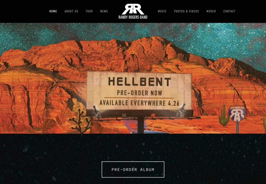
Randy Rogers Band have been making music for a little over 17 years now and their country music blended with rock and roll is what makes them grasp so many people by their ears, literally. The 7 man band realizes that it is essential to have a website as it reduces costs by a lot and takes a lot of work out of their hands such as the option of putting out information, or making their tickets available on the website or creating a store where you can find their official merchandise (even autographed).
50. Sanara- Travel and Hospitality
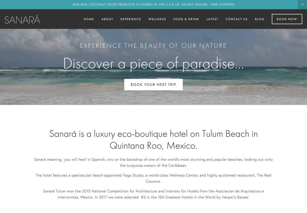
A luxury hotel making its website on Squarespace sounds pretty unrealistic right? But Sanara is just that, apart from being a dream destination for a lot of people globally but the place does not just offer relaxation and fun. The main focus here is to make your vacation about you and to be able to heal you on a physical and spiritual level so that you get an experience that is unparalleled. The color combination in the website itself supports the serene concept and location of the hotel and would instantly make you connect to it.
Conclusion
Squarespace is not traditional in any sense whatsoever and all these sites prove it in 50 different ways, and I doubt that at this point anyone can really disagree with the fact. It brings out new ways to take the best of your product or imagination so that you can put it on highlight and make the world attracted to it as soon as they come to your website. Although, most of the features are relatively similar and reply on minimalism and simplicity in their design, that speaks volumes about the kind of designs that people find attractive and what you should be aiming for as well as you start to develop your own website and let the world see what you bring to the table.
In today’s world a website is necessary not just to maintain an online presence but to make sure that your business or art keeps on growing. These sites have been doing pretty well even as Covid has been grappling the world and that is just one example of why a website is necessary to be out there in the world. While most of the world today is shifting to online, so should you. And Squarespace is surely a start for that.
