The first time I wrapped a handmade soap bar in plain plastic, it looked more like a grocery item than a special treat.
The moment I switched to a simple paper band with a clean label and a bit of twine, people started calling it “gift-worthy.” Packaging doesn’t just cover the soap. It tells buyers what to expect before they even smell it.
Good soap packaging balances beauty, function, and story. It needs to protect the bar, highlight your ingredients, and reflect your brand—whether that’s rustic, luxurious, or eco-conscious.
Think kraft sleeves, stamped muslin bags, or minimal boxes with clear scent descriptions. After all, if your soap looks this good on the outside, who can resist finding out how it feels on the inside?
Related Articles –
- 26 Fantabulous DIY Soap Bar Ideas That Smell Like Heaven
- 25 Amazing and Whimsical DIY Ideas Absolutely Worth Seeing
- 40 Fun And Easy DIY Coasters To Gift Or Keep
1. Punchy Pastels, No Shelf Required
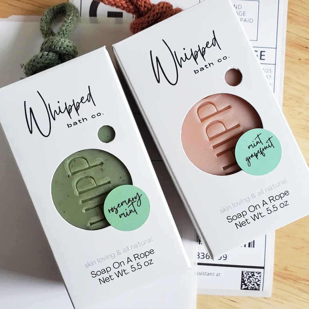
Image by whippedbathco
Skip the dish—these soaps come ready to hang. A chunky knit loop turns each bar into bathroom decor, ideal for small showers or zero-clutter fans. The die-cut window gives a peek at the soap’s soft tones and stamped branding, while the handwritten scent stickers add a boutique feel. It’s playful, practical, and totally giftable.
2. Wrapped Like A Farmers Market Find
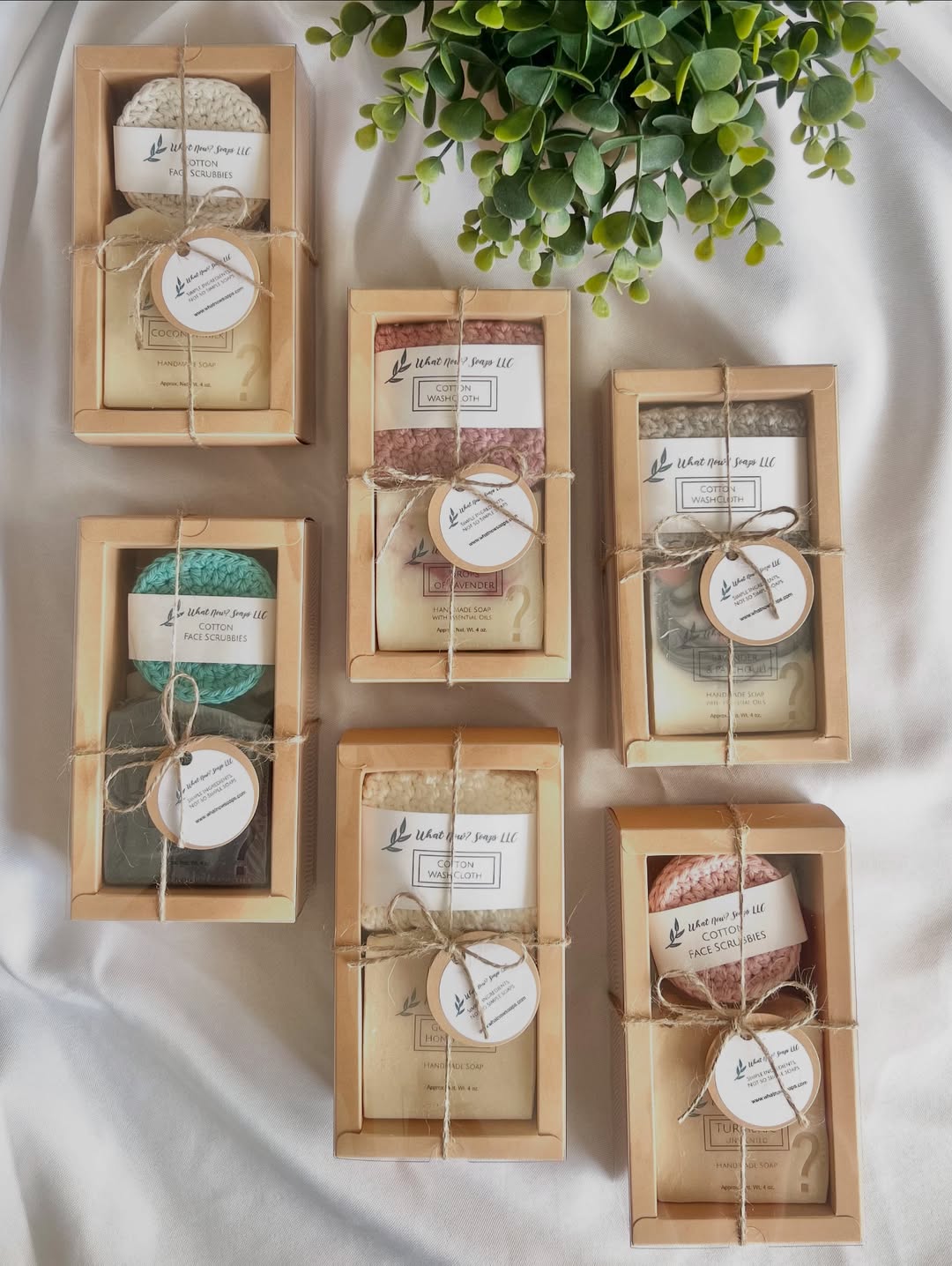
Image by whatnowsoaps
Each set feels like a tiny care package, tied with twine and full of slow-living charm. The kraft paper boxes show off handmade soaps and textured cotton cloths through clear windows—no surprises, just cozy goodness. Muted tones and natural fibers say “thoughtful gift” without even trying. It’s giving homestead chic, one scrub at a time.
3. Glossy Green And Tied In Twine
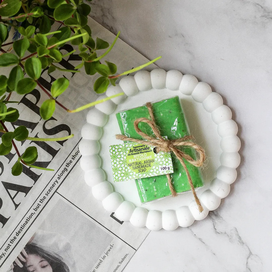
Image by paulina.err
This soap goes bold with its vibrant green wrap and glossy finish, instantly catching the eye. A rough twine bow adds that handmade touch, keeping it from feeling too polished. The patterned tag leans Moroccan-inspired, hinting at the argan oil inside. It’s a little luxe, a little rustic—like market day meets skincare ritual.
4. Dessert Bar, But Make It Soap
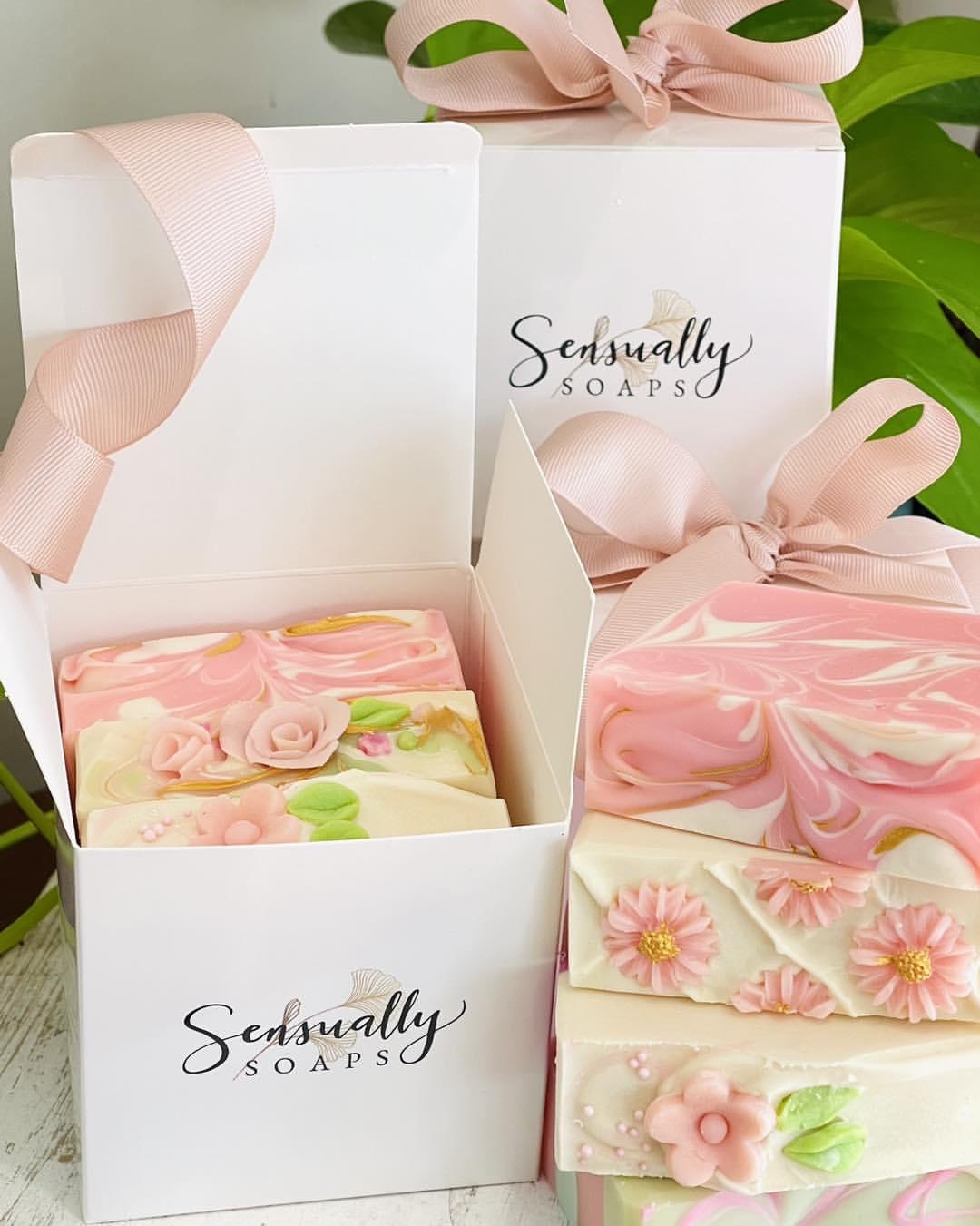
Image by sensuallysoaps
These soaps look good enough to eat—and that’s exactly the point. Swirled like frosting and topped with delicate florals, each bar is a mini sculpture in sugar-pink hues. The branding stays sleek and understated so the product does all the talking. Wrapped in a ribboned box, it feels more like a pâtisserie gift than bath product.
5. Pastel Fade, Luxe Pouch
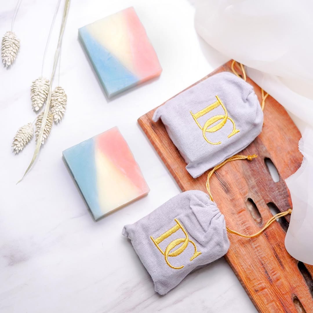
Image by marrel
Diagonal bands of peach, ivory, and sky blue turn each bar into a soft color story. The linen pouches, stitched with golden monograms, feel like part of a high-end skincare ritual. Simple, minimal, and ultra-giftable—nothing extra, just elegant details that speak volumes.
6. Straightforward Bars, Botanical Mood
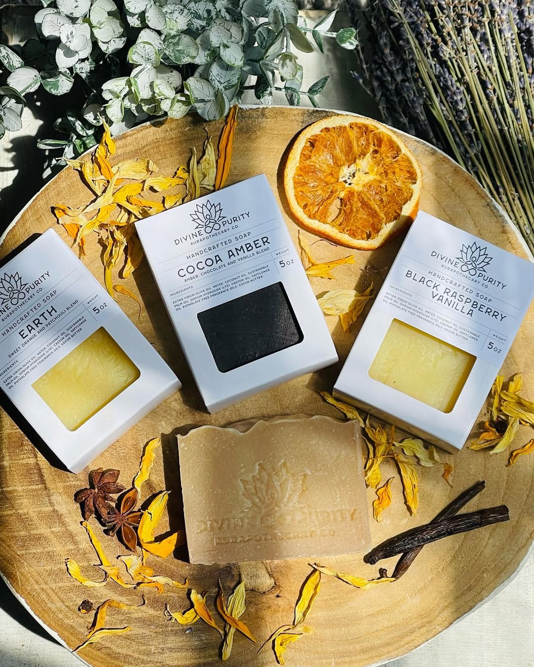
Image by divinepurity
No frills, just clean lines and nature-forward packaging. Cut-out windows give a peek at rich tones—charcoal black, creamy yellow—while the crisp font keeps it feeling modern apothecary. Scattered petals and dried citrus reinforce the scent story without stealing the spotlight.
7. Mini Rounds, Major Scent Appeal
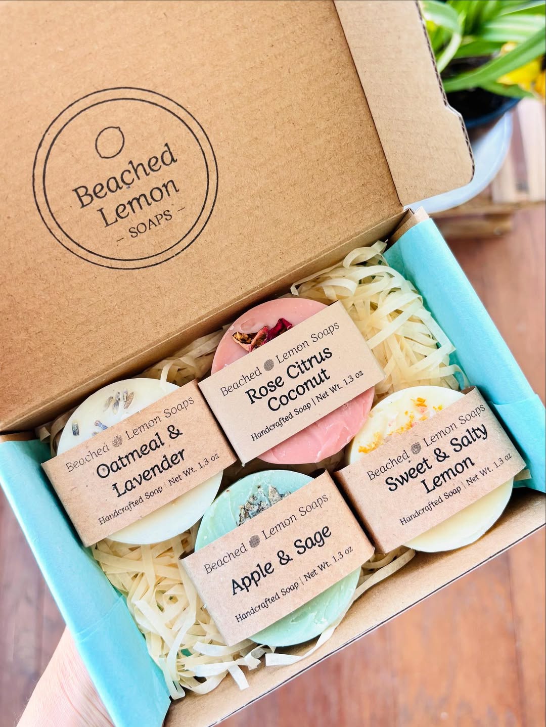
Image by beachedlemonsoaps
Bright, beachy, and boxed to delight—each soap puck comes wrapped in kraft paper with typewriter-style labels that feel both nostalgic and handmade. Crinkle paper and pastel tissue keep it breezy and gift-ready. Between the playful names and juicy color palette, it’s like a farmers market for your senses.
8. Wrapped Like A Love Letter
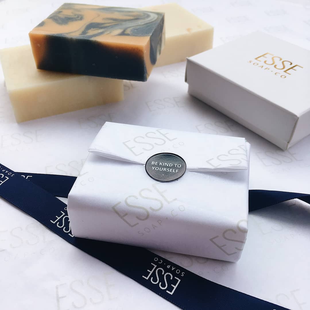
Image by noissueco
Crisp white paper, gold-lettered branding, and a seal that whispers “Be Kind to Yourself”—this is soap with main character energy. Every detail is intentional, down to the luxe navy ribbon and minimal box. Feels like opening skincare couture, not just washing your hands.
9. Soft Touch, Simple Type
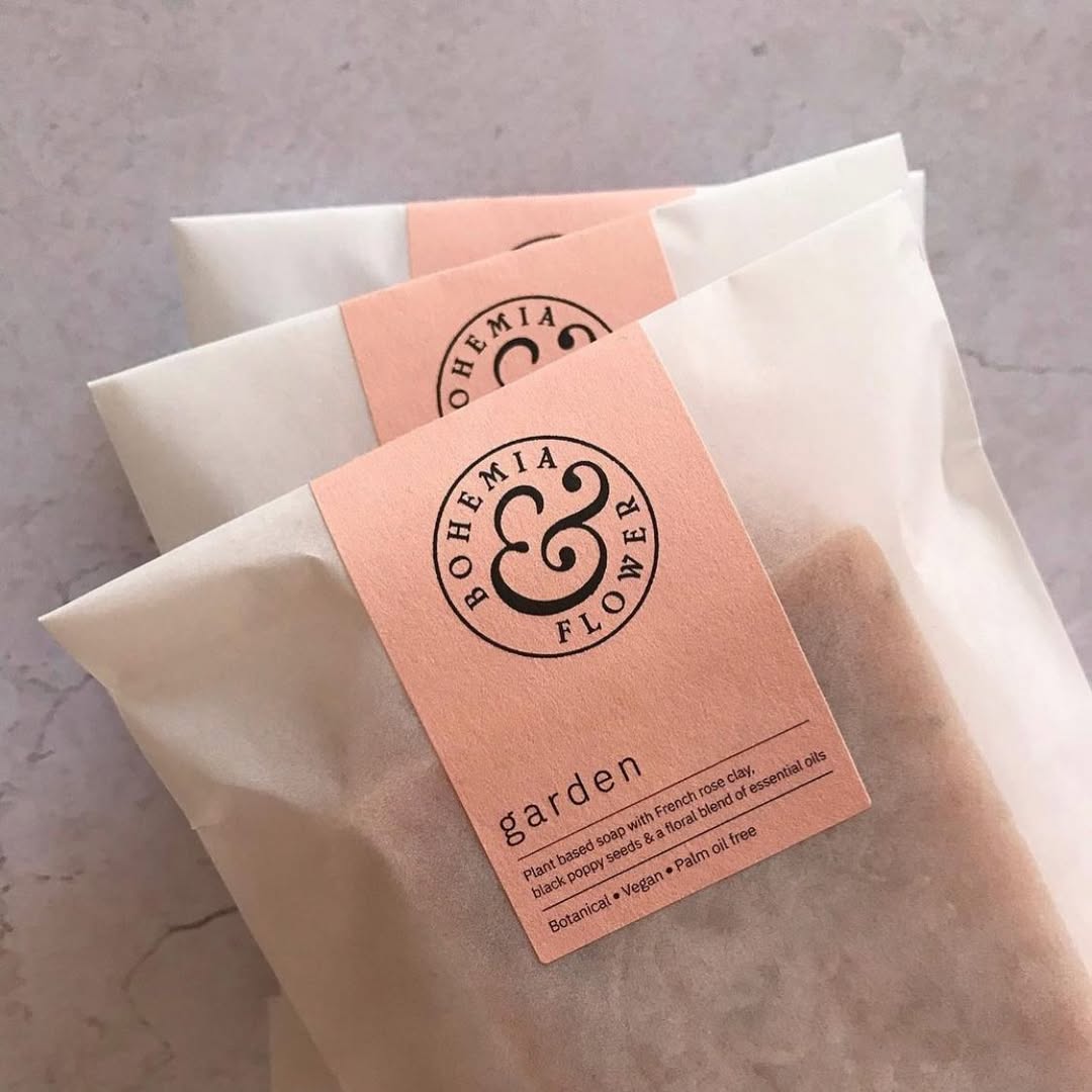
Image by mobbsanddaughters
Peach-toned labels and translucent paper wraps let the texture of the soap peek through, keeping the look organic and fuss-free. A bold ampersand gives the branding just enough personality without overdoing it. Earthy, minimal, and quietly chic—exactly what you’d expect from a brand named Bohemia & Flower.
10. Loud, Round, And Ready To Lather
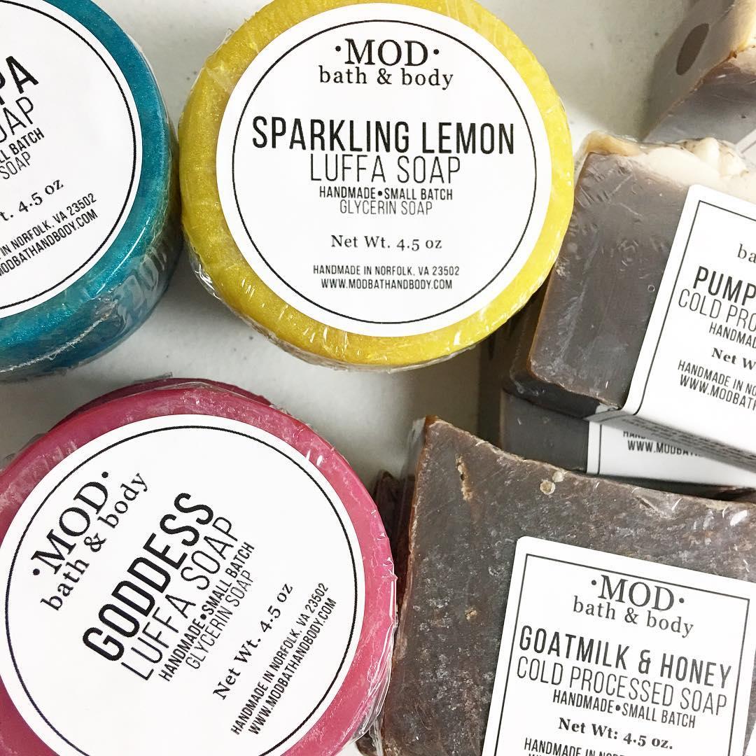
Image by modbathandbody
Bright shrink-wraps and punchy fonts make every soap here feel like it belongs in a retro soda shop. From “Sparkling Lemon” to “Goddess,” the names do the heavy lifting, while the bold contrast labels keep it all clean and readable. Perfect for shoppers who want their bath to come with a side of personality.
11. Soft Curves, Subtle Scents
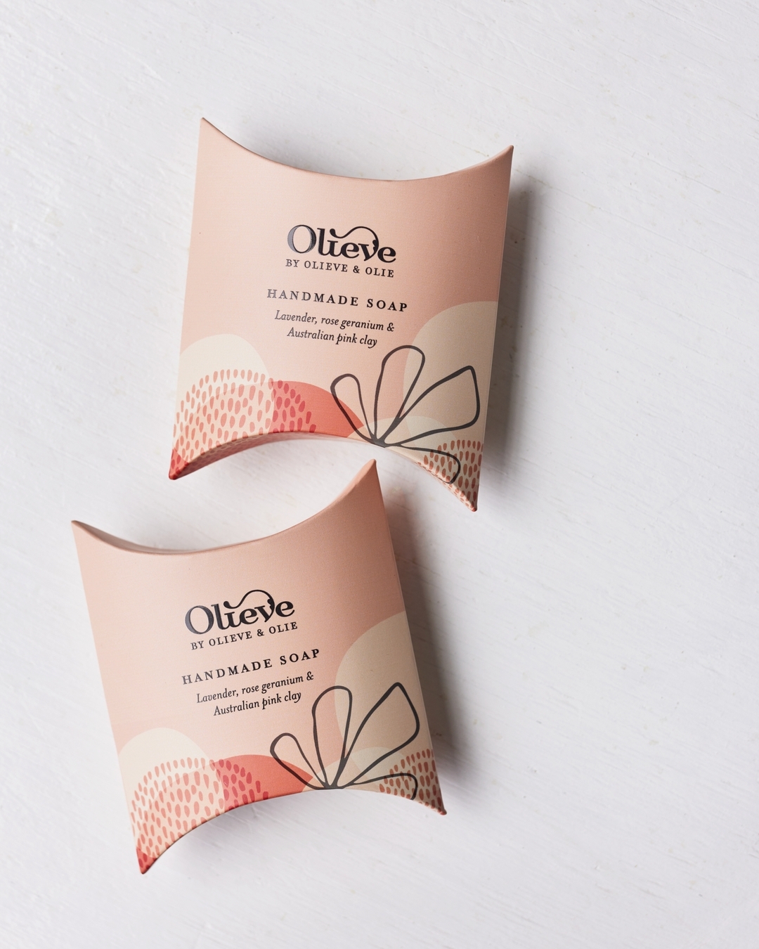
Image by olieveandolie
Curved pillow boxes in blush tones feel more like luxe gift wrap than everyday packaging. Abstract florals and a hint of texture give it a gentle, spa-like aesthetic. Even the font pairing feels intentional—feminine but not fussy, perfect for a soap that wants to be both pretty and practical.
12. Boxed And Labeled Like A Local
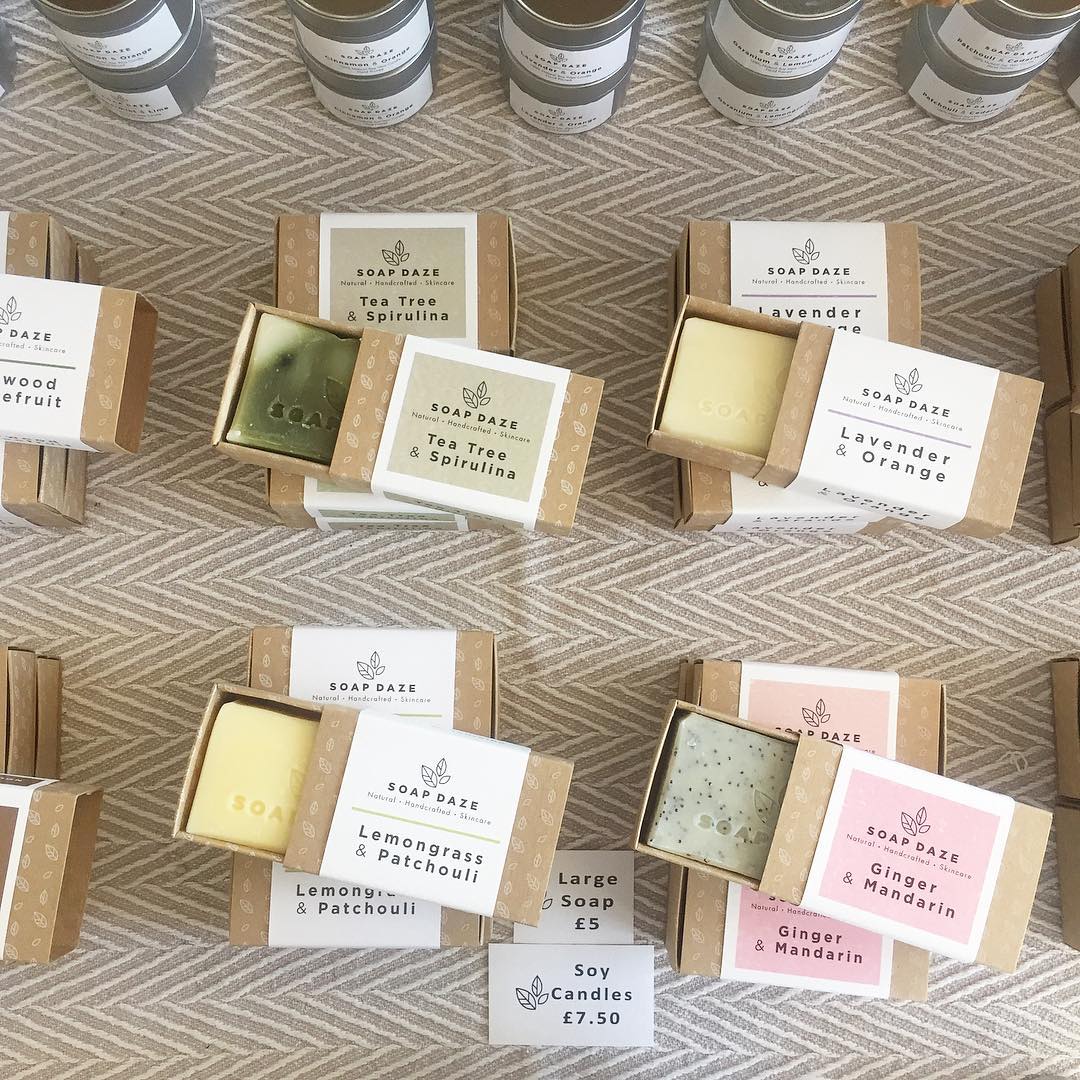
Image by exetercreatives
Kraft sleeves and white labels keep things grounded and handmade, while the color-coded tags make scent-spotting easy. Each bar gets its moment in a peekaboo box that slides open like a tiny drawer. Think farmers market charm, upgraded with boutique polish.
13. Color Stories, Wrapped Just Right
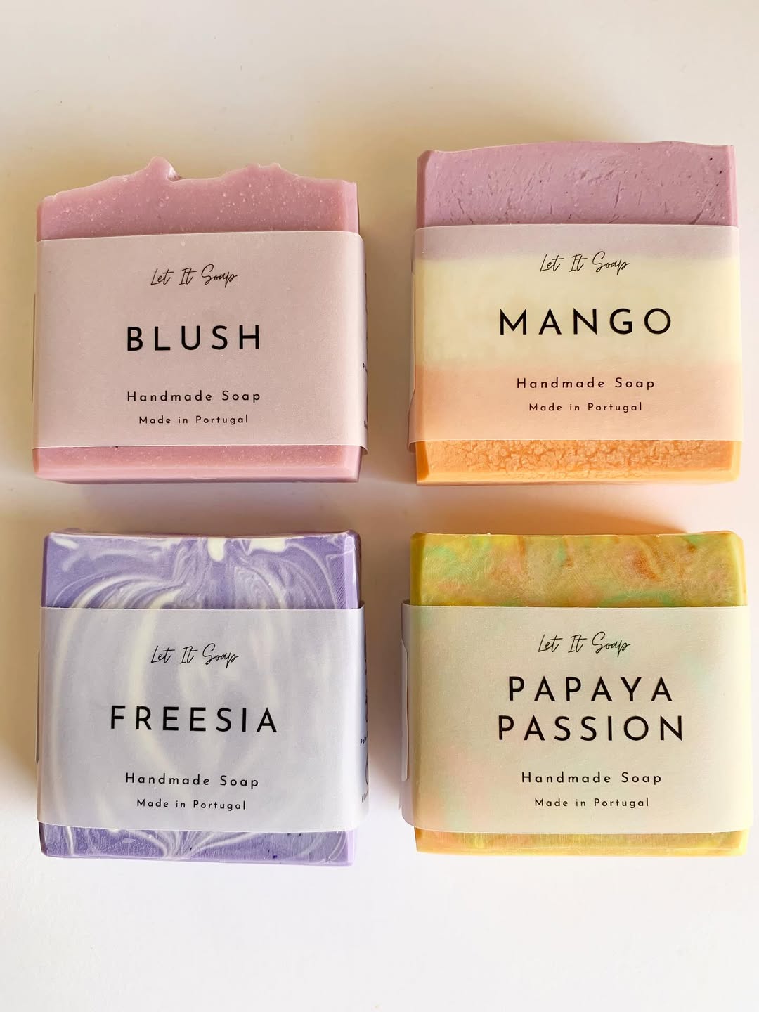
Image by let_it_soap
Soft gradients and clean serif fonts make each label feel like a mini mood board. The pastel marbling and vibrant hues peek out just enough to tempt the senses without overwhelming. Branding stays subtle, letting names like “Blush” and “Papaya Passion” take center stage—short, sweet, and shelf-ready.
14. Dot Marks The Scent
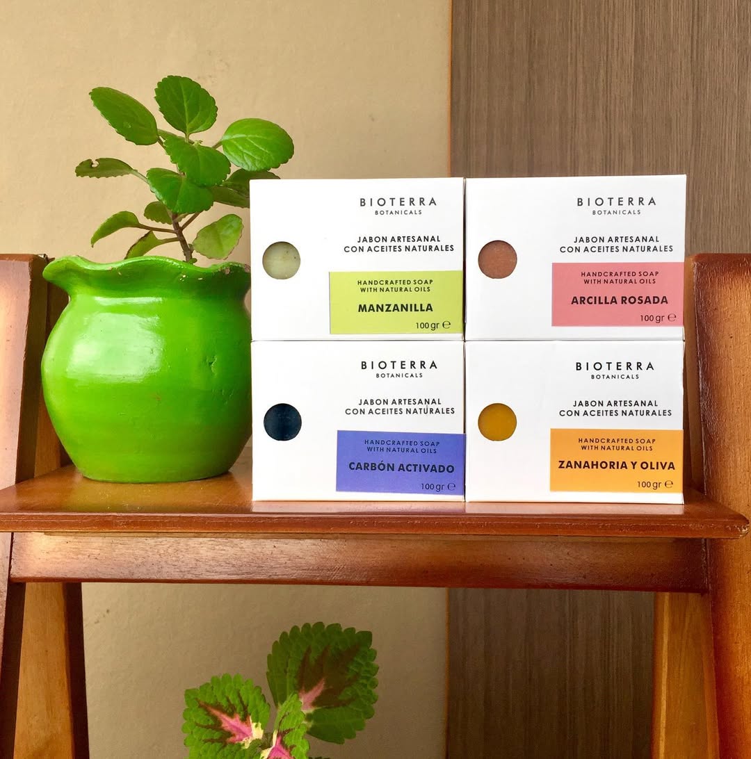
Image by caritespy
Punchy color bands and peek-through dots turn minimalist packaging into a smart scent cue system. Each soap gets its own pop of identity—from charcoal black to sunny orange—without needing a loud design. The boxed shape stacks beautifully too, making it feel equal parts apothecary and eco boutique.
15. Whimsy Wrapped In Dots And Doodles
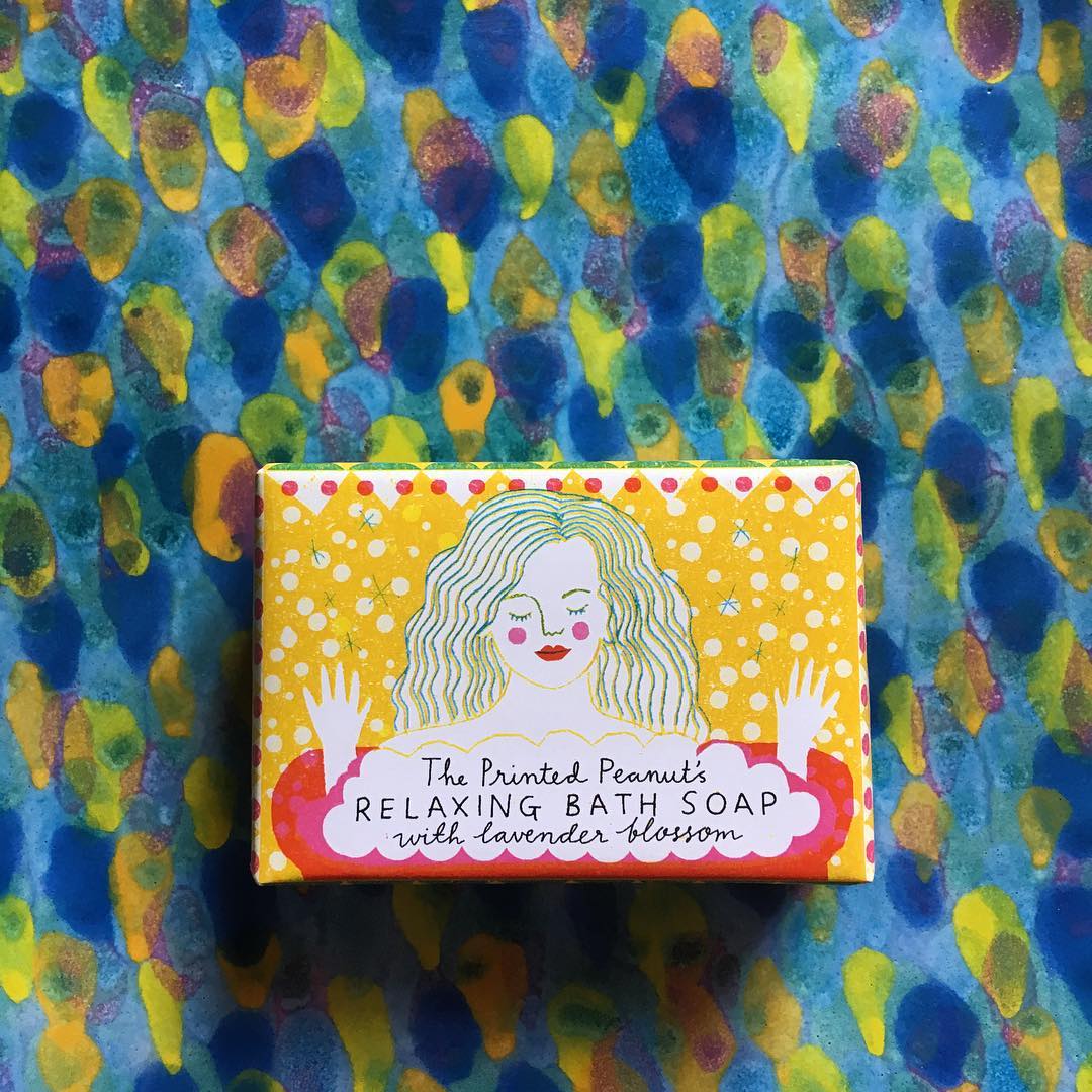
Image by theprintedpeanut
Bright polka dots, hand-drawn lines, and a serene illustrated figure instantly set a playful, indie tone. The vibe is unapologetically artsy—like something you’d find in a quirky gift shop or museum store. Bonus points for packaging that feels like part of the gift, not just the container.
16. Bare Bars, Earthy And Honest
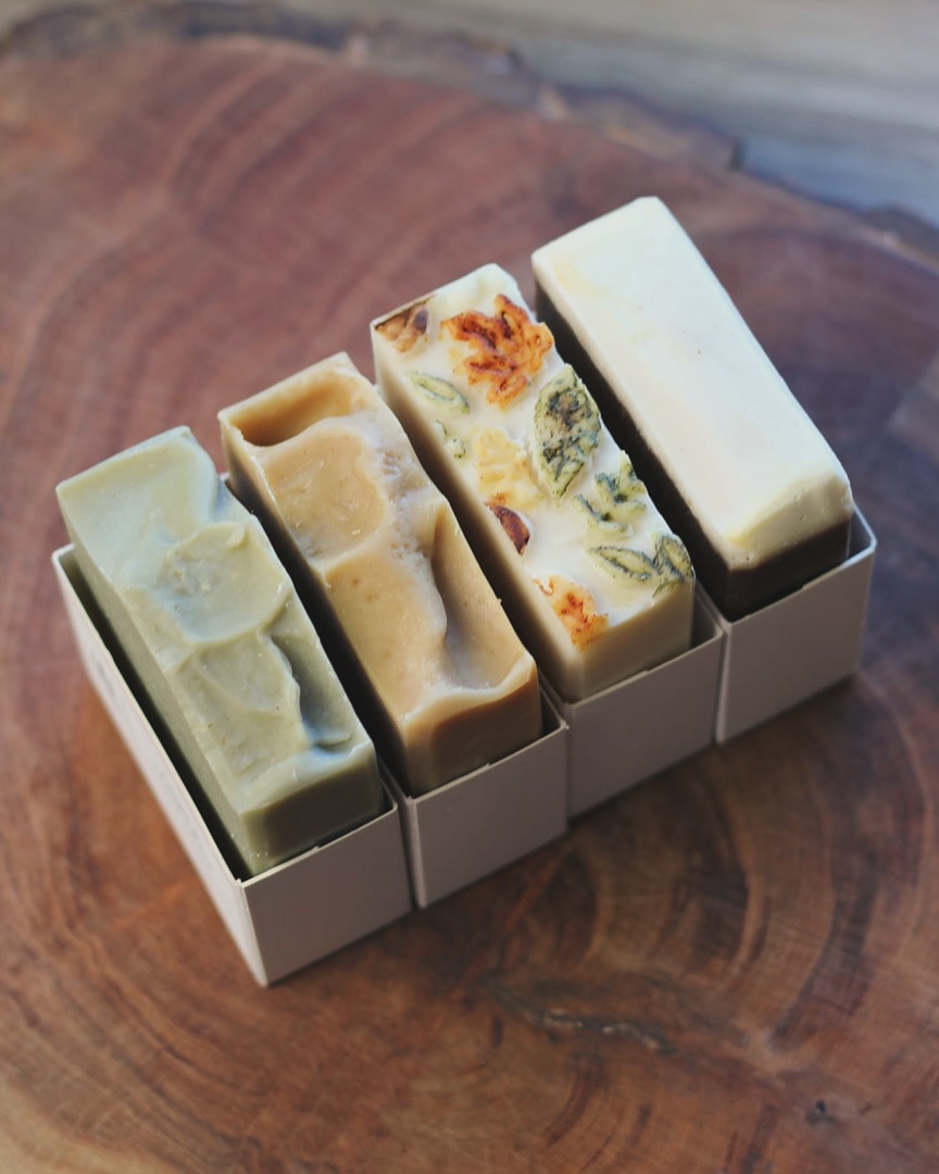
Image by pinecreeksoapworks
Textural tops, botanical embeds, and a snug open-face box show off the soaps exactly as they are—raw and beautiful. No plastic, no fuss, just a tight square base that keeps things neat while letting the organic shapes breathe. Each bar looks like it was poured with purpose and sliced by hand.
17. Botanicals Meet Bold Typography

Image by thepinkdiamond.co
Floral wrapping gives the whole collection a fresh-from-the-garden vibe, but the minimalist label design keeps it feeling modern. Large block fonts and simple scent names like “Pink Clay” and “Sugar Rose” strike a balance between pretty and punchy. Bonus: the cohesive look makes mixing and matching feel intentional, not chaotic.
18. Craft Table Energy, Elevated
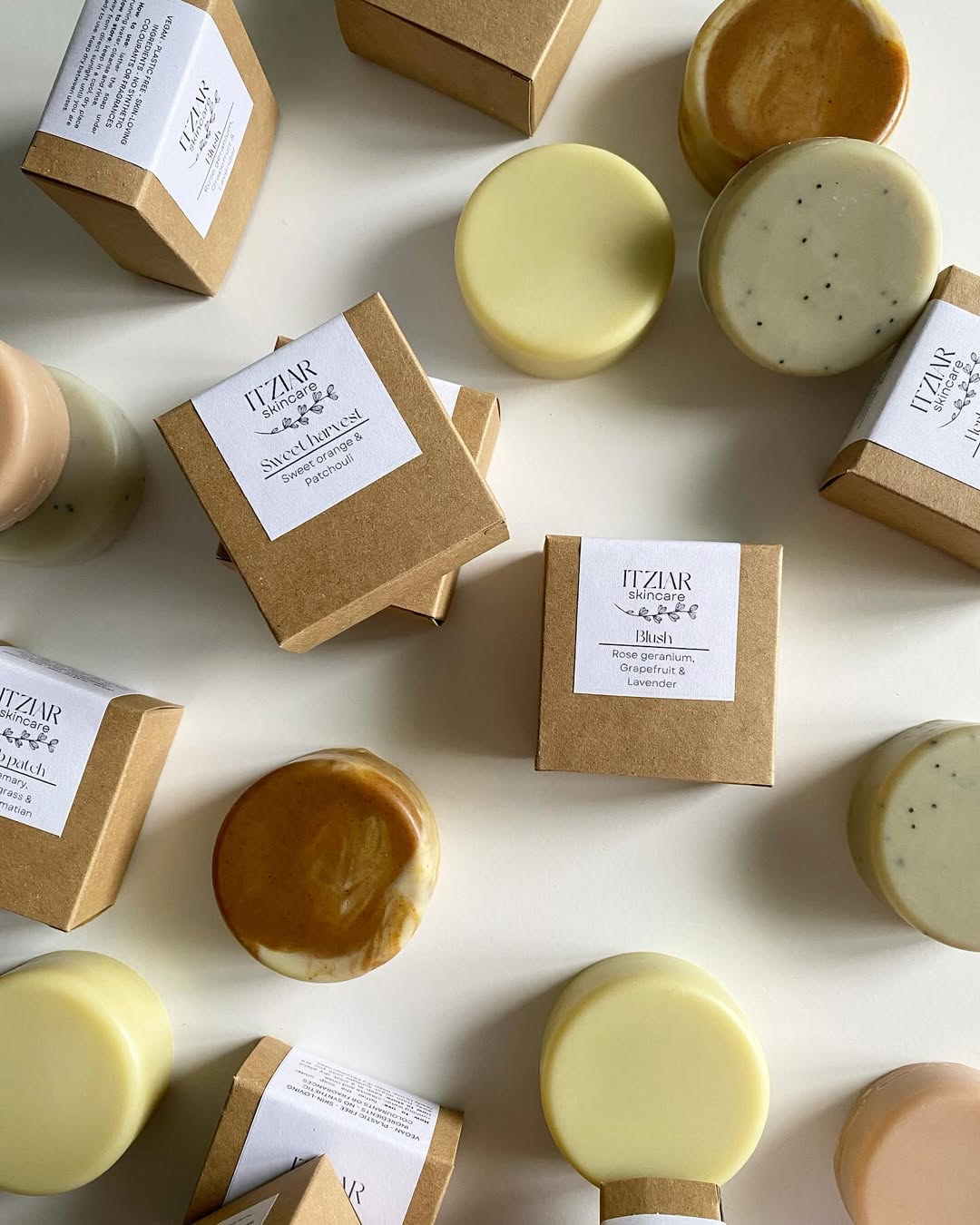
Image by itziarskincare
Round soaps and kraft boxes give this setup a charming, handmade feel—but it’s the subtle label design that keeps it polished. White stickers with delicate fonts let the natural color and texture of each bar take the lead. Ideal for a brand that wants to feel organic without losing its edge.
19. Lavender Layers, Framed In Clean Lines
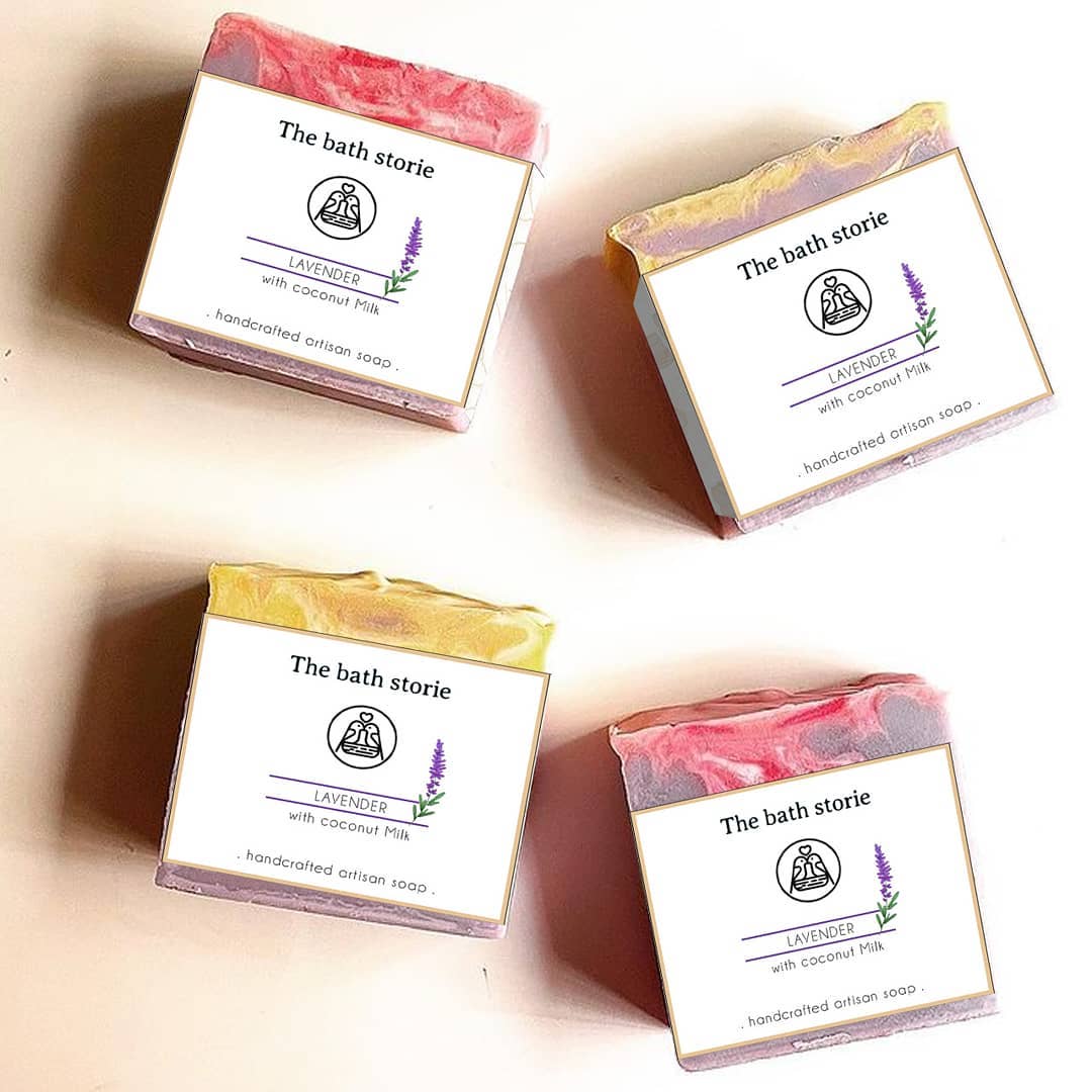
Image by ardent_arts_
Soft swirls on top and crisp labels on front create a balanced, boutique vibe. A fine-line illustration paired with a sprig of lavender adds a quiet touch of charm, while the classic serif font keeps it feeling calm and trustworthy. Feels like something you’d pick up in a slow-living shop—and never want to unwrap.
20. Soap That Speaks First
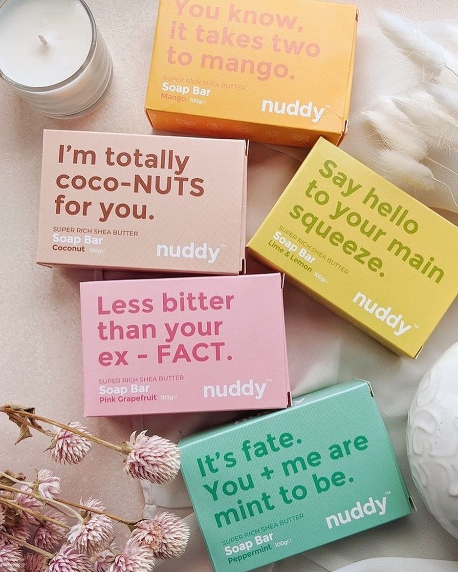
Image by soapsocietyxkanokcosmetic
Bright blocks of color and bold type do all the talking—literally. Each box drops a playful pun or cheeky phrase that doubles as shelf appeal and mood booster. Minimal design, maximum personality. You might buy it for the joke, but you’ll come back for the scent.
21. Textbook Simplicity, Wrapped In Cotton
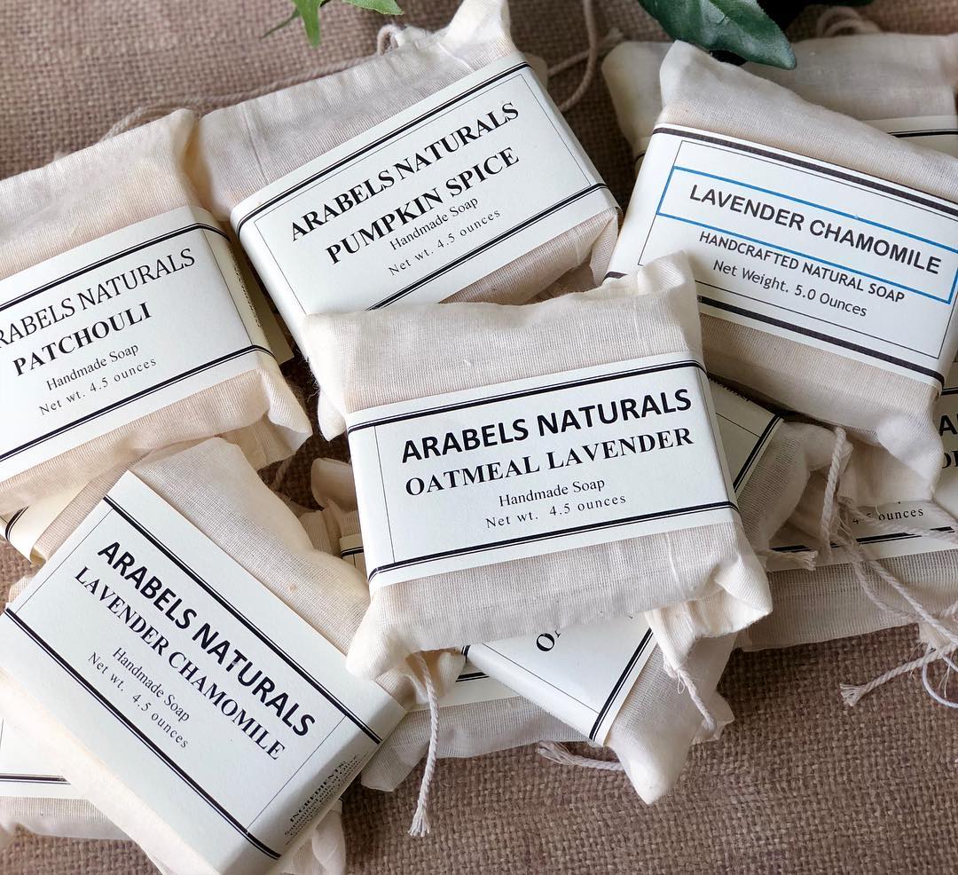
Image by arabelsnaturals
Unbleached drawstring bags and classic serif labels give off strong farmer’s market energy. Each scent is announced plainly—no frills, no fluff—just straightforward, timeless packaging that feels honest. It’s the kind of branding that makes you trust what’s inside before even untying the string.
22. Pastel Stack, Clinical Cool
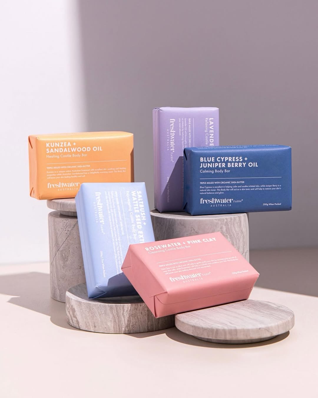
Image by soapsocietyxkanokcosmetic
Matte pastels and all-caps ingredients create a wellness-lab aesthetic that’s soft yet scientific. Thoughtful spacing and sans serif fonts keep things clean and highly legible, while the angled product stack shows off each bar like it’s on a skincare runway. The look is modern apothecary—Instagram-ready but rooted in function.
23. Color Swirls Meet Cut-Out Cool
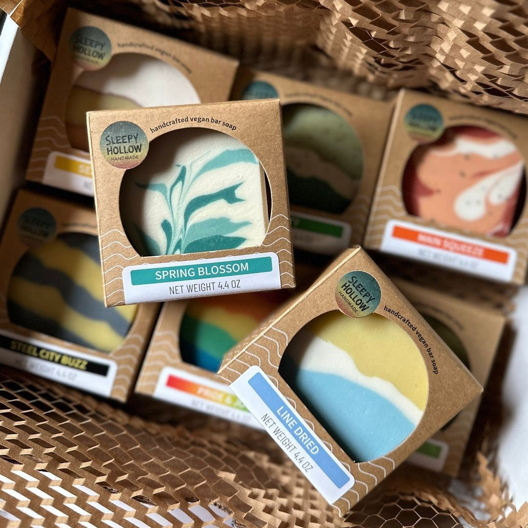
Image by avery
Wave-patterned kraft boxes and playful cut-outs let the soap designs peek through like mini art prints. Each scent gets its own color-coded label strip—easy to spot, fun to collect. The mix of earthy packaging and vibrant bars hits a sweet spot between rustic and retail-ready.
24. Wrapped Like A Letter From The Farm
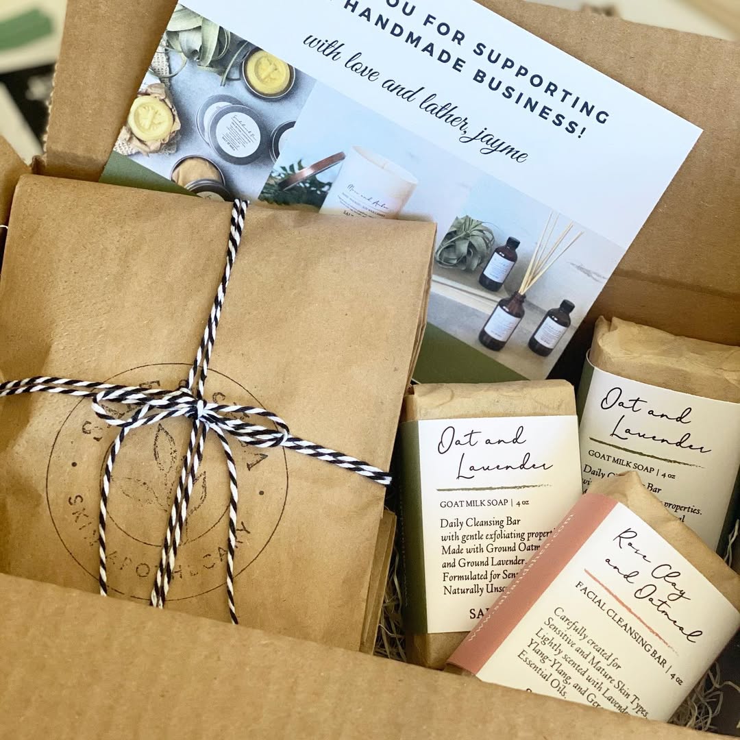
Image by saltandshea
Kraft paper, hand-tied twine, and soft script labels give this soap box the feel of a slow morning in a country kitchen. Nothing glossy, nothing rushed—just thoughtful packaging that leans into warmth and handwritten charm. Feels like a thank-you note with a lather.
25. Circle Window, Swirl On Display

Image by lustfulbath
Kraft boxes get a modern upgrade with die-cut round windows that spotlight each soap’s marbled design like a tiny gallery piece. Names like “Black Love” and “Fresh Waters” are simply printed on clean white stickers—no fuss, just clarity. The uniformity of the packaging lets the colorful soap designs do all the talking.
FAQ’s About Soap Packaging Ideas
Q: Why is soap packaging important for handmade and commercial soaps?
A: Soap packaging protects the product from moisture, dust, and damage while helping maintain its scent and shape. It also plays a major role in branding, making soaps more appealing to customers. Good packaging communicates quality, ingredients, and the overall style of the product.
Q: What materials are commonly used for soap packaging?
A: Common materials include kraft paper, cardboard boxes, shrink wrap, glassine paper, and fabric wraps. Eco-friendly options like recycled paper or compostable wraps are popular choices. The material should balance protection, aesthetics, and sustainability.
Q: How can soap packaging be made visually appealing?
A: Using clear labels, coordinated colors, and simple typography enhances visual appeal. Adding elements like twine, wax seals, or custom stickers gives packaging a handmade feel. Transparent windows or wraps allow customers to see the soap, increasing trust and interest.
Q: Are eco-friendly soap packaging ideas effective for selling?
A: Yes, eco-friendly packaging appeals to environmentally conscious customers and aligns well with handmade or natural soaps. Minimal packaging with recyclable or biodegradable materials builds brand trust. Clearly stating sustainability benefits on the label adds extra value.
Q: How can soap packaging support branding and sales?
A: Consistent packaging design helps customers recognize your brand easily. Including details like scent descriptions, ingredients, and usage instructions improves the buying experience. Attractive and informative packaging increases perceived value and encourages repeat purchases.