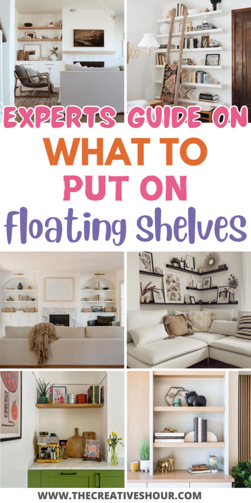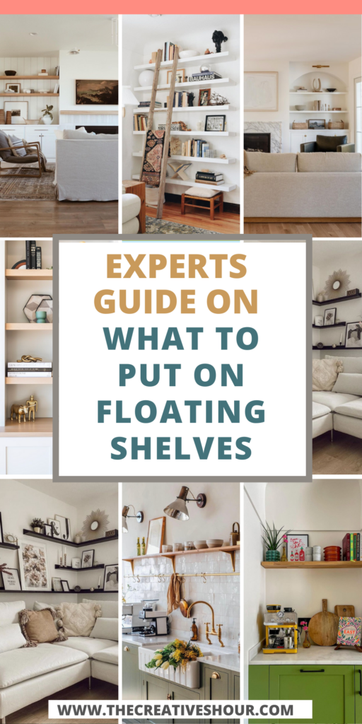
Floating shelves have become a popular choice in modern home design, offering a perfect blend of functionality and aesthetics. Not only do they provide a practical solution for storage, but they also serve as an opportunity to enhance the overall look of a room.
Whether you’re looking to display your favorite decor or keep everyday items within easy reach, styling floating shelves can be tricky.
To help you strike the right balance, we asked three interior design experts to share their tried-and-true methods for making floating shelves both beautiful and useful.
Balance Function With Aesthetics
“When it comes to styling floating shelves, I’ve learned that balancing function and looks is crucial. To pull this off, try to create an arrangement of items that looks good together and makes sense.
One way that works well is to put similar things next to each other, like books, plants, or decorative stuff. This doesn’t just make things look neat—it also helps each item stand out.
In a recent project, I styled some floating shelves in a modern living room. To make the space both useful and good-looking, I mixed books, small potted plants, and decorative sculptures. The books gave depth and texture, while the plants brought in some nature and greenery.
The sculptures, which matched the room’s overall look, became eye-catching points. This well-balanced setup did not only make the space look better but also provided a handy storage spot for everyday items.” – Giovanni Patania, Architect Director, WindsorPatania Group
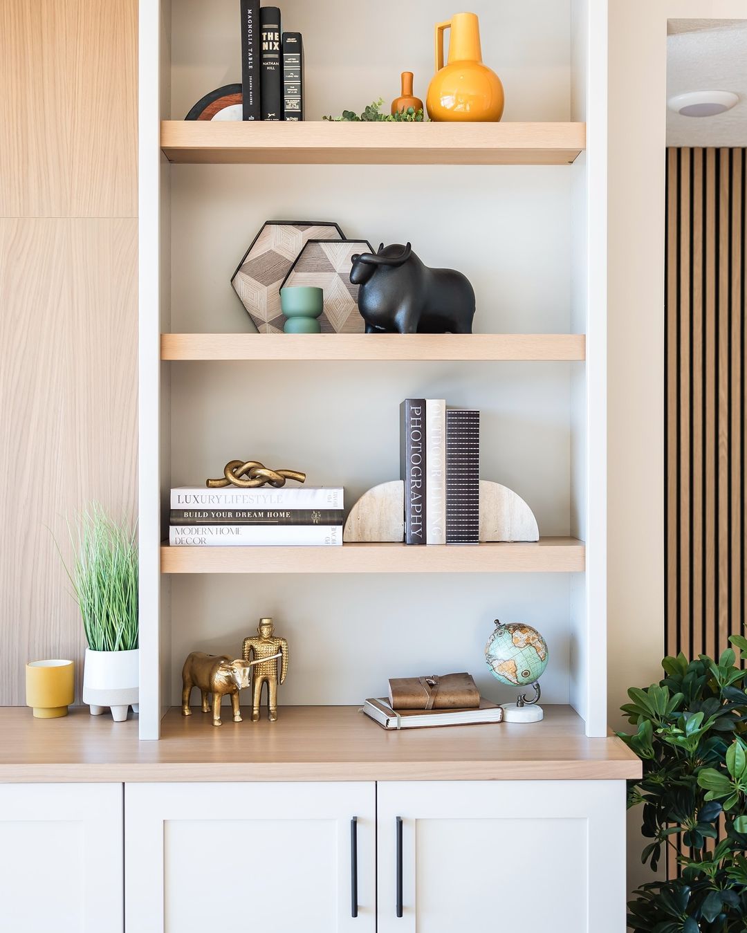
Image by interiorsbyjcurry
Giovanni’s approach demonstrates the perfect balance between aesthetics and functionality by blending practical items with decorative pieces. His use of books, plants, and sculptures creates a well-rounded design that feels cohesive while still being useful.
I agree with his emphasis on balancing similar items—this helps keep the shelves looking neat and visually pleasing. If you’re unsure how to style your floating shelves, start by grouping items like books or plants together, which will make each piece stand out and enhance the overall look.
Match Items to the Kitchen’s Theme
“I’ve used floating shelves to maximize function and aesthetics in a lot of kitchens. The key to functionality is to only display the items that are frequently used, and the key to aesthetics is to make sure those items fit with the overall theme of the kitchen.
For example, if a kitchen has copper accents in its cabinet handles, stovetop, etc., then it would be great to display your copper cookware on floating shelves. If you had traditional black or stainless steel cookware, this setup would not work because they don’t match well enough with the overall design.
Fresh indoor herbs are also a great addition to a nature-themed kitchen. If your kitchen primarily uses earthy colors like pastel green and wood tones, displaying your basil and other plants on floating shelves would be perfect. They’re easy to access for cooking, and they blend perfectly into the space.” – David Silva, Interior Designer, HomRem LLC
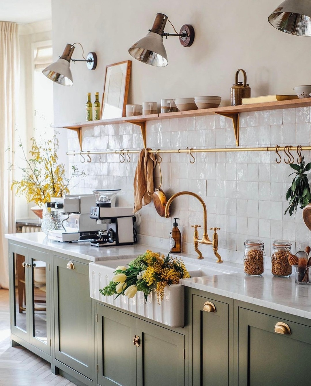
Image by stiltje.se
David’s advice on aligning the items with the kitchen’s overall theme is spot on. The idea of matching copper cookware to copper accents or using fresh herbs in an earthy-themed kitchen not only enhances the aesthetic but also serves a functional purpose.
I agree that keeping items relevant to the kitchen’s design ensures a cohesive and polished look. If you’re looking to style your kitchen shelves, try incorporating frequently used items that match your color scheme—whether it’s earthy tones or metallic accents—to achieve a harmonious and practical display.
Create Balance with Color and Texture
“The most important thing is to create balance. Alternate items on shelves according to color, texture, size, and shape. Don’t go overboard by adding too many things; group items together in bundles of one to two for each shelf, and use some artwork or frames to fill any negative space.
Add decorative storage boxes, wicker baskets, ceramic pots, and vases to use as functional storage, and you’ll be sure to have a beautifully styled shelf!” – Ashley Snyder, Interior Designer, Saltbox Studio
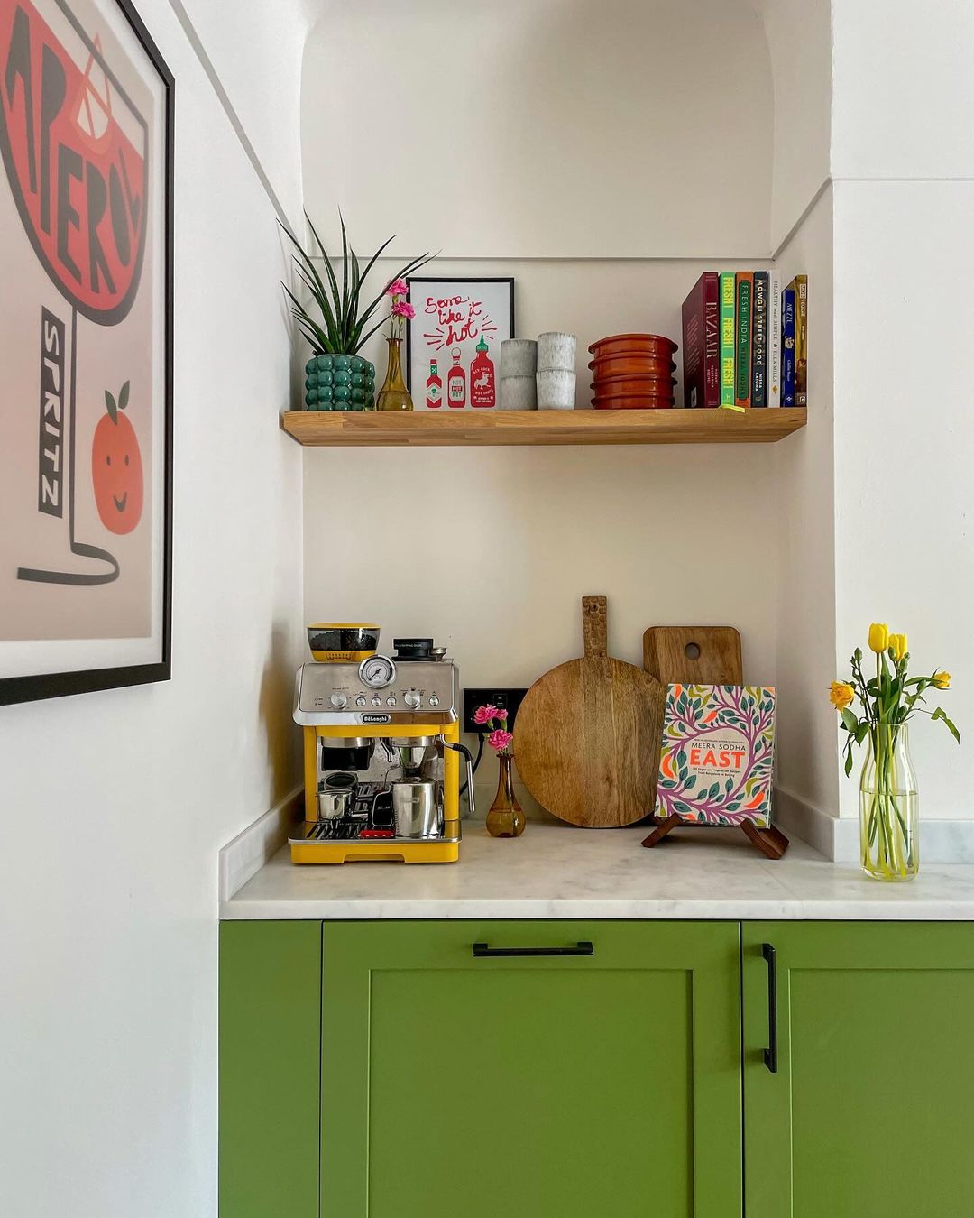
Image by carlaelliman
Ashley’s method of creating balance by alternating color, texture, and shape is a smart way to make floating shelves both functional and visually appealing. Her advice to group items in small bundles and use artwork or frames to fill empty spaces ensures that the shelves don’t look overcrowded.
I love the idea of incorporating decorative storage like wicker baskets and ceramic pots, as these add style while also serving a practical purpose. If you’re trying to style your floating shelves, start by alternating items based on texture and size, and don’t forget to use artwork to break up the space and maintain balance.
Practical Tip for Maximizing Shelf Space
Prioritize functionality without sacrificing style
When styling floating shelves, think about how each item can contribute to both the function and the design. Opt for pieces like decorative storage boxes or baskets that not only look appealing but also serve a practical purpose, such as storing small items that can easily clutter a shelf.
Maximize vertical and horizontal space
Instead of placing too many items on one shelf, consider using varied heights and layers to make the most of your space. Use stackable items or tiered stands to add dimension while keeping the surface uncluttered.
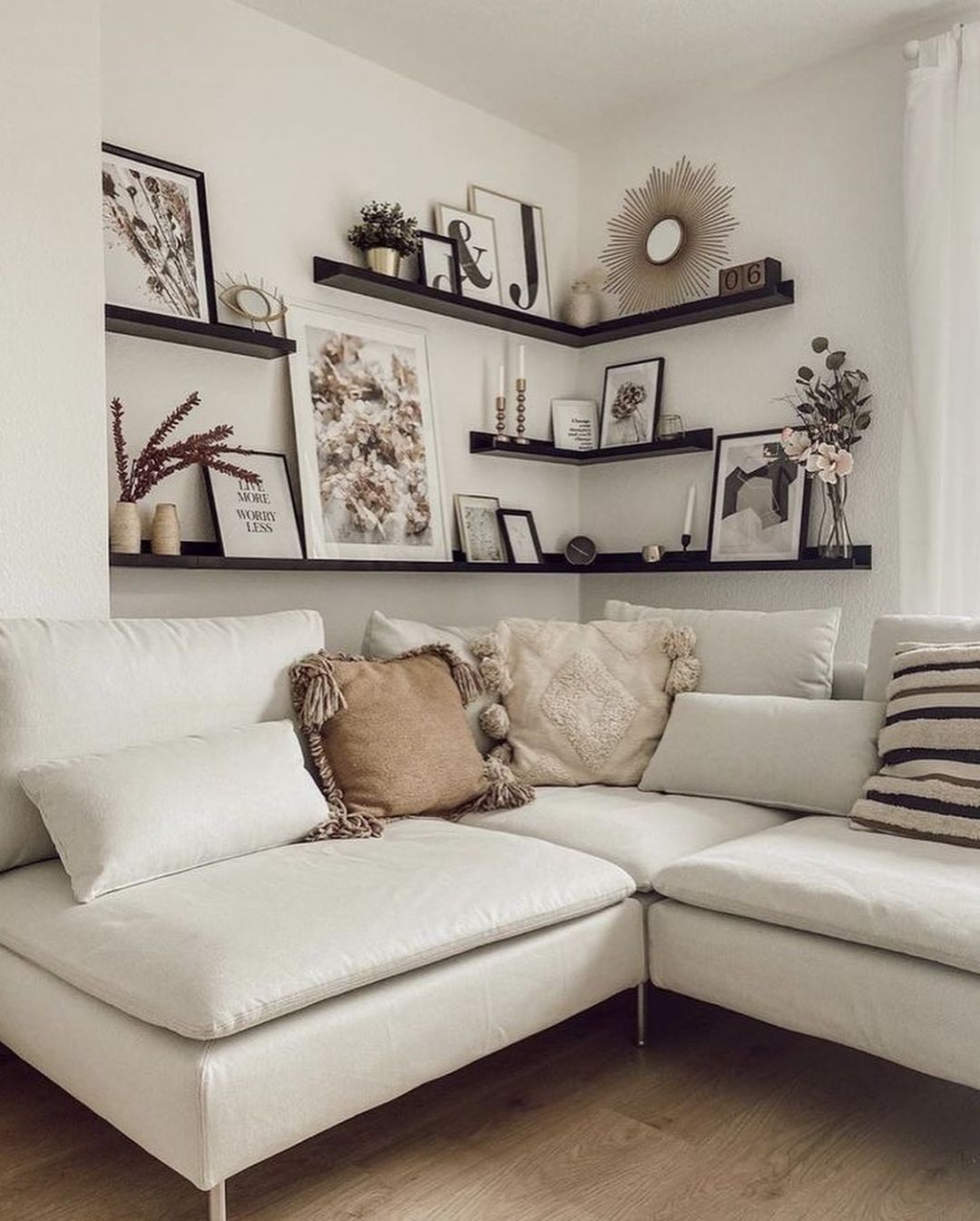
Image by _hello.self
Incorporate hidden storage
Decorative storage containers, like wicker baskets or sleek wooden boxes, are ideal for keeping everyday items like keys, remotes, or mail out of sight. This helps maintain a streamlined and polished appearance without sacrificing functionality.
Focus on intentional organization
Group similar items together or create themed sections on your shelves. This not only helps visually balance the space but also makes it easier to find what you need quickly.
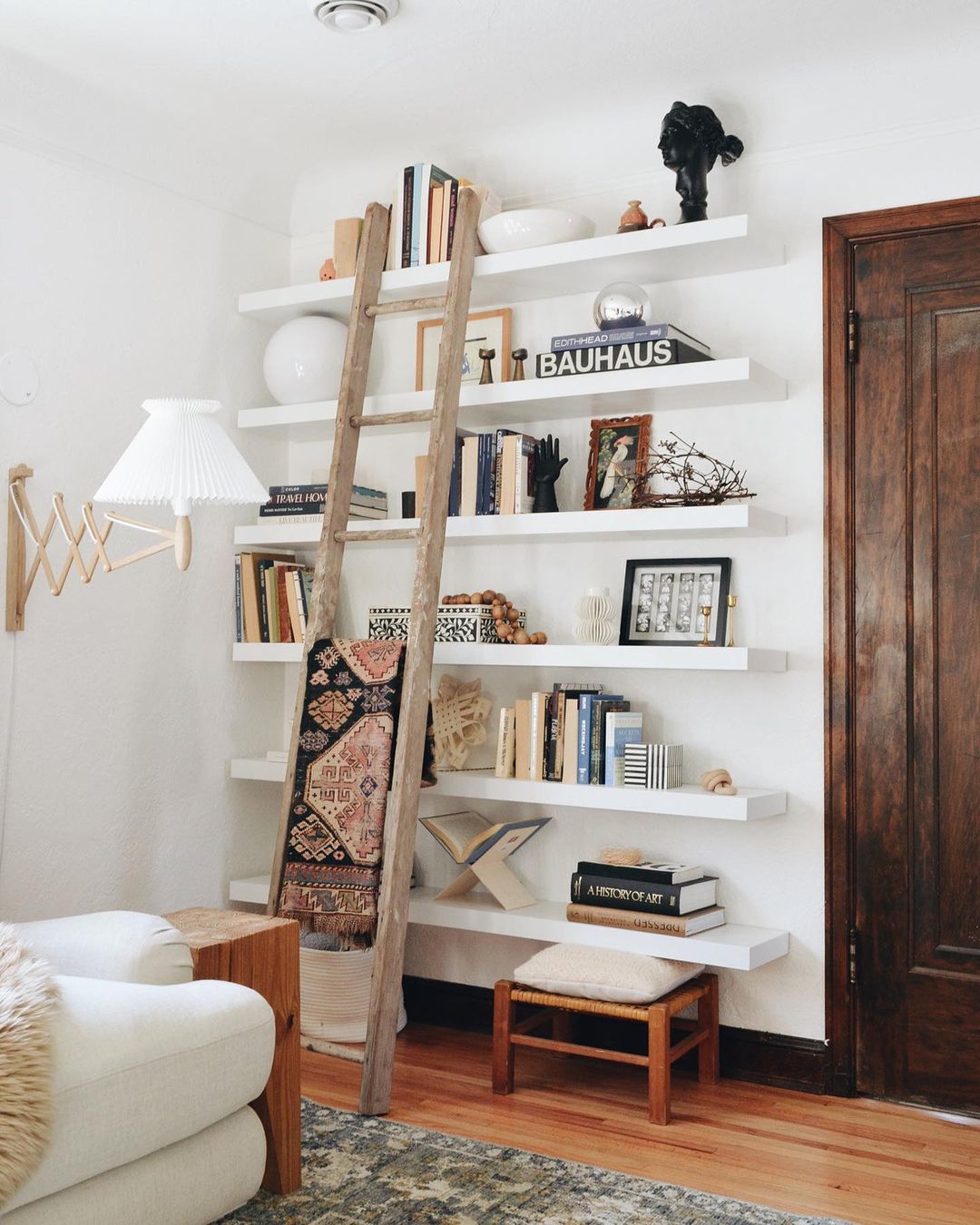
Image by francois_et_moi
Keep a curated, minimalist approach
Avoid overloading shelves with too many items or different themes. Instead, choose a few multifunctional pieces that complement each other in style and purpose, helping the space feel more organized and cohesive.
This approach ensures your floating shelves are both practical and visually appealing, creating a balanced design that adds value to any room.
Common Mistakes to Avoid
Styling floating shelves can be tricky, especially when trying to strike the right balance between beauty and practicality. Many homeowners unknowingly make design choices that lead to cluttered, mismatched, or dysfunctional spaces. Here are some common mistakes to watch out for and how to avoid them to achieve a polished, well-styled look.
Overloading shelves
One of the most common mistakes when styling floating shelves is trying to fit too many items onto them. Overcrowding makes the space look cluttered and can overwhelm the eye. To avoid this, select a few key items and space them out evenly. Leave some negative space to allow the items to breathe and the shelf to feel more open.
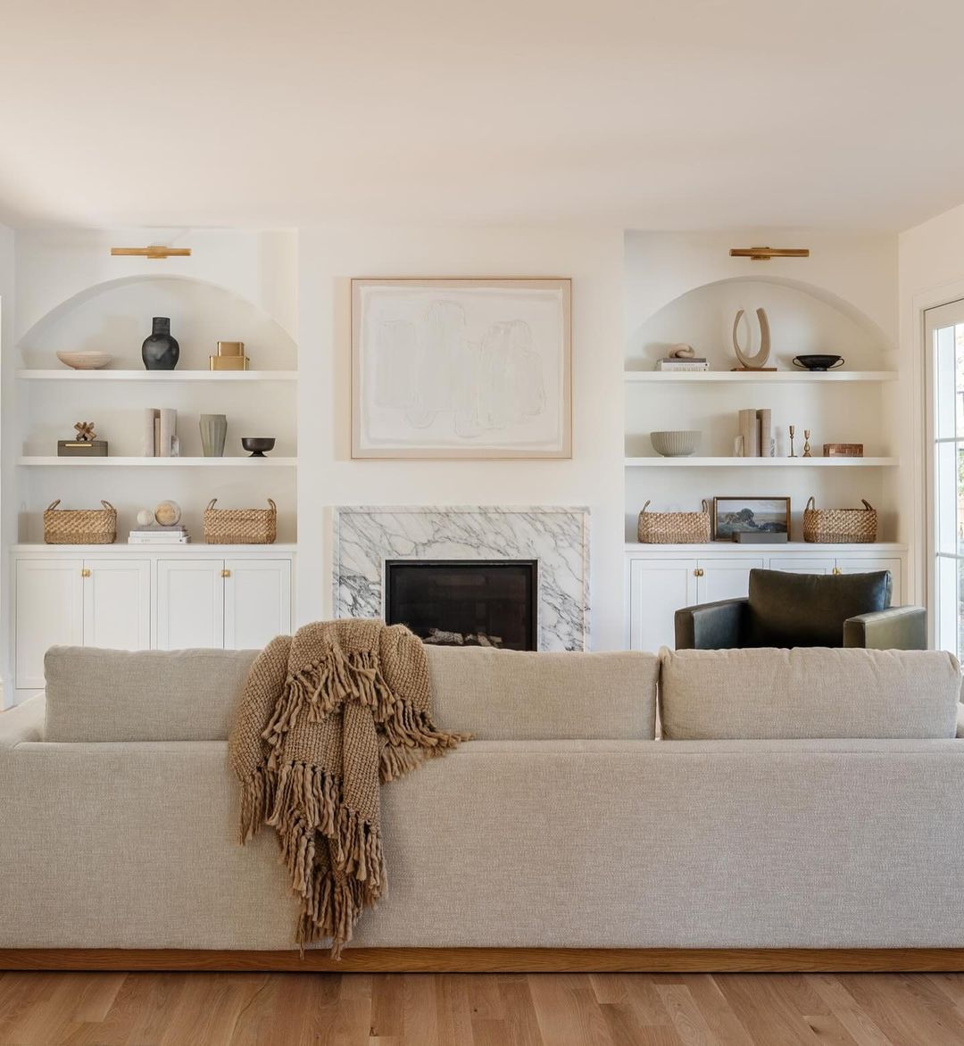
Image by mif_design
Mismatching styles
Mixing too many different design themes or clashing styles can lead to visual chaos. Stick to a cohesive aesthetic that complements the room’s overall design. For example, if your space leans towards modern minimalism, avoid throwing in rustic or overly ornate decor pieces.
Ignoring proportions and balance
Another common error is not paying attention to the size and scale of the items on the shelves. Placing large items next to tiny ones can disrupt the visual flow. Instead, aim for balance by alternating between different sizes and shapes, while ensuring that no single item dominates the space.
Using too many colors
A cluttered color palette can overwhelm the senses. Stick to a few key colors that complement the room’s existing decor, and avoid using too many bold hues at once. Adding pops of color through small accents can work, but try to keep the base neutral for a more cohesive look.
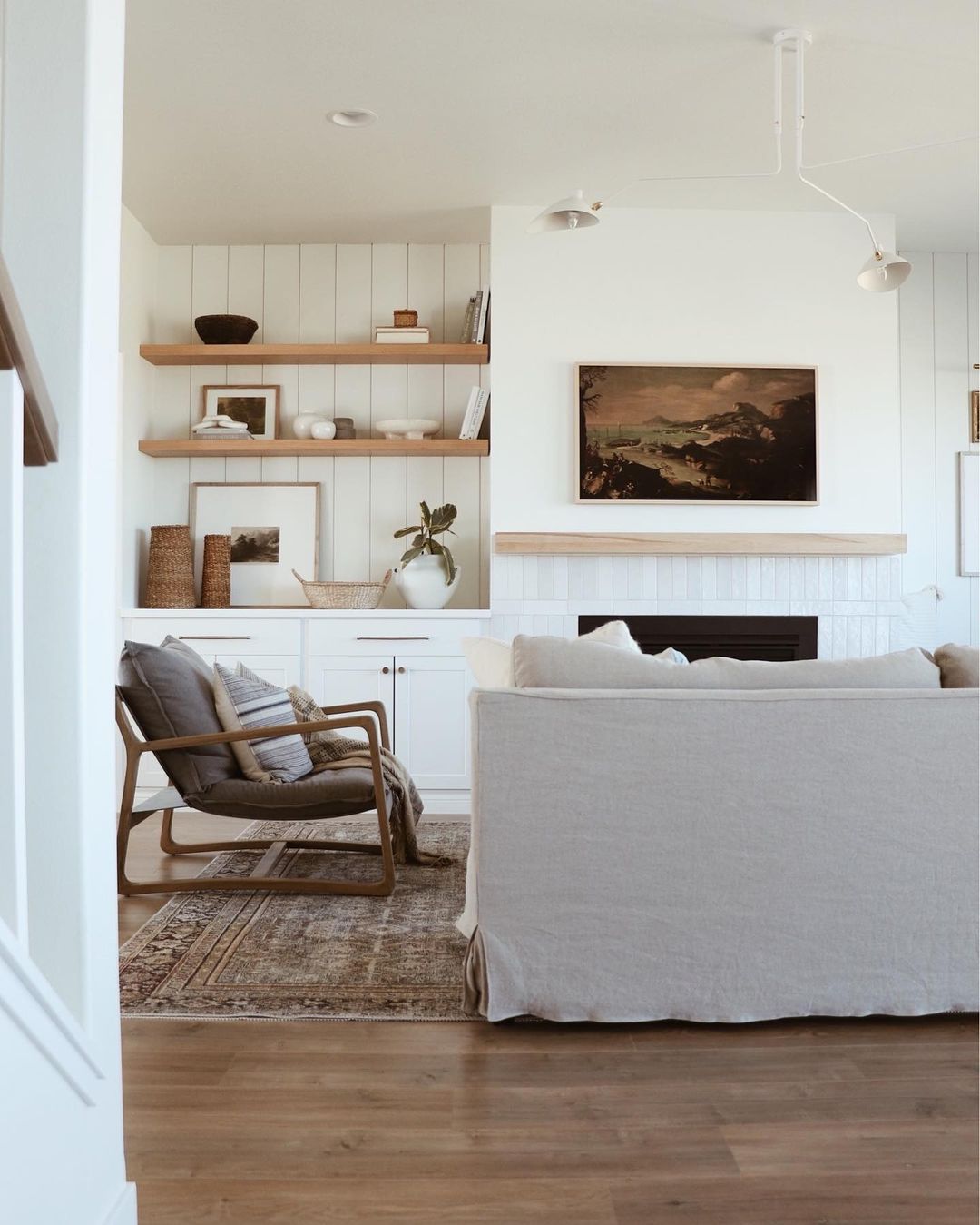 Image by ltk.home
Forgetting functionality
Some people style their shelves purely for aesthetics and forget about functionality. While the decor is important, it’s essential to also consider how you use the shelves in your daily life. Incorporate functional elements like storage boxes or everyday items you use, but in a way that aligns with the overall design.
By avoiding these common mistakes, you can create floating shelves that are both stylish and practical, adding value to your space without clutter or confusion.
