There’s plenty of advice out there on how to design the perfect gallery wall, with tips on measuring every angle and making sure frames line up just right. But when we chatted with designers, their approach was refreshingly laid-back.
As designer Katie Hodges put it, “A gallery wall should feel like an organic extension of the space, not a formula.” Rather than following strict rules, designers love when a gallery wall reflects the homeowner’s personal story—whether through sentimental pieces, unique finds, or art that simply makes you smile. It’s about creating something that feels natural and collected over time.
One popular tip from the experts? Mixing different types of art is great, but keeping a common color theme can help things feel more pulled together. That said, don’t be afraid to go your own way—rules are meant to be broken, and your gallery wall should reflect your style, no matter how unique or colorful it is.
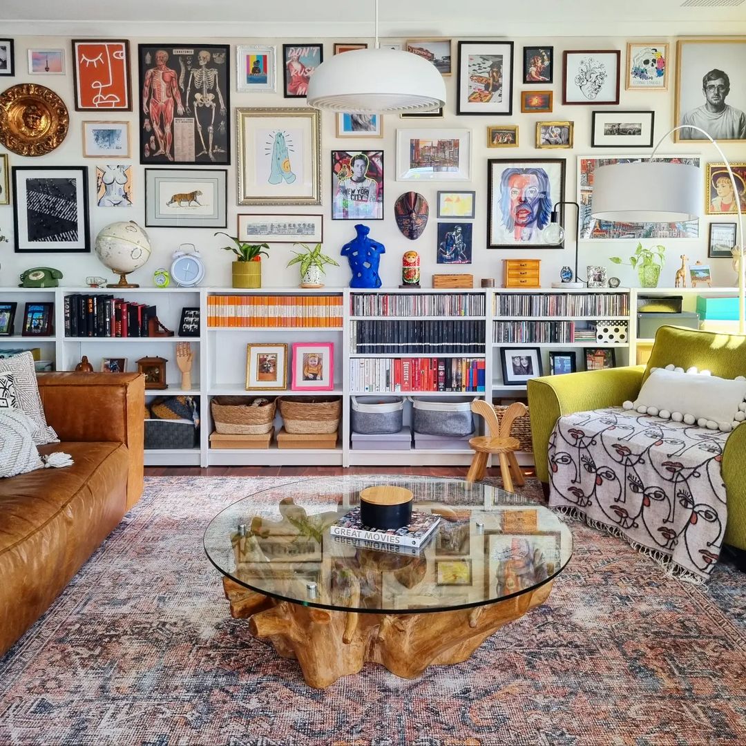 Image by mismatchedhome
What designers notice in gallery walls?
1. Emily Henderson – “A gallery wall layout doesn’t need to be rigid—throw in an oval canvas or even a textile piece to give your eyes a visual break.” She emphasizes the importance of variety to avoid too much structure and to add personality to the wall.
Why she says this: Emily stresses variety in shapes and textures to avoid the strict grid-like feel that many gallery wall ideas fall into. By introducing different elements, such as textiles or sculptural items, she ensures that the wall remains dynamic and visually interesting, encouraging a more organic and natural flow.
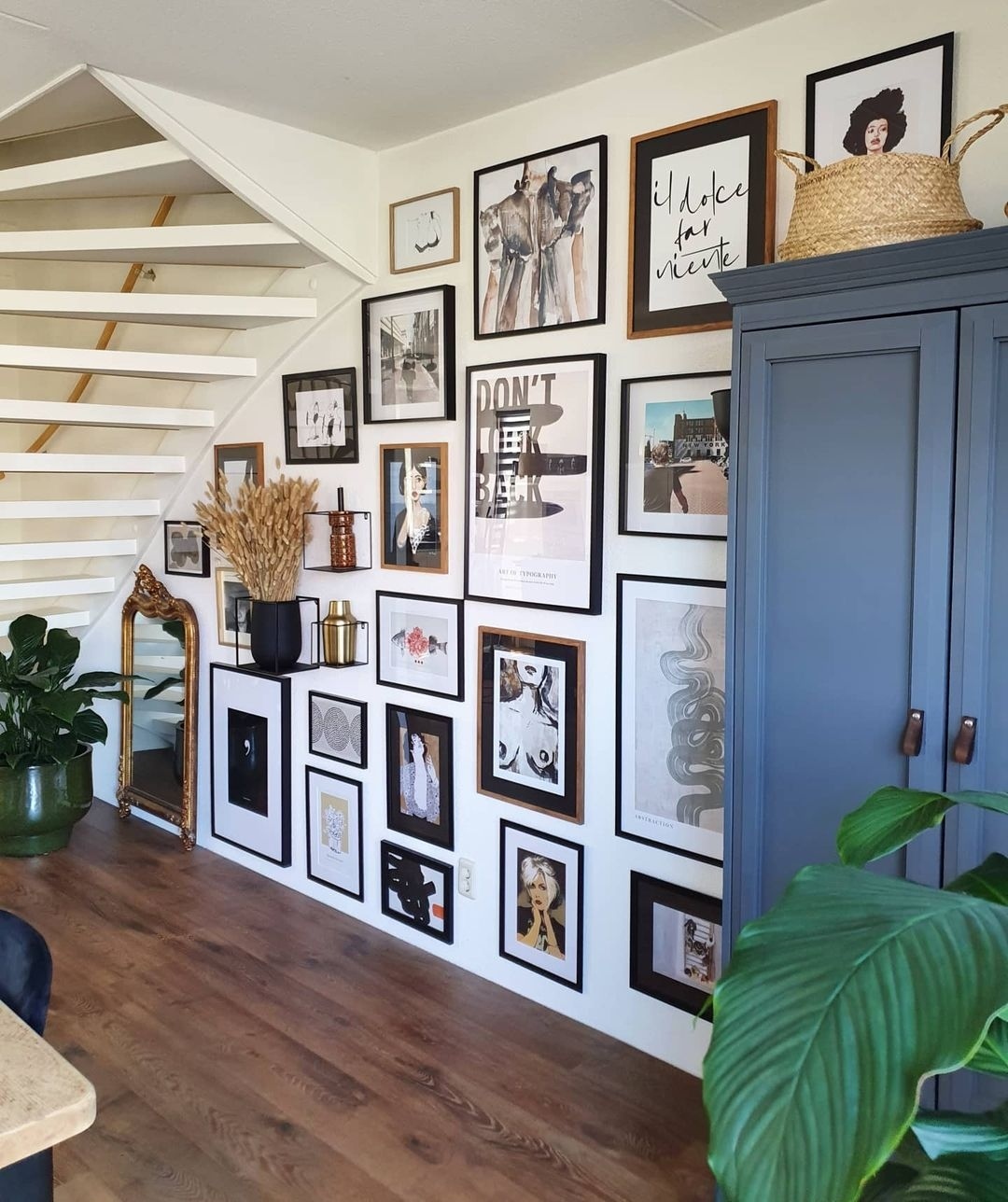 Image by artfullywalls
2. Amber Lewis – “A personal gallery wall should feel like a collection of memories, family photos, layered and curated over time.” She focuses on mixing textures, personal items, and art to bring depth and character to the space.
Why she says this: Amber’s philosophy revolves around making spaces feel lived-in and personal. For her, a gallery wall or art wall should not be something that looks too perfect or curated all at once. It should evolve, just like the story of a home, bringing personal meaning and warmth to the room.
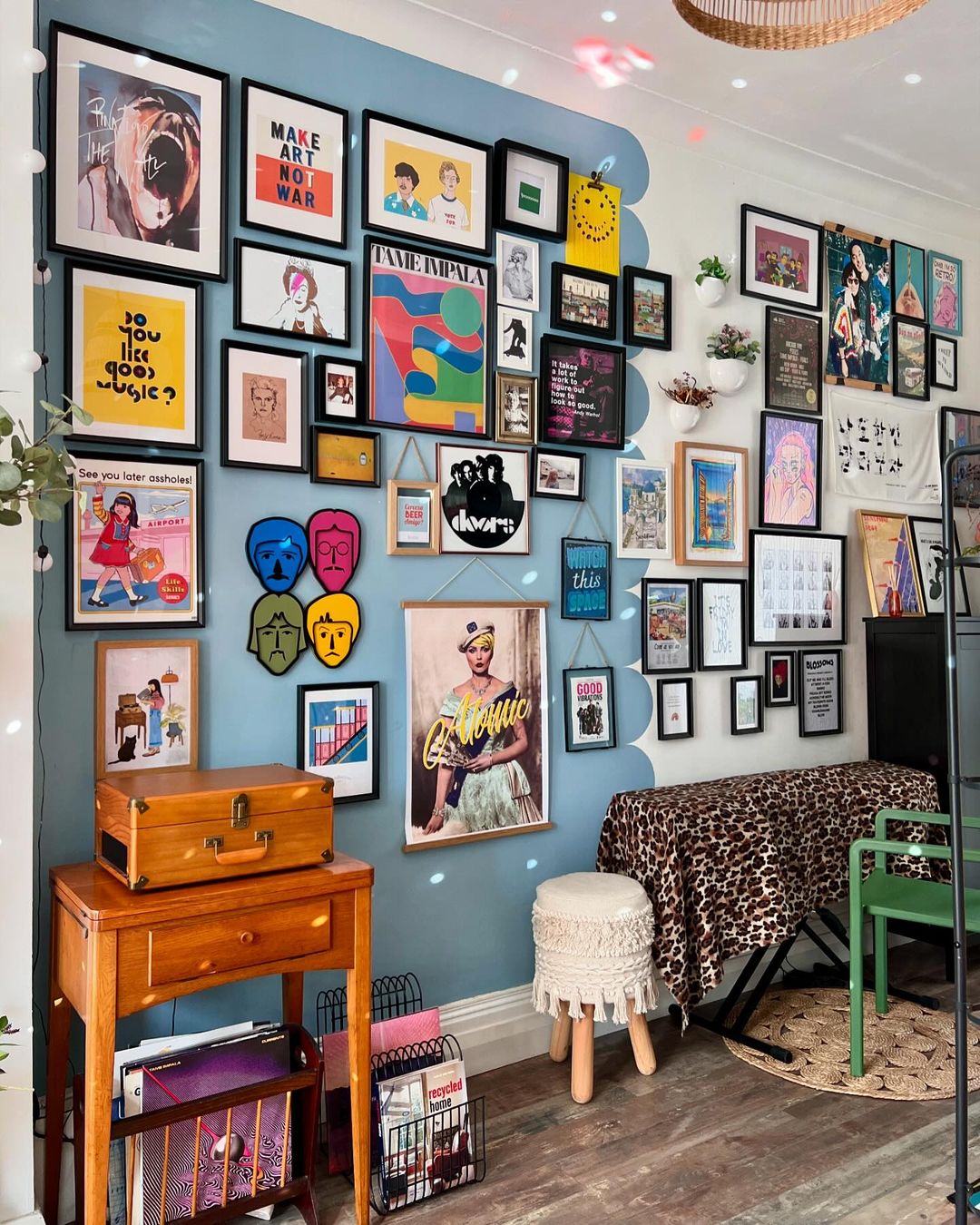 Image by letsby.avenue
Read – 20 More beautiful And Well-Organised Entryway Gallery Wall Ideas
3. Justina Blakeney – “Include everything from mirrors to postcards, and don’t worry about perfection. It’s all about making the space feel uniquely you.” She highlights the importance of incorporating personal touches.
Why she says this: Justina is known for her bohemian, eclectic style, where self-expression is key. She encourages clients to use a picture rail that is mix of items that resonate with their personalities and experiences. Her approach removes the pressure to follow strict rules and allows for spontaneity and joy in decorating.
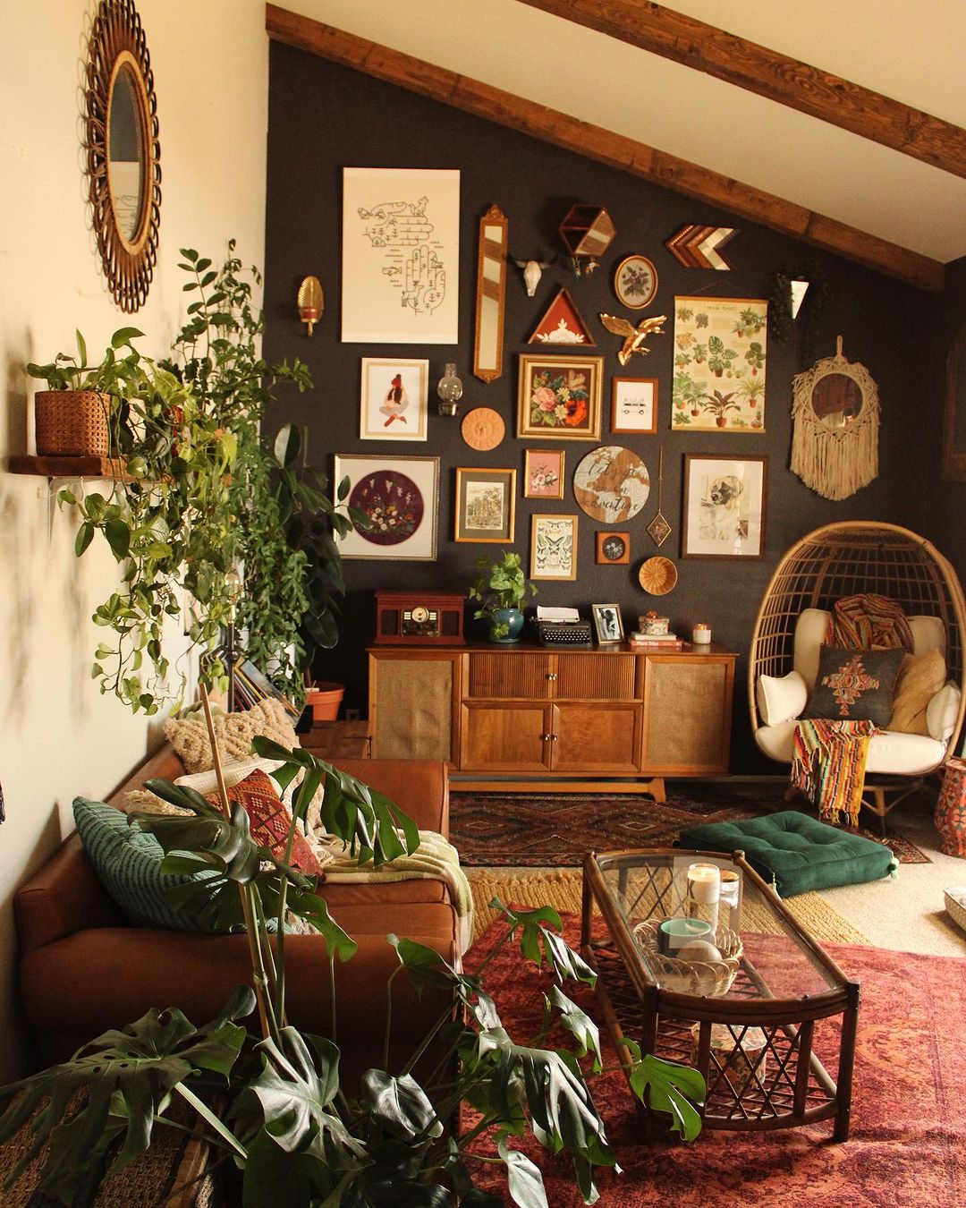 Image by mybohojunglebook
4. Joanna Gaines – “Lay out your art on the floor first to see how everything fits together, and don’t be afraid to mix different shapes, large scale prints, and sizes for visual interest.” She focuses on planning and arrangement to create balance.
Why she says this: Joanna emphasizes the importance of balance and planning, but with room for creative freedom. By laying out the pieces in advance, you can experiment with arrangements before committing, ensuring that the wall looks cohesive without losing the playful variety of sizes and shapes.
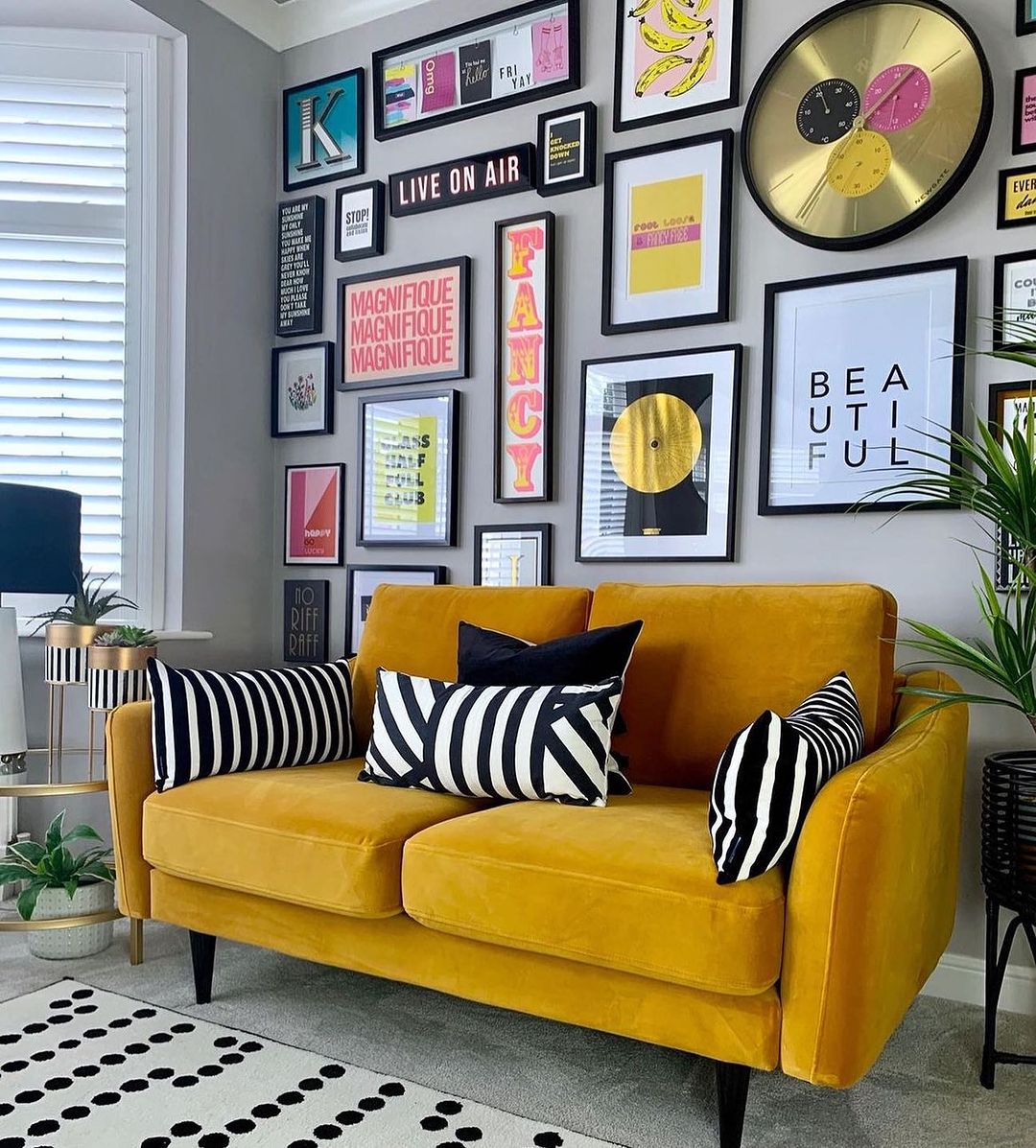 Image by graceemilydesign
5. Nate Berkus, a principal designer – “You can mix all kinds of art, but sticking to a consistent color palette helps tie everything together and keeps the wall from feeling chaotic.” Berkus highlights the importance of cohesion through color.
Why he says this: Nate’s approach combines eclecticism with a sense of unity. While he encourages mixing various styles of art, he understands that too much variety can feel disorganized. Using a consistent color palette gives the wall a cohesive look, preventing visual overload.
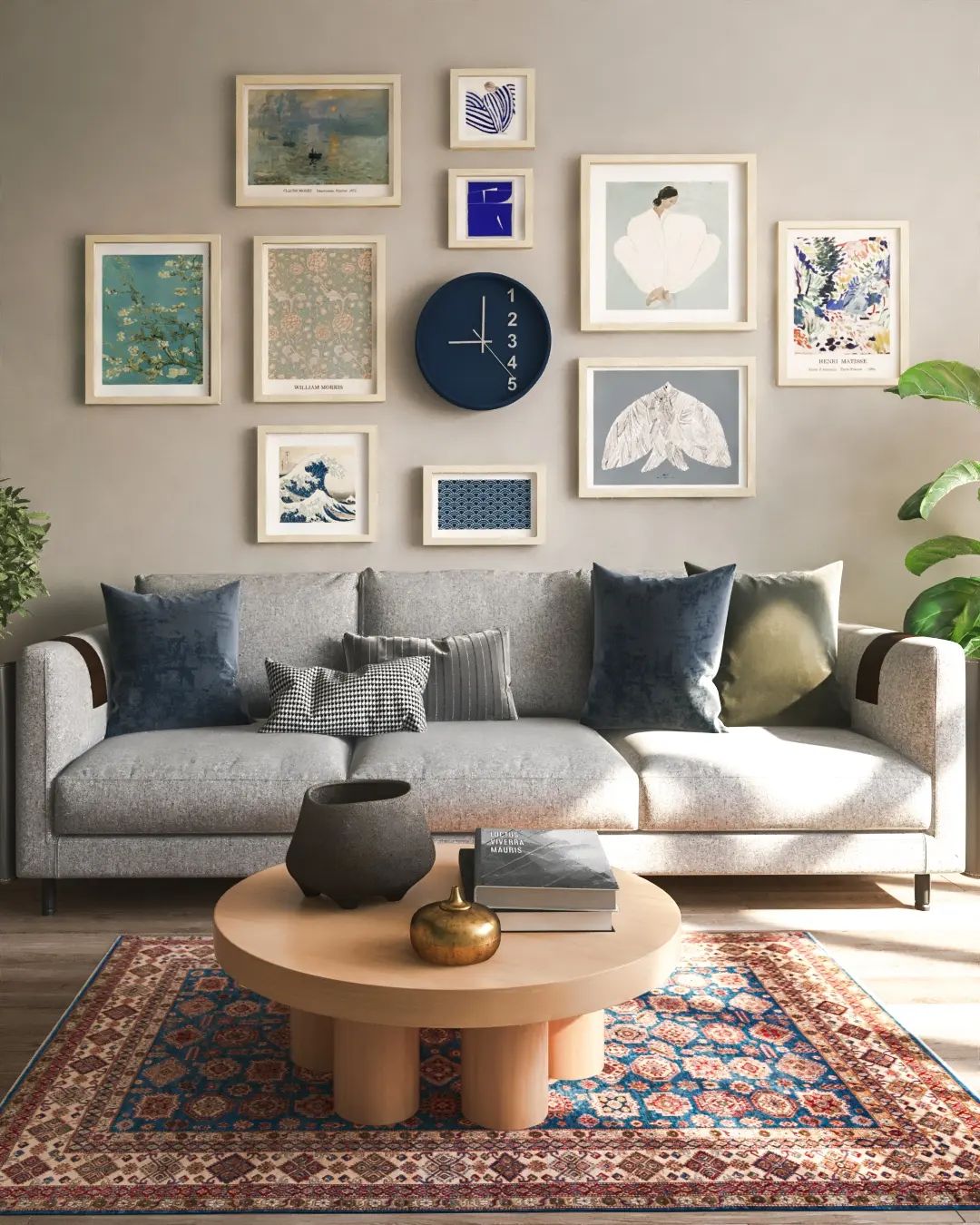 Image by khanehma.gallery
Read – 25 Stylish And Sophisticated Living Room Wall Shelves Decor Ideas
6. Orlando Soria – “A successful gallery wall is never done—keep adding to it as you discover new pieces that speak to you.” His approach is dynamic, encouraging continuous evolution.
Why he says this: Orlando’s philosophy is all about embracing the evolving nature of design. A gallery wall shouldn’t be static; it should grow and change as you find new artwork that reflects your evolving taste and experiences. This keeps the space feeling fresh and personal.
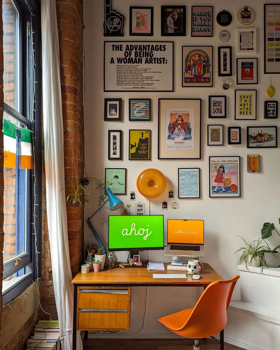 Image by mymanchome
7. Sarah Sherman Samuel – “You want a mix of large and small pieces, so the eye has room to rest between visuals.” Samuel emphasizes balance and the importance of varied proportions.
Why she says this: Sarah values visual balance. By varying the size of the pieces, she ensures that no single element dominates the wall, allowing for a rhythm that guides the viewer’s eye across the display without overwhelming them.
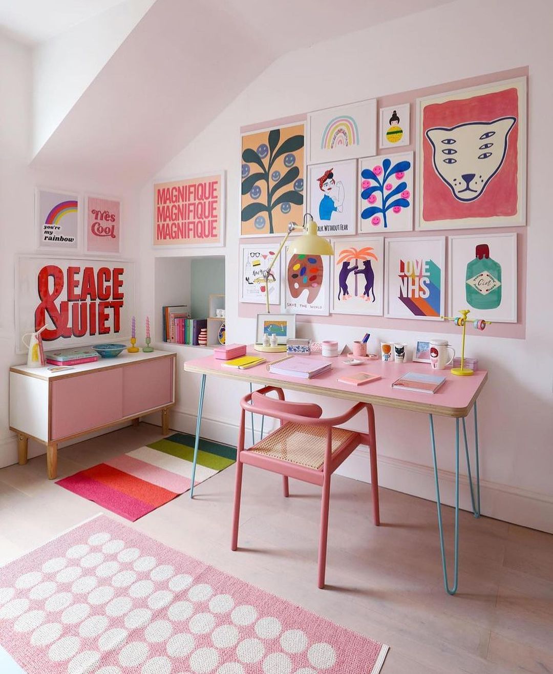 Image by doodle_moo
Read – 25 Dramatic Black Wall Decor Ideas You Will Love
8. Bobby Berk – “Make sure to mix frame finishes to keep it interesting, but stick to a cohesive theme for a polished look.” Berk believes mixing frames adds texture while keeping a unified aesthetic.
Why he says this: Bobby balances variety with cohesion. While he advocates for mixing frame finishes to add texture, he understands the importance of maintaining an underlying theme to ensure that the wall decor doesn’t feel disjointed.
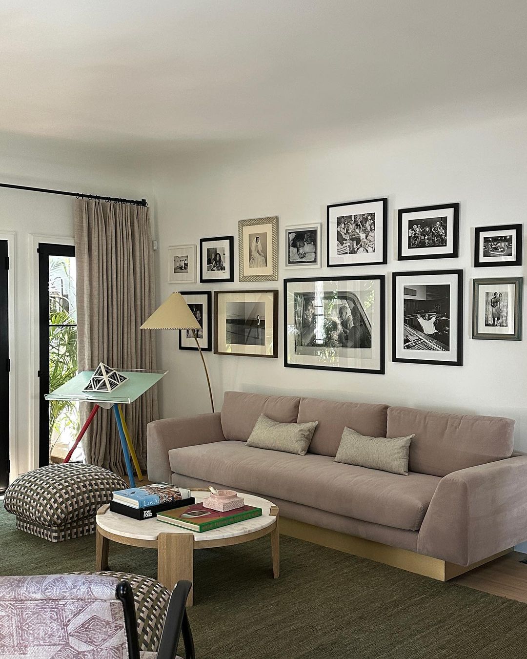 Image by jaquiseerman
9. Genevieve Gorder – “Art is deeply personal, so your gallery wall should tell a story unique to you.” She encourages using sentimental items alongside traditional art to make the space feel personal and alive.
Why she says this: Genevieve believes that design should reflect the homeowner’s personal journey. By incorporating meaningful pieces, the gallery wall becomes more than just decoration—it becomes a visual narrative of the homeowner’s life and experiences.
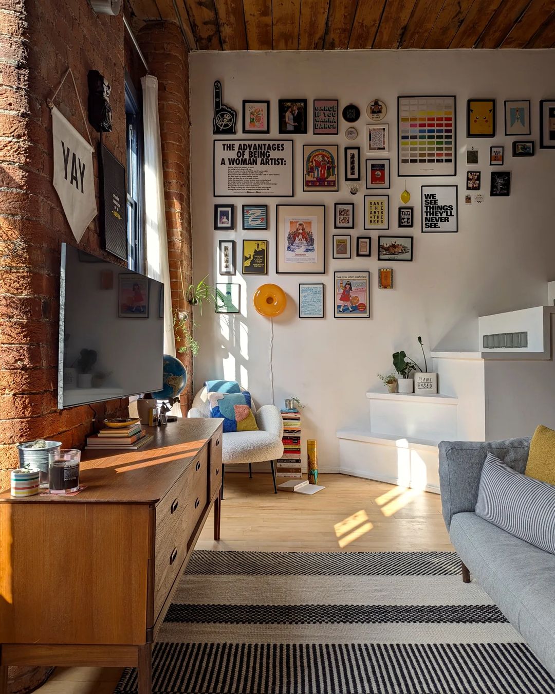 Image by mymanchome
Read – 25 Beautiful And Elegant Tall Wall Decor Ideas You Should See
10. Victoria Smith – “Gallery walls are a way to showcase your eclectic taste, so don’t be afraid to go bold with color and frame styles.” Smith champions boldness and creativity in choosing both art and frames.
Why she says this: Victoria encourages boldness and creativity. She believes that gallery walls are the perfect opportunity to showcase an eclectic mix of styles and colors, allowing homeowners to express their unique tastes without fear of breaking design rules.
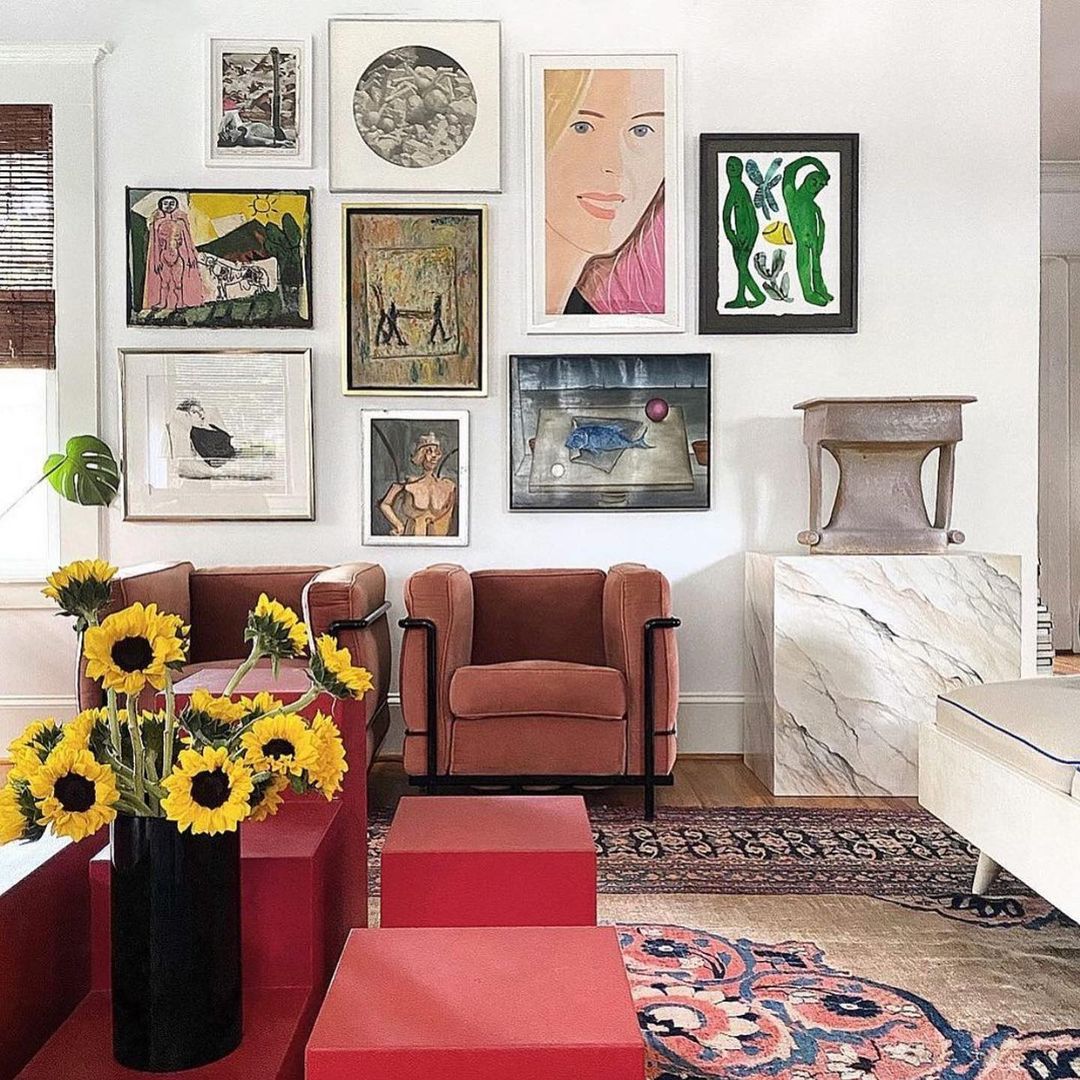 Image by thecontemporarycreatives
