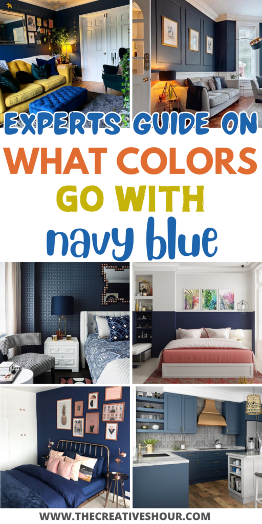
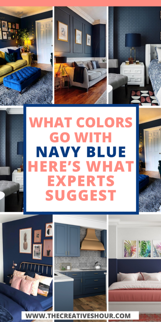
Navy blue is a color that can instantly add depth and elegance to any room. It’s classic, timeless, and surprisingly versatile. While most people pair it with familiar shades like white or grey, designers have been exploring some unexpected combinations—and they really work.
Imagine walking into a living room where navy is paired with blush pink or warm earth tones. It’s a surprising choice, but somehow it creates a beautiful balance between boldness and softness. These combinations are proof that stepping outside the box can lead to stunning results.
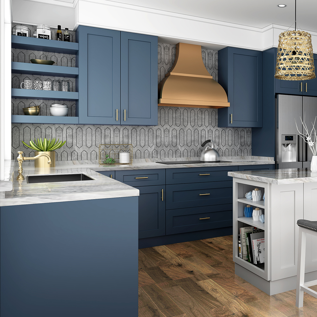
Image by rtacabinetstore
Personally, I used to think certain colors just didn’t belong together—like navy and pink. But after hearing from designers who’ve made it work, I’ve changed my mind. The creativity behind these pairings is inspiring, and it shows just how much potential navy blue has when mixed with the right colors.
In this article, a few expert designers share their favorite unexpected color combinations with navy blue. Their real-world examples show just how versatile and striking this shade can be. Let’s take a look!
1. Navy and Light Pink Elegance
Pairing navy blue with light pink might sound unusual at first—almost like stepping into a cotton candy dream. That’s exactly what David Silva, Interior Designer at HomRem LLC, thought when his client suggested the combination. But as he soon discovered, these two colors can create a beautiful balance of sophistication and playfulness.
David explains:
“I had a client who pitched this color combination to me, and initially, I thought it would be cartoonish, to say the least. It sounded like living in blue-raspberry cotton candy. But I’m usually not one to dismiss an idea without at least trying, and sure enough, we made it work beautifully.
The final color palette ended up being navy blue, light pink, light grey, and some gold accents. The navy blue and gold brought a lot of elegance to the space, and the light grey added some neutral balance to prevent an imposing presence from such dark and bold colors. The light pink brought a playful energy to a space you would never expect it to.
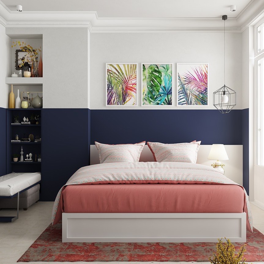
Image by designcafe.dc
The result was a space that perfectly balanced sophistication with youthfulness. Like a king or queen who attends daily galas but still makes time to play with their daughters in the morning. – David Silva, Interior Designer, HomRem LLC“
In this project, navy blue was combined with light pink, light grey, and gold accents. The navy brought elegance, the light pink added a playful energy, and the gold gave the room a touch of luxury. The final result was a space that felt both refined and fun—perfect for anyone who loves a balance between sophistication and youthfulness.
Sometimes, trying an unexpected color pairing like this can create something truly special. Navy and pink might seem like an odd match, but when done right, they can completely transform a space.
2. Blush Pink Complements Navy
Navy blue is strong and classic, but when you pair it with blush pink, something magical happens. JD Lloyd, Business Development Manager at Bella Virtual Staging, discovered that the softness of blush pink can balance navy’s depth, creating a mix of elegance and warmth.
JD explains:
“A color combination we’ve found surprisingly effective with navy blue is blush pink. It’s an unexpected pairing, but it works because of how the softness of the blush complements the depth of the navy. Navy is strong, grounding, and classic, while blush pink offers a subtle, feminine touch that brings warmth and elegance to the space.
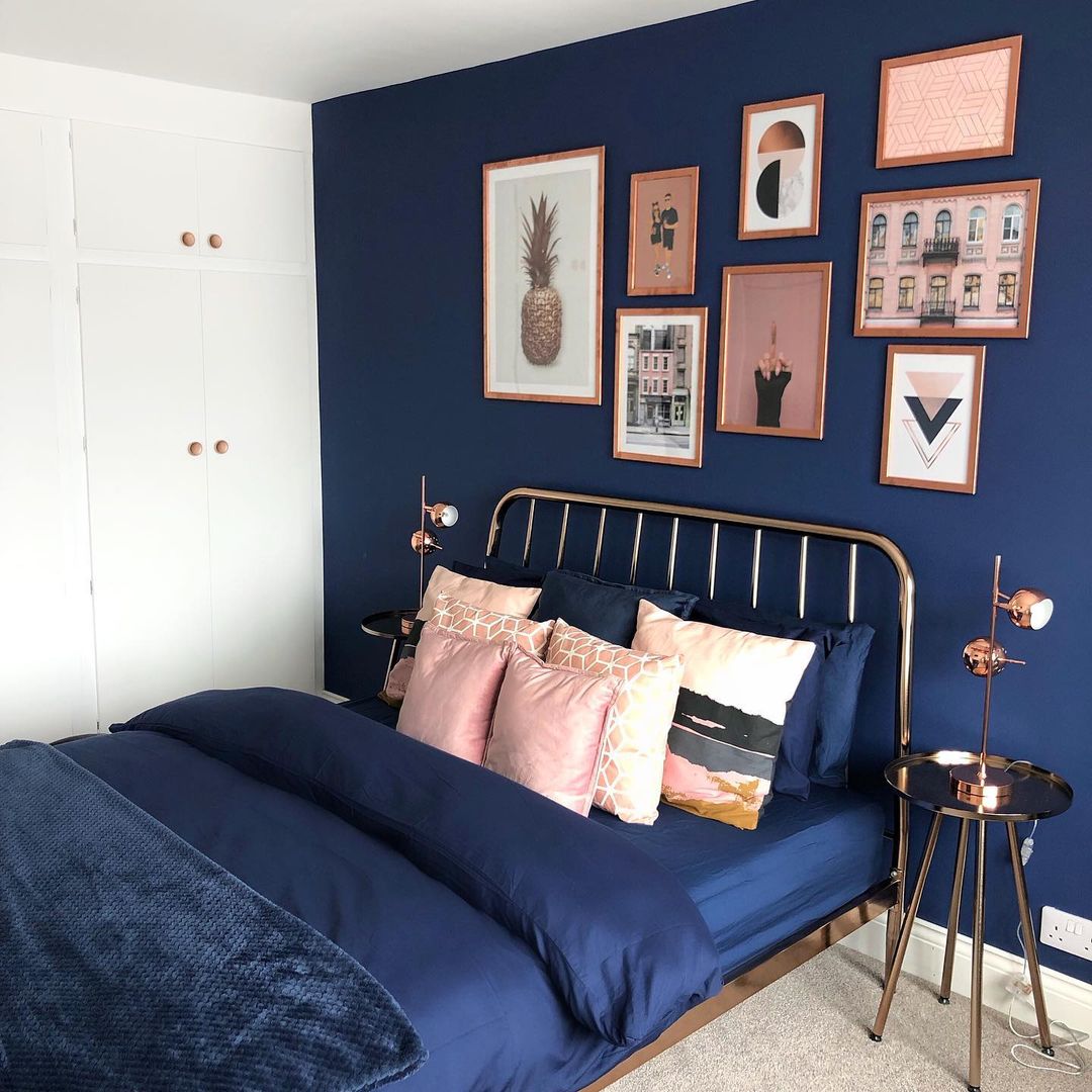
Image by sevenpalmtreehouse
We recently staged a living room where the walls were painted a deep navy, and we incorporated blush tones through a rug, throw pillows, and an ottoman. The contrast between the dark navy and the delicate blush made the room feel both sophisticated and approachable. It was one of those pairings that people didn’t expect, but once they saw it, they couldn’t stop commenting on how beautiful and balanced it looked. – JD Lloyd, Business Development Manager and Project Manager, Bella Virtual Staging”
In a recent project, JD’s team transformed a living room with navy walls and blush accents like a rug and pillows. The result? A space that felt both stylish and cozy, blending sophistication with an inviting feel. Navy gave the room structure, while blush softened the look, making it approachable yet elegant—proof that sometimes, the most unexpected combinations create the best results.
3. Classic Navy and White Sheers
Navy blue and white is a pairing that just never goes out of style. It’s like a tailored suit—crisp, clean, and always elegant. Charles Chakkalo, Owner of Joey’z Shopping, knows how powerful this duo can be, especially when you throw in the softness of white sheers. The combination adds both depth and lightness, creating a beautifully balanced room that feels sophisticated yet inviting.
Charles explains:
“When it comes to navy blue, the classic pairing with crisp white sheers is a timeless choice. It’s the design equivalent of a perfectly tailored suit—elegant, sophisticated, and always in style.
Navy blue walls create a sense of depth and intimacy, while white sheers soften the edges and allow natural light to flood the space. It’s a beautiful balance of warmth and coolness, creating a serene and inviting atmosphere.
We recently used this combination in a client’s bedroom. Navy walls provided a luxurious backdrop, while sheer white curtains added a touch of ethereal beauty. The result was a calming retreat, perfect for relaxation and restful sleep.
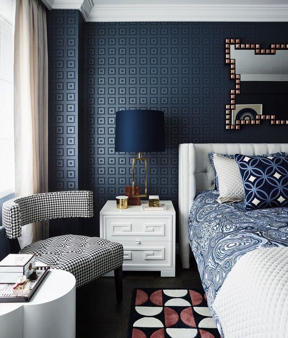
Image by averyfrankdesigns
This classic pairing works because it plays on contrasts. The deep, rich navy provides a grounding element, while the airy white sheers add lightness and openness. It’s a versatile combination that can be adapted to various styles, from traditional to contemporary.
By layering textures and incorporating subtle patterns or pops of color, you can personalize this classic duo and create a space that’s uniquely yours. And remember, the sheer white curtains play a starring role, allowing natural light to filter through while maintaining a sense of privacy and elegance. It’s a simple yet effective way to transform any room into a haven of tranquility and style.” – Charles Chakkalo, Owner, Joey’z Shopping
Why does this combination work so well? Navy brings depth, grounding the room, while white sheers add light and a touch of softness. It’s the contrast that makes it special—richness on one hand, and openness on the other. It’s a pairing that never fails to impress, whether you’re going for a modern look or something more classic.
4. Navy with Warm Earth Tones
When you think of navy blue, you might picture cool, classic spaces. But pair it with warm earth tones like ochres and terracottas, and you get a whole new vibe—cozy, inviting, and full of depth. Elise Szeszycki, Interior Designer at Parlor Interiors, has mastered this combination, showing how navy can ground a room while earthy shades add warmth and texture.
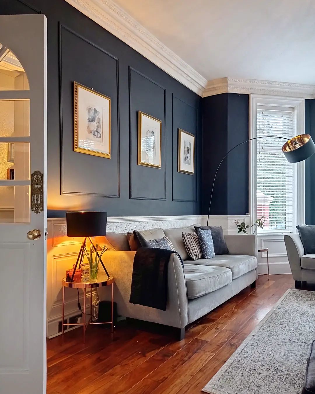
Image by victorianhouse1896
Elise shares her experience:
“One of our most recent projects paired navy blue with a combination of blacks, ochres, and terracottas to create an elevated yet comfortable living room. In “World Traveler,” we had a custom sectional with a breakfast banquette along the back upholstered in Lee Jofa’s “Relic” fabric in the color Chestnut. We accented this with pillows made in Dedar’s “Patchwork” fabric in Marine and Chataigne, along with a variety of fabrics with motifs that pulled colors from these families.
The navy and black tones grounded the composition with depth, allowing the terracotta and ochre tones to tell a story. The end result was a sophisticated color palette with a balance of cozy textures and playful patterns.” – Elise Szeszycki, Interior Designer, Parlor Interiors
This combination works because it brings balance. Navy anchors the space, while warm tones like terracotta and ochre add a natural, welcoming touch. It’s a great choice if you’re looking to make a room feel both polished and comfortable—proof that opposites can attract in the best possible way!
5. Navy as a Versatile Neutral
Navy blue may seem bold, but it’s surprisingly versatile when used as a neutral base. Whether you’re working with rust, mustard, or even greige, navy has the unique ability to tie a room together without overpowering the space. Katie Ensminger from the Interior Design Team at Farinelli Design Studio knows just how flexible navy can be, working it into a variety of palettes to create cohesive, balanced designs.
Katie shares her insight:
“Due to its versatility as a grounding neutral in any space, navy is able to span far beyond the classic combination of blue and white that many people associate with the color. Navy lends depth and focus to a space, without overpowering a palette, allowing it to work as a neutral with a wide array of colors. We love a muted navy paired with warm tones—greiges, accents of rust, coral, or mustard, or earthy greens. When used in combination with natural wood tones and warm metal finishes, navy can help bring cohesion to just about any space.” – Katie Ensminger, Interior Design Team, Farinelli Design Studio
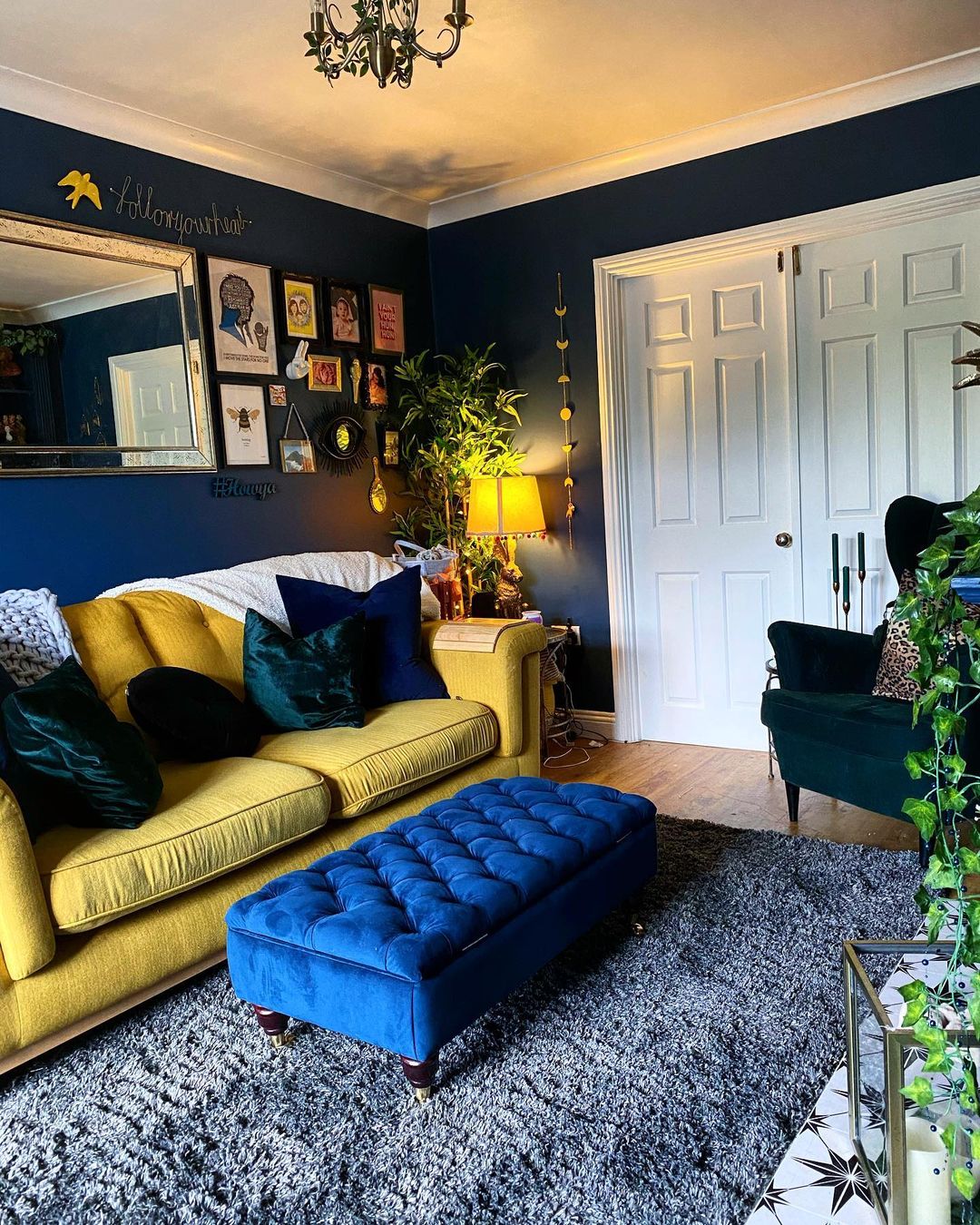
Image by sprucingupthegaff
What makes navy such a great neutral? It’s deep enough to add dimension but flexible enough to pair well with everything from earthy tones to bright pops of color. It’s the kind of color that can ground a space while letting other elements shine, making it a fantastic choice if you want a room that feels both dynamic and pulled together. So next time you’re considering neutrals, don’t overlook navy—it might just surprise you!
Conclusion
Navy blue is more than just a bold, classic color—it’s a versatile foundation that can work with a surprising range of shades. Whether it’s paired with soft blush pink, earthy terracotta, or crisp white sheers, navy proves that it’s capable of anchoring almost any design while bringing depth and elegance to a room.
It’s easy to stick with the tried-and-true combinations, but why not take a risk? As these expert designers have shown, unexpected pairings with navy can completely transform a space, making it feel fresh and unique. From soft pastels to warm earth tones, navy invites creativity and balance in ways that other colors just can’t.
In my own home, I’ve experimented with pairing navy with some colors I thought would never work together. To my surprise, it always manages to pull everything together, no matter how bold or subtle the combination is. So, the next time you’re redecorating, don’t be afraid to mix things up. Who knows—your perfect pairing might be just a little outside the box, waiting to bring your living space to life!