
Choosing the right color for your living room can often be quite overwhelming, considering the never-ending tussle between picking something timeless or chasing the latest trend. We hear you.
Here’s what two top designers say about a living room color scheme that always works. They share the exact colors, what made it work, and tips to help you do the same.
But before we dive in, let’s take a moment to understand why choosing the right color palette for your living room matters so much.
Why Choosing the Correct Color Palette for Your Living Room Is So Important
Your living room is more than just a space—it’s the heart of your home. It’s where you unwind after a long day, entertain guests, share conversations, and create memories. And at the center of it all is your color palette. The colors you choose have a powerful influence on how the room feels, functions, and reflects your personality.
1. Embrace Soft Lavender and Neutral Tones

Image by briahammelinteriors
“In a recent project with an older Victorian-style home, I chose a soothing palette of soft lavender, paired with cream and light gray. This combination created a sense of tranquility while respecting the home’s vintage character. The lavender served as the core color, appearing in accent pieces, while creams and grays provided a neutral base for larger elements like walls and furniture.
A major challenge was maintaining cohesion while respecting the intricacies of the ornate architecture. We addressed this by using lavender sparingly, focusing on textiles and accessories, and letting the neutral tones of gray and cream balance the space. Key to the cohesion was incorporating varying textures—plush rugs, matte finishes, and smooth fabrics—to ensure the room felt layered yet serene.
For others aiming for a cohesive color scheme, identify one color that naturally complements the architectural style and local climate, and build around it using neutrals to ground the space. Emphasize texture and consider scale, keeping the main color in smaller doses to avoid overwhelming the room.” – Kristin Hintlian, Owner, Bonsai Kithcen, Bath & Flooring
2. Balance Deep Navy with Light Neutrals
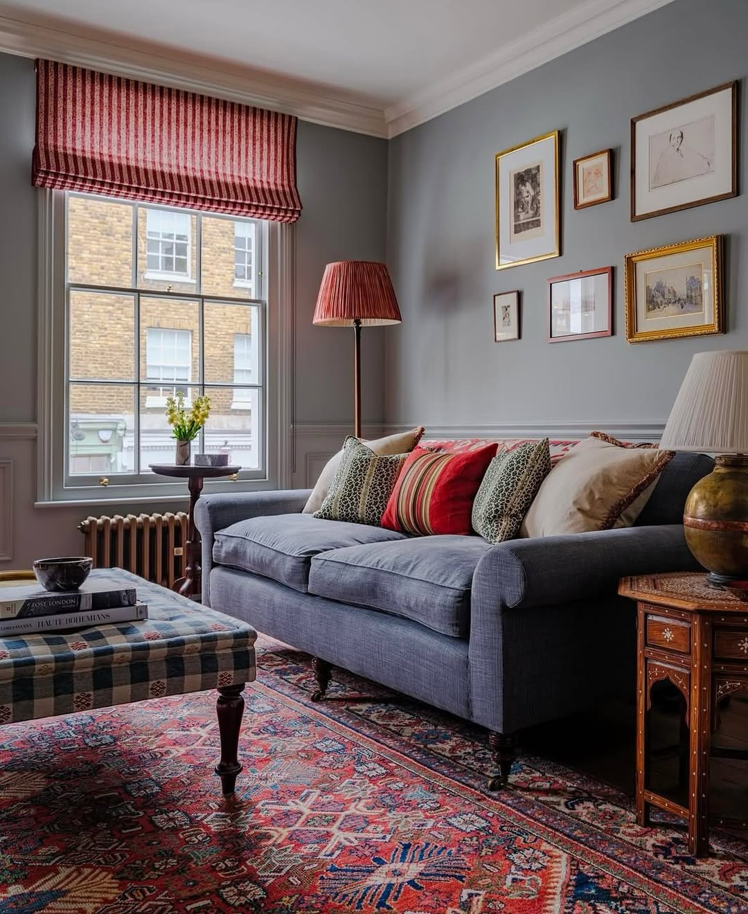
Image by theexpert
“One of the most foolproof living room schemes I’ve worked on was a deep navy, warm caramel, and soft cream palette. It worked because it balanced richness with lightness–navy for depth, caramel for warmth, and cream to keep things from feeling too heavy.
The biggest challenge was making sure the navy didn’t overpower the room. We used it on the couch, but kept the walls and larger furniture in neutral tones. A caramel velvet armchair and gold-accented pillows pulled everything together without feeling forced. The trick with darker colors is knowing when to pull back. If everything is bold, nothing stands out. My advice? Pick one deep tone as the anchor, then layer in lighter neutrals and one or two warm accents. That keeps the room feeling inviting instead of overwhelming.” – Jay Soni, Founder and Director of Sales and Marketing, Yorkshire Fabric Shop
Other Color Schemes You Might Like
1. Muted Tones with Cozy Pops
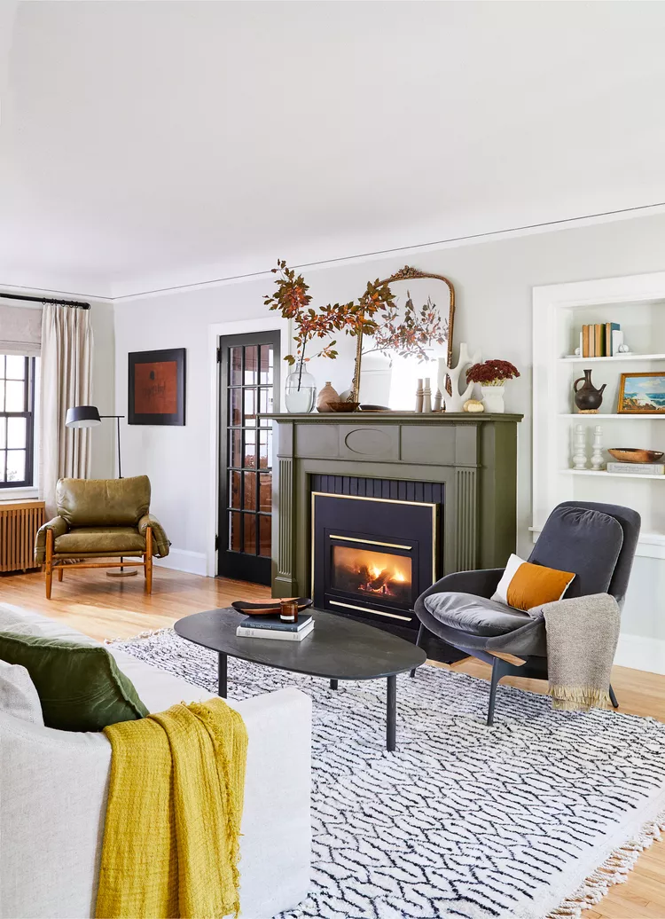
Image by BetterHomesAndGardens
A soft base of whites and grays gets a cozy lift from olive green, mustard, and charcoal accents—perfect for a warm, layered color story. The muted green fireplace is the unexpected hero, anchoring the whole palette with quiet confidence.
2. Warm Neutrals with Rich Accents

Image by serenaandlily
This space embraces a soft neutral foundation layered with burnt orange, deep indigo, and natural wood for a perfectly grounded yet vibrant combo. It’s a lesson in balance—warm, cozy, and just a little bit boho without trying too hard.
3. Bold Blues with Earthy Warmth
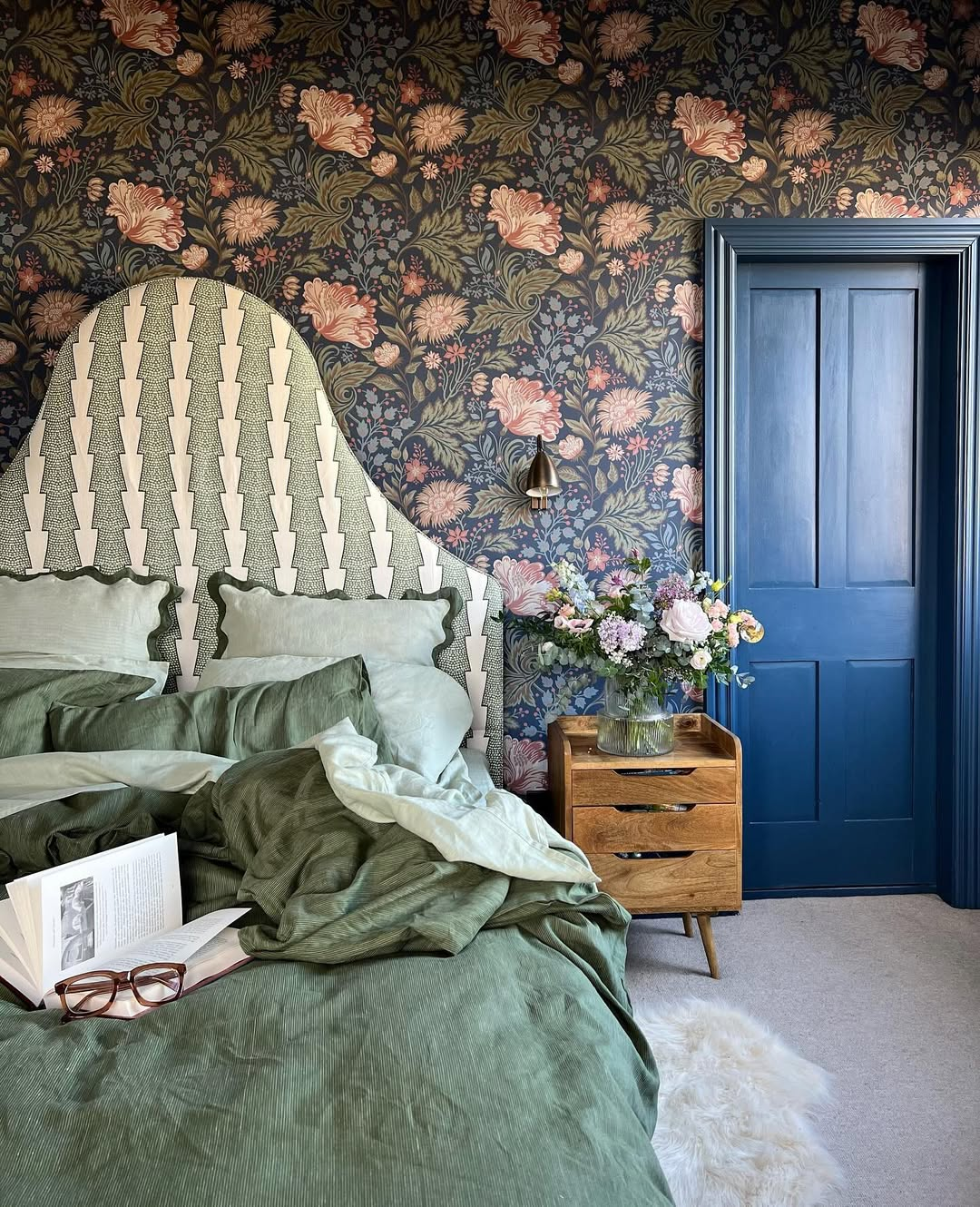
Image by the_idle_hands
Deep navy walls paired with rich indigo and burgundy upholstery create a moody yet cozy palette that feels both dramatic and grounded. Pops of crisp white in the ceiling trim and side tables offer just the right amount of contrast to keep things balanced.
4. Earthy Neutrals with Global Flair
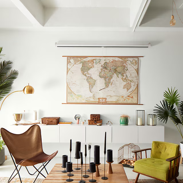
Image by BenjaminMoore
Earthy tones like olive green, cognac leather, and warm wood pop beautifully against the soft white backdrop, creating a fresh, travel-inspired vibe. The palette feels collected and calm—like a cozy passport to every corner of the globe.
5. Coral and Cream with a Twist
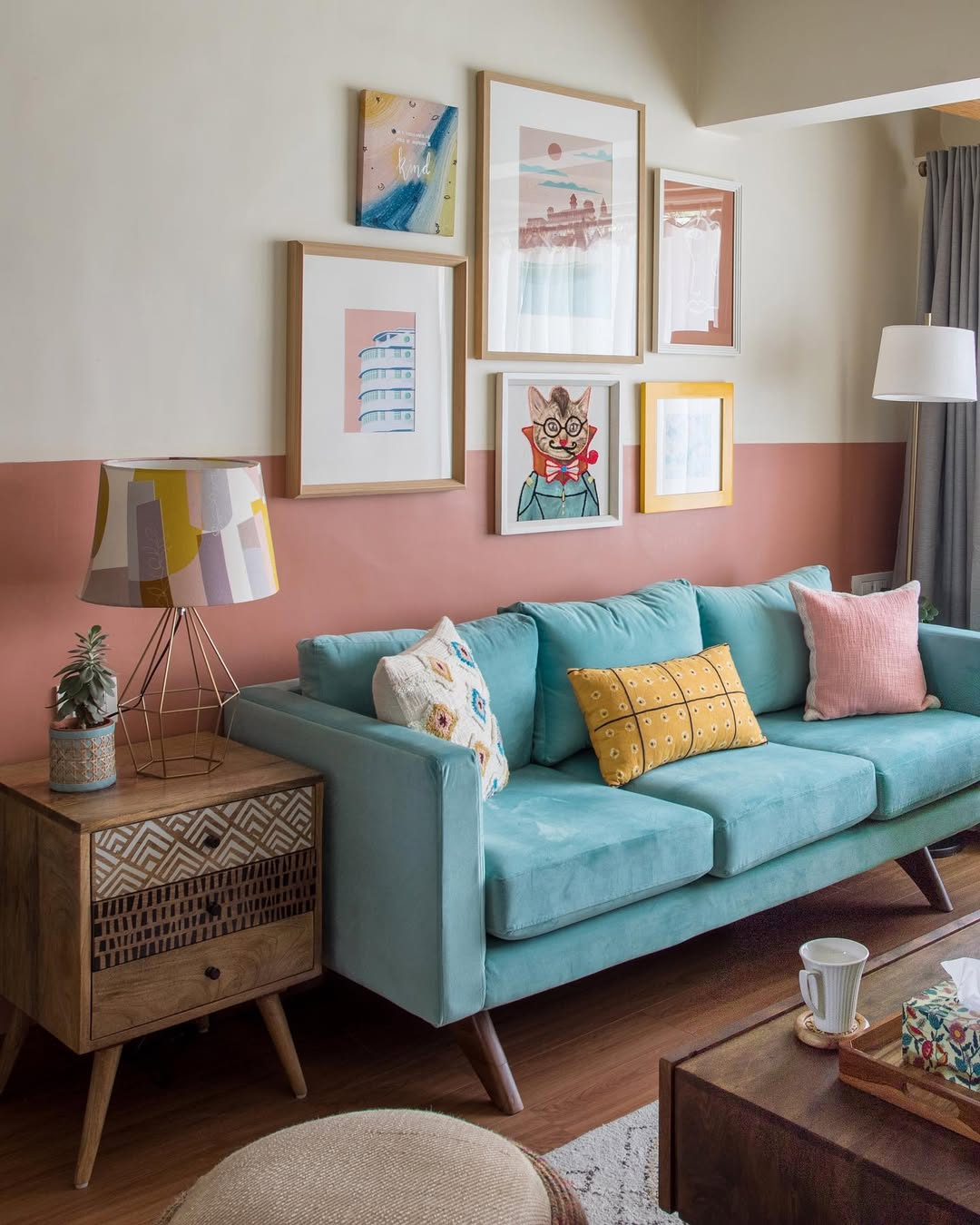
Image by attrail.in
Coral walls bring warmth and energy, while soft beige upholstery and deep wine accents ground the look with subtle sophistication. It’s a bold yet balanced palette that feels both modern and joyfully retro.
6. Sage and Sky: Serene Pairing

Image by GoodHousekeeping
The sage green walls and soft blue sofa strike a serene yet sophisticated balance, while warm gold and cream accents add a touch of understated glam. This combo is all about calm luxury—with just enough contrast to keep things interesting.
FAQS
Q: How do I choose the right color scheme for my living room?
A: Start by considering the mood you want—calm and relaxing, vibrant and energetic, or warm and cozy. Then look at your room’s lighting, existing furniture, and overall style. Neutrals offer versatility, cool tones like blues and greens bring serenity, and warm tones like terracotta or mustard add comfort and charm.
Q: What are some timeless color combinations for living rooms?
A: Classic pairings like navy and white, beige and charcoal, or soft gray with blush tones never go out of style. These combinations create a sophisticated, balanced look and allow for flexibility in swapping out décor over time without needing to repaint the entire space.
Q: Can bold colors work in a living room without overwhelming the space?
A: Absolutely. The key is balance. Use bold hues like emerald green, deep navy, or mustard yellow as accent walls, in furniture pieces, or through décor like cushions and rugs. Pair them with lighter or neutral shades to keep the space grounded and visually appealing.
Q: How do I use color to make a small living room feel larger?
A: Light, cool colors like pale blues, soft grays, or off-whites reflect more light and can open up a space. Keeping the walls, ceiling, and large furniture in similar tones creates a seamless look, making the room feel airy and more expansive.
Q: Should my living room color scheme match the rest of my home?
A: It doesn’t have to match exactly, but it should feel cohesive. Try using a consistent undertone (warm or cool) throughout the home or repeating one or two accent colors in different ways. This helps rooms flow naturally from one to the next while still allowing each space its own personality.

If you love these tips, don’t forget to pin the above image to your “Home and Garden” board.

