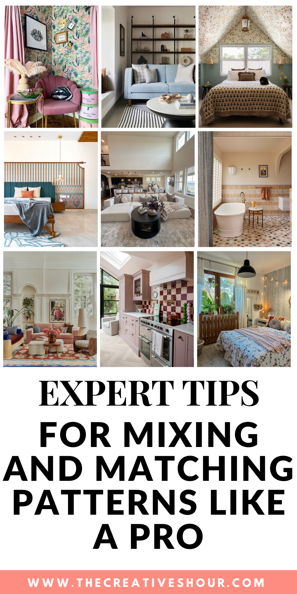
Creating a beautifully layered space with different patterns can make you feel like walking a fine line between chaos and style. But when you do right, mixing and matching patterns immediately breathes life into your room. It adds personality, depth and vibrancy. However, achieving the perfect harmony is not as easy as it sounds.
Fortunately, today, in our article, I have gathered insights from 9 experts. So, read on to master the art of pattern mixing to elevate your space with confidence.
Related articles –
- Incorporating Mixed Metals in Bathroom Design
- 7 Creative Ways to Use Fluted Patterns in Home Decor
- 5 Creative Indoor Swing Ideas for Small Spaces
1. Select a Unifying Colour Palette
“Pattern combinations mixing can truly make or break the aesthetic when designing a room. To achieve balance and harmony, I select a unifying color palette that sets the foundation.
Then, I mix organic patterns with varying scales—pairing a bold, large print with a more subtle, small pattern prevents the space from becoming too overwhelming. Textures also play a significant role in adding depth and intrigue.
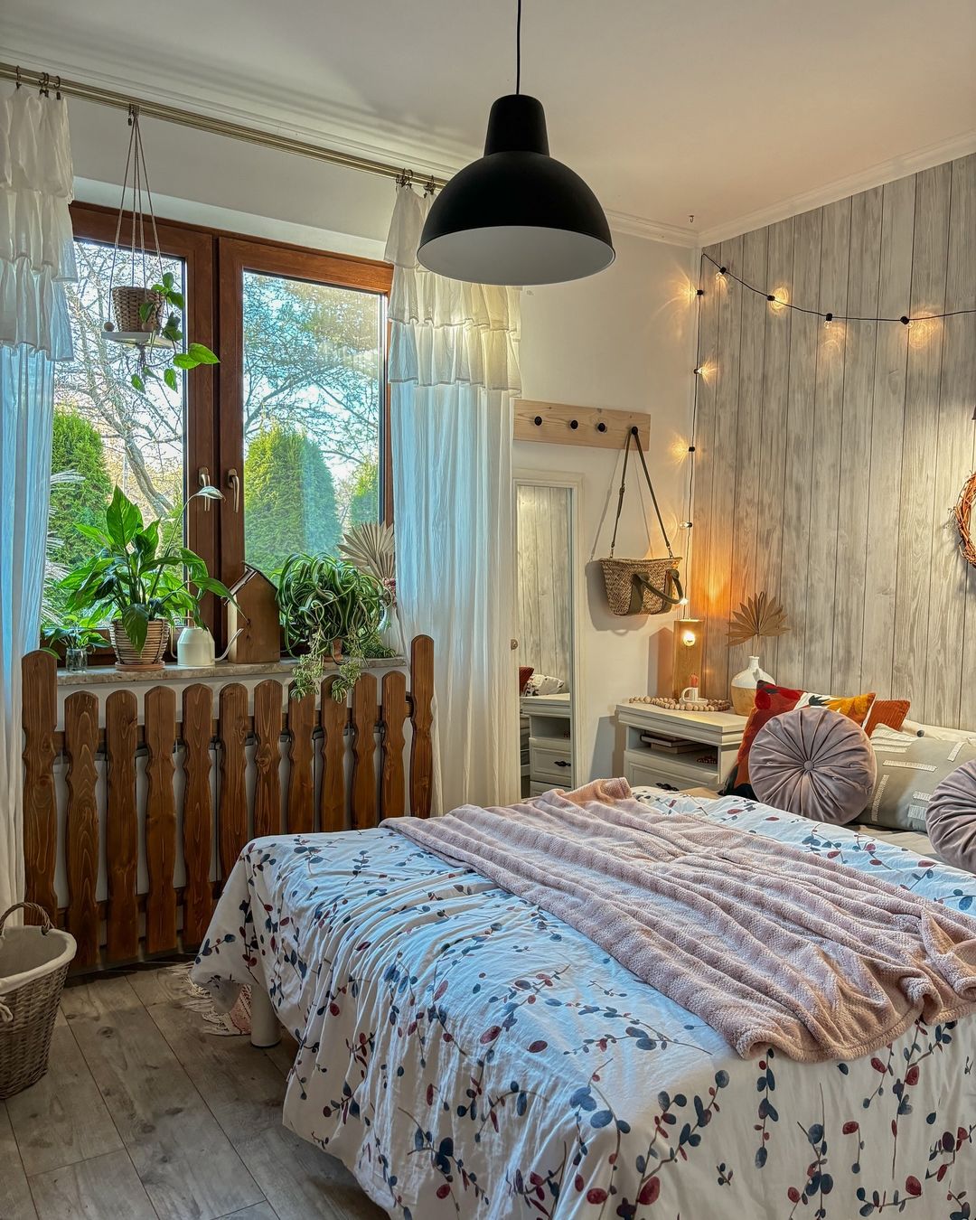
Image by home_in_garden
Reflecting on a recent project, I helped a client transform their living room by combining a geometric rug with floral cushions and striped drapes. Ensuring the patterns shared a common color theme made the room feel cohesive and inviting rather than disjointed.
Utilizing pattern mixing has a magical way of adding personality to any space, and with the right strategy, it elevates the room’s ambiance significantly. As an entrepreneur with an eye for design, I feel that these decisions are second nature and have remarkably enhanced my clients’ spaces, breathing life into otherwise dull rooms.” – Ketie Zhang, Founder, Ketie Story
2. Understand Scale, Color, and Texture
“When designing a room, the key to mixing patterns for balance and harmony lies in understanding scale, color, and texture.
In a recent project where we remodeled a kitchen, we used a combination of geometric tile pattern play for the backsplash and soft floral fabrics for the window treatments. The geometric tiles created a modern edge, while the floral patterns added warmth and softness.
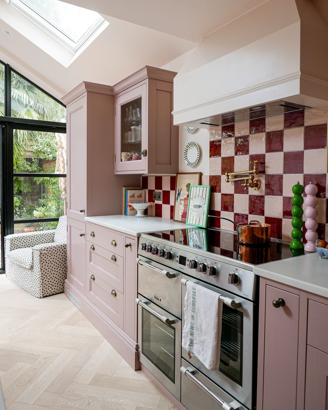
Image by lucyalicehome
To ensure harmony, we selected a cohesive color palette that tied both patterns together. Soft blues and whites complemented our best online kitchen cabinets.
We also incorporated two-tone kitchen cabinets—with a darker hue on the lower cabinets and a lighter tone above—which added depth while allowing the patterns to shine without clashing. It created a space that felt both stylish and inviting, showcasing how effective pattern-mixing can elevate a room’s aesthetic while maintaining a sense of unity.” – Josh Qian, COO and Co-Founder, Best Online Cabinets
3. Choose Complementary Colors and Textures
“When it comes to mixing patterns for balance and harmony, I focus on selecting complementary colors and textures that create a cohesive look.
Recently, I worked on a golf-training-facility headquarters where I incorporated a mix of geometric tiles and subtle stripes. By choosing colors from the same palette and ensuring one pattern was bold while the other was understated, we created an engaging yet balanced aesthetic.
In addition, I always consider the function of the space. In this project, we used durable, easy-to-clean materials that could withstand heavy use.
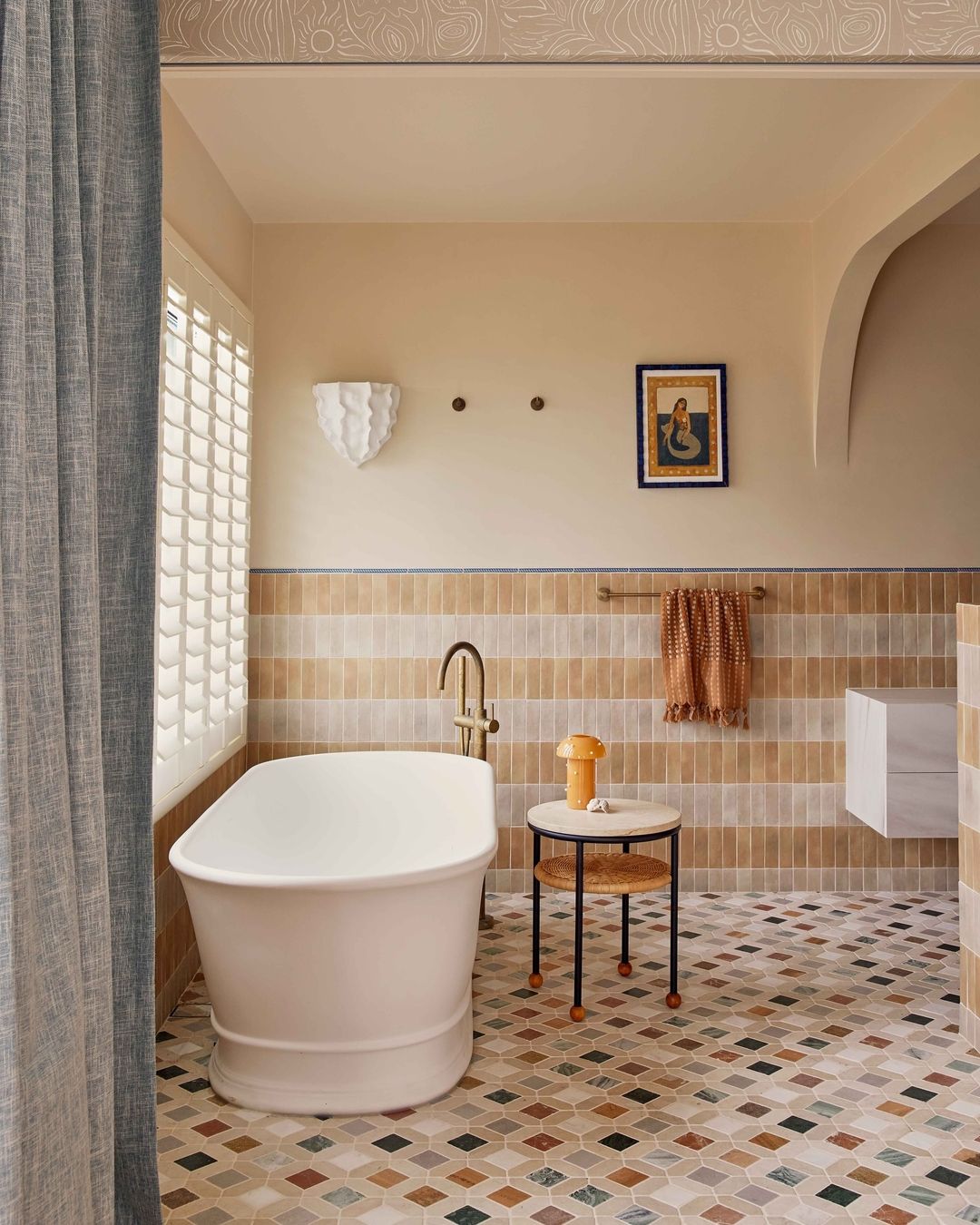
Image by jono.fleming
For example, the striking geometric tiles were perfect for the high-traffic training area, while the softer, striped wallpaper added a relaxing touch in staff rooms. Mixing patterns in this way not only lifted the design but improved the functionality of each area.
I recommend combining a statement pattern with a complementary, simpler design to avoid overwhelming the room.
Consider the purpose and flow of the space, and remember that a cohesive color scheme ties different patterns together seamlessly, creating unity amidst variety.” – Brayden Montgomery, Owner, Vantage Builders
4. Consider Paint Same Color as the Foundation
“When deciding how to mix patterns for a room, we often start by considering the paint color as the foundation. Neutral or muted wall colors help create a backdrop for bold patterns, while more vibrant paint choices can tie different patterns together.
The key to successful pattern-mixing is ensuring that the paint and patterns complement one another without overwhelming the space.
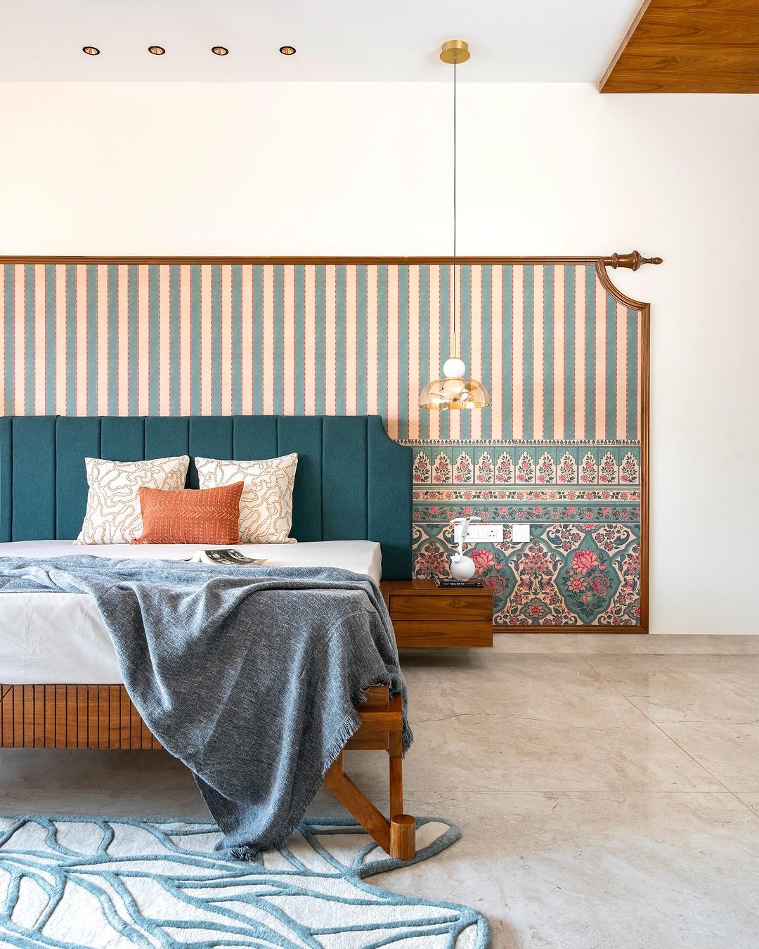
Image by cuttingedge_designstudio
In a recent home renovation, we painted the walls a soft, neutral gray to provide a calm canvas. We then combined patterned wallpapers and painted surfaces to add dimension. One wall featured a bold chevron design in complementary colors, while the adjoining wall was painted in a solid hue to balance the room.
On top of that, we incorporated patterned tiles around the fireplace and mixed in textured, painted cabinetry in the kitchen area to enhance the overall aesthetic.
This approach allowed us to use patterns without clashing, creating a harmonious look while maintaining visual interest. The interplay of paint and patterns transformed the room, giving it character and warmth without sacrificing cohesion.” – Steve Britchford, Senior Partner, Polycote
5. Blend Elements That Complement Each Other
“To achieve balance and harmony when mixing patterns in a room design, I focus on blending elements that complement each other rather than clash. It’s crucial to start with a cohesive color palette; choosing patterns within this palette helps maintain a unified look.
Varying scale and style is my next step—combining large prints with smaller, more-subtle patterns prevents visual clutter and keeps the eye interested. Recently, I worked on a project where we transformed a hotel lobby using a mix of geometric prints and delicate florals.
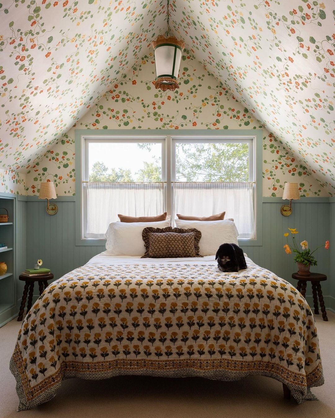
Image by jzinteriordesigns
By anchoring the space with neutral tones, we created a serene backdrop that allowed the patterns to shine without overwhelming the senses. This thoughtful pattern juxtaposition breathed life into the room, showcasing sophistication and creativity.
Each pattern told a story, yet they sang a harmonious melody together.” – Kate Hill, Founder and Director, Kate Hill Flowers
6. Layer Complementary Patterns with Cohesive Colors
“When mixing patterns in a same room, the key is balance. I always start by choosing a dominant pattern—something bold that sets the tone—then layer in complementary patterns that vary in scale and texture.
It’s important to keep the color palette cohesive, as that’s what ties everything together, even when the patterns are different.
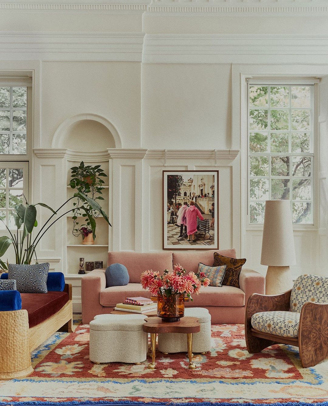
Image by studioashby
In a recent living room project, I combined a large geometric rug with softer, more delicate patterns in the throw pillows and curtains. The rug had bold, clean lines, so I softened the space by adding floral pillows and a subtle, striped curtain.
By sticking to a neutral palette with pops of color, the patterns didn’t clash—they created a dynamic yet harmonious space that felt lively but not overwhelming. This layering of patterns gave the room depth and personality while still feeling cohesive.” – Charles Chakkalo, Owner, Joey’z Shopping
7. Incorporate Patterns and Textures for Harmony
“When designing a room, incorporating various patterns and textures can enhance visual interest, flow, and harmony. The key is to use patterns of different scales that complement each other, all unified by a shared color palette.
In one of my recent projects, we renovated a kitchen and family room, significantly increasing their size. We began by selecting fabrics for the sectional and sofa, as they were the largest pieces in the room, then expanded from there.
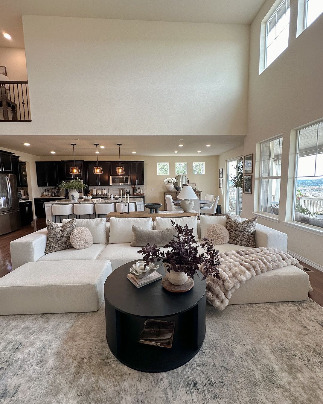
Image by homeinteriortips
We sourced various patterns for pillows, accents, and rugs that complemented our chosen colors, creating a cohesive look. Once the main color palette was established, it became easy to find paint colors that worked harmoniously with the overall design.” – Kelly Anne Sohigian, Interior Designer-Stager, kellydesigns
8. Choose a Cohesive Color Scheme
“Choosing a color scheme is the initial stage in the pattern-mixing process. This will assist you in selecting the patterns that you want to use. It’s crucial that your color scheme includes a variety of large-, medium-, and small-scale patterns.
This will keep the overall design in check and keep it from feeling overly busy. Consider utilizing a large-scale floral design on your drapes, a medium-scale striped pattern on your pillows, and a small-scale geometric pattern on your rug, for instance, if your color scheme is blue and white.
Next, think about the room’s design. Is it eclectic, classic, or modern? This will influence your choice of pattern as well. Opt for bright patterns and crisp lines in a modern space. Choose more conventional and refined patterns for a room with a traditional feel. You have greater leeway to mix and match various patterns and materials in an eclectic setting.
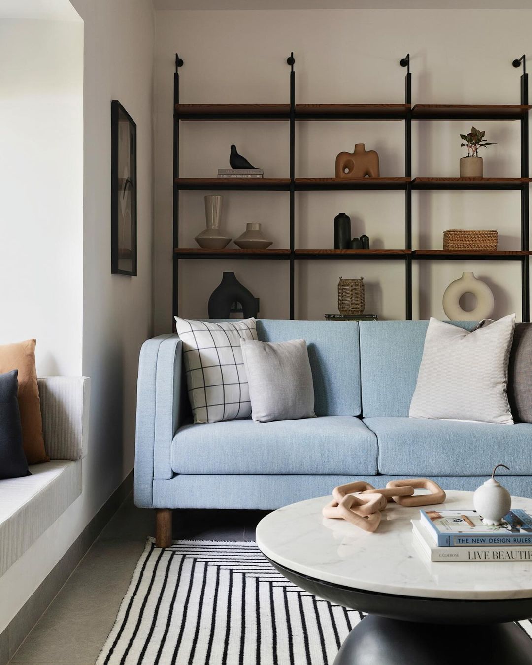
Image by sunitayogeshstudio
It’s time to choose which patterns to combine now. Selecting patterns that share at least one color is a solid general rule of thumb. This will keep the patterns from clashing and give the design a unified appearance. Patterns that belong to the same color family, like blue tones, can also be combined.
Let’s go over an example from a recent project where we combined patterns successfully. The color combination of blue, gray, and white was requested by our client for a contemporary and elegant living room. We designed the curtains with a large-scale geometric pattern in blue and gray tones in order to accomplish this. This pattern gave the space a contemporary feel while acting as its main feature.
Our design choice for the pillows was a blue-and-white striped pattern on a medium scale. In addition to giving the sofa more visual appeal, this served to bring the colors from the drapes together. The small-scale geometric design in tones of blue, gray, and white that we chose for the rug was the last one. This design provided texture to the area while tying together all the colors.
Wallpaper, artwork, and accessories are more ways to add patterns to your space besides combining patterns in fabrics. But do not forget to take the room’s style into account and adhere to your color scheme.” – Grace Chisom, Lead Designer and Stager, Ontario Property Buyers
9. Follow a Formula for Mixing Patterns
“Use a formula for mixing patterns that have balance and harmony. Depending on the number of patterns you end up using in a space, keep the following guidelines in mind.
Choose a focal pattern first. Ideally, this pattern should include all or most of the colors of your palette and be larger in design. This pattern will be the visual centerpiece. Patterns with a lot of movement, like florals, are often a great choice here.
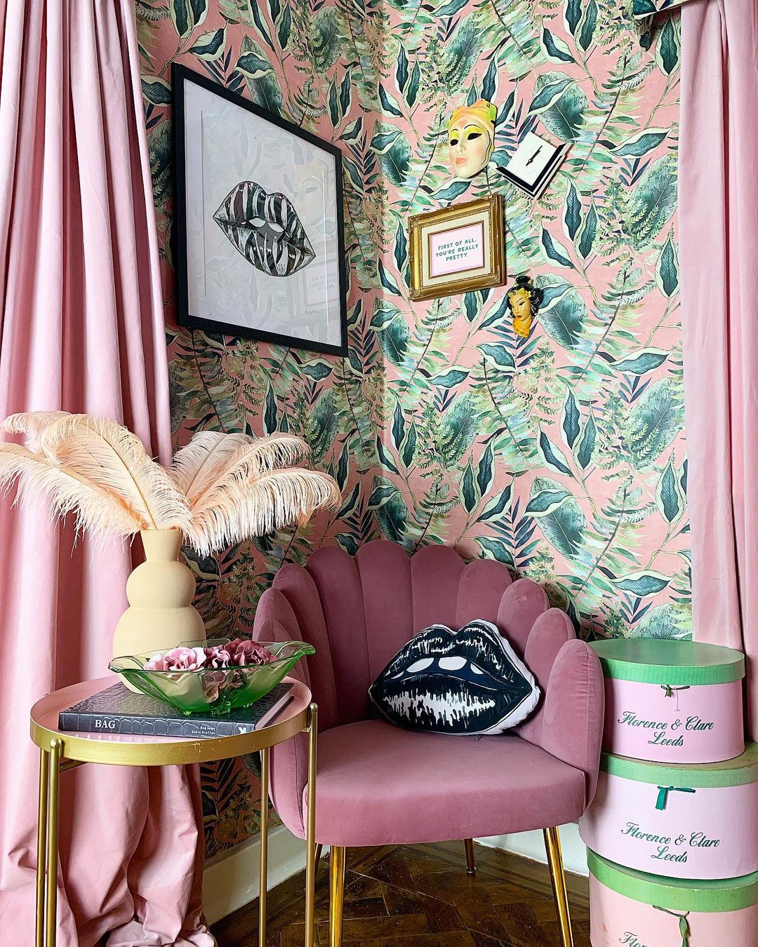
Image by interiorcurve
For secondary patterns, go with a medium scale. These patterns could be mirrored or intertwining patterns, or a larger geometric pattern. Choose patterns that don’t outshine your focal pattern but still add a lot of interest. I try to choose patterns that also have a smaller range of colors in your palette—maybe 2 or 3.
Add texture with your final layer of patterns. These patterns are typically smaller in scale and less conspicuous in pattern type. Think stripes, plaids, textures, ditzy florals, or small geometric patterns here. The goal is to add depth without a lot of attention.
When you layer these three pattern types together, your eye has a wow factor, a supporting visual, and a place to find rest and pause. It’s the perfect formula for a beautiful space that’s interesting but not overpowering.” – Lisa Mabey, Designer, Lisee Ree Designs
Conclusion
Mixing and matching large scale pattern is all about experimenting and finding what feels right. Don’t worry if your first try on multiple patterns feels a bit wild, even the best designers have the “redo” moments. Just play around, step back, and trust your instincts.
Also, keep in mind, bold pattern are there to add warmth and personality, not perfection. So what are you waiting for? Go ahead, mix and match to make your space truly yours.
