

When working with historic homes, choosing the right colors make all the difference. The goal is to find the sweet spot between timeless charm and modern appeal. The perfect palette can highlight original details while still feeling fresh.
We’ve gathered insights from seven design experts who share their favorite color combinations and real-life projects that beautifully balance old-world elegance with a new twist.
1. Deep Navy and Warm Marble for Modern Flair

Image by alexanderjamesinteriors
“When tasked with preserving historical elegance while adding a contemporary twist, selecting color combinations that respect the home’s heritage yet bring freshness is essential. At Bonsai Kitchen, Bath & Flooring, I worked on a Victorian home where we used a deep navy blue for cabinetry paired with warm-toned marble countertops. This combination kept the traditional look intact with a modern flair.
A key project involved a Colonial-style home where we complemented the original hardwood flooring with a soft dove gray palette on walls and cabinetry. The mix of classic wood textures and neutral tones refreshed the space while paying homage to its historical roots. From this experience, I learned that it’s crucial to balance vibrant new ideas with respectful nods to a home’s origins.
The takeaways from these projects emphasize the power of color to bridge past and present. By selecting historically respectful hues and coupling them with modern, understated tones, you can improve a home’s timeless character and make it appealing for contemporary living.” – Kristin Hintlian, Owner, Bonsai Kithcen, Bath & Flooring
2. Combining Classic and Modern Tones

Image by vinterior
“A careful mix of color will help to preserve the beauty of a historical property while still giving it a modern, updated vibe. Combining rich, classic tones with softer, modern colors to accentuate architectural elements while keeping the space light and inviting is one of the most successful techniques I have discovered.
We recently worked on a 1920s Craftsman house with amazing original woodwork but felt gloomy and heavy from aged wallpaper and deep brown walls. We utilized a deep navy (Benjamin Moore Hale Navy) for contrast, a soft warm white (Sherwin-Williams Alabaster) for balance, and subdued sage green (Farrow & Ball Lichen) on accents to tie in the natural surroundings while still honoring its legacy. This mix maintained the historic character of the house while giving it more modern appeal.” – Matthew O’Grady, Director, Thomas Matthew Kitchens & Furniture
3. Balancing Historical Charm with Contemporary Colors

Image by vinterior
“In my role at Accountable Home Services, I’ve realized that respecting historical charm while adding a contemporary twist is all about strategic color use. A memorable project was with an Edwardian-era home where we aimed to maintain its character yet provide a sense of modern rejuvenation. We opted for earthy tones like sage green and muted mustard to complement the vintage wood details while adding a fresh contemporary finish.
We employed eco-friendly paint brands like Benjamin Moore Natura for an environmentally conscious refinement. The sage green accentuated the home’s intricate wood detailing, while the mustard acted as a vibrant yet respectful nod to the home’s storied past. This harmony not only preserved the home’s historical elegance but also made it immensely appealing to modern homeowners.
Through this experience, I learned the value of balancing classic elements with new trends using color. The right palette can redefine a space’s character without compromising its intrinsic architecture, appealing to both potential buyers and current owners who wish to modernize responsibly.” – Mike Martinez, Owner, Accountable Home Services
4. Neutral Base with Deep Accents
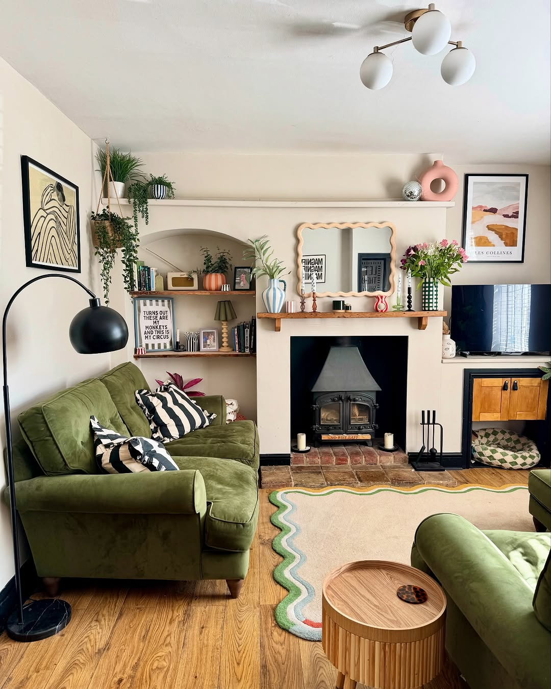
Image by thegreenwoldgaff
“I’ve found that using Benjamin Moore Swiss Coffee as a warm, neutral base really sets the stage for blending historical elegance with a fresh twist. I often pair it with deep, moody accents like charcoal or navy blue to highlight architectural details, and sometimes introduce a pop of antique brass or crisp white to keep the look modern and vibrant. This combo creates a refined backdrop that honors the character of older homes while giving them a contemporary lift.
We used Swiss Coffee on the walls to create an inviting, timeless feel, then accentuated the intricate woodwork and moldings in my living room. In the entryway and dining room, touches of navy blue added depth and a hint of modern sophistication. The transformation was striking—the home maintained its historical charm yet felt light, fresh, and utterly relevant. The key takeaway? A neutral base paired with thoughtful, contrasting accents can seamlessly marry heritage with modern style, elevating a home’s character in respectful and innovative ways.” – Kristin Marquet, Founder & Creative Director, Marquet Media
5. Navy, Ivory, and Brass for Spanish Style

Image by onekingslane
“Believe it or not, deep navy with soft ivory and warm brass accents works incredibly well for keeping historical charm intact while adding a fresh touch. We used it on a 1920s Spanish-style home in Phoenix, where the original dark wood beams and intricate tilework had a strong presence. The navy cabinetry and trim brought depth without making the space feel heavy, while ivory walls kept it open and bright. Brass fixtures tied it all together, adding warmth that blended seamlessly with the home’s original details. Basically, the goal was to enhance rather than compete with the existing architecture.
To be honest, balance makes or breaks a historical renovation. Over 60% of the home’s surfaces stayed in their original finishes, allowing the updated colors to complement rather than overpower. When you think about it, pushing too far into modern tones can strip away a home’s character, making it feel disconnected from its roots. A strong color scheme should highlight the craftsmanship, not overshadow it. At the end of the day, thoughtful updates make a home feel refined, not forced.” – Danny Niemela, Vice President & CFO, ArDan Construction
6. Heritage Green and Gold for Staircase

Image by na_architects
“Our home’s stairs, bought from the 1880s, had beautiful woodwork buried under layers of outdated paint. Stripping them down revealed rich hardwood with intricate detailing, but they needed a color scheme that would honor the home’s history while giving it a fresh update. After experimenting with different combinations, the best balance came from pairing deep heritage green with warm cream and soft gold accents. The green gave the stairs a bold, classic feel, while the cream kept the space bright, and the gold details added just the right amount of elegance.
This combination worked because it highlighted the original craftsmanship without making the space look outdated. The deep green tied into the traditional Victorian style, while the cream softened the contrast and kept it from looking too heavy. The gold accents on the railing and trim reflected natural light beautifully, adding warmth and a subtle touch of sophistication. It brought out the depth in the wood grain and made the whole space look more intentional.” – Daniel Vasilevski, Director & Owner, Bright Force Electrical
7. Mixing Original and Contemporary Flooring

Image by verandaestatehomes
“In a century-old home restoration, we maintained the original hardwood flooring in the entryway but introduced contemporary wide-plank white oak in adjacent rooms. This combination honored the home’s history while creating a modern transition. We refinished the original floors in a warm honey tone that complimented both traditional and contemporary elements. This approach preserved historical character while allowing for updated design elements in newer spaces.” – Dan Grigin, Founder & General Manager, Elephant Floors
FAQS
Q: How can I choose colors that feel fresh but still honor my home’s historic character?
A: The key is to blend traditional hues with updated tones. Start with historically accurate base colors—like muted sages, ochres, or deep blues—and pair them with lighter, modern accents. This keeps the integrity of the home while giving it a livable, refreshed look.
Q: Are there specific color palettes that suit certain historic architectural styles?
A: Yes. For example, Victorian homes often suit rich jewel tones and dark woodwork, while Colonial styles favor earth tones and muted pastels. Research your home’s era or work with a preservation expert to identify palettes that reflect its original style.
Q: Can I use bold or trendy colors in a historic home?
A: Absolutely—just use them thoughtfully. Bold colors can serve as accents in modern furnishings, artwork, or even a single feature wall. When balanced with traditional tones in the architectural elements, they can breathe new life into old spaces without clashing.
Q: What’s the best way to modernize a historic space with paint?
A: Use a classic-neutral foundation—think creams, soft greys, or warm whites—on walls and ceilings. Then introduce subtle colours in trim, cabinetry, or textiles. This approach updates the space while letting the home’s original details shine through.
Q: How do I test if a new color works in a historic interior?
A: Try paint samples on large poster boards and move them around the room throughout the day to see how natural light affects them. Compare the samples against original features like wood trim or tilework to ensure they complement, not compete.

If you love these tips, don’t forget to pin the above image to your “Home and Garden” board.
