
The first time I painted my living room a deep emerald green, my neighbor peeked in and said, “Bold choice!”—and honestly, that’s the whole point. Colour drenched living room ideas are about embracing saturated hues from floor to ceiling, creating rooms that create a vibe.
Whether it’s navy walls with matching trim or a warm terracotta cocoon, this trend ditches safe neutrals for full-bodied personality.
But it’s not just about drama—it’s about mood. Rich colors can make a space feel cozy, confident, even cinematic.
Pair bold walls with layered textures, tonal accents, and good lighting, and suddenly your living room becomes a statement. Because really—why whisper in beige when you could sing in cobalt?
Related Articles –
- 25 Bold And Groovy Vintage Eclectic Living Room Ideas To Try
- 25 Lush And Cozy Living Room Plants Decor Ideas You Need To See
- 30 Elegant And Vintage Victorian Living Room Ideas For You
1. Maximalist Jungle Meets Jewel Tones
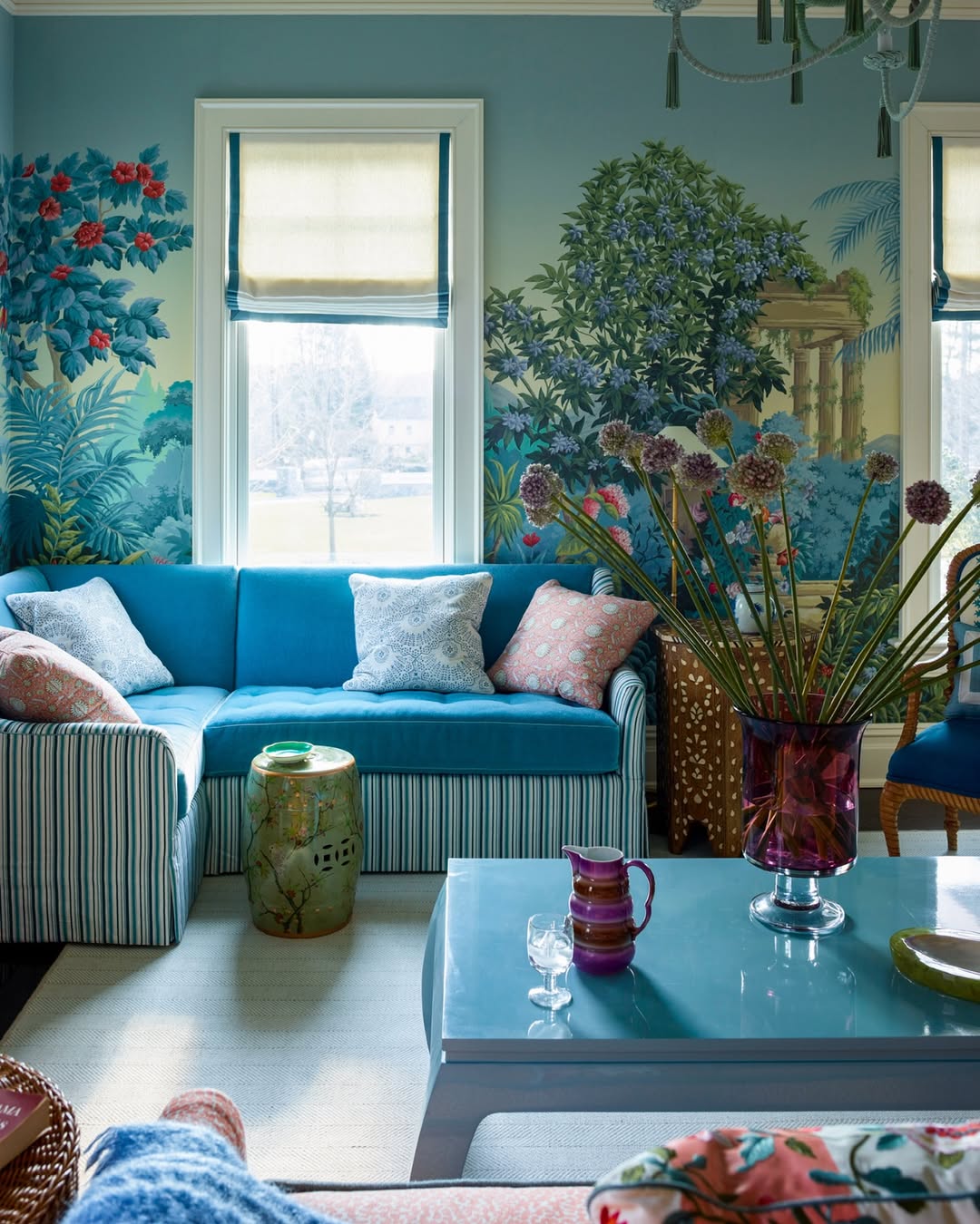
Image by andrewjhow
Feels like a scene from a vintage travel poster—and we’re here for it. The panoramic wall mural turns this living room into an exotic escape, with lush greens and florals that echo across the upholstery and accents. That saturated teal velvet sofa anchors the palette, while mismatched cushions keep it playful. Even the ceramic garden stool and plum glass vase get in on the maximalist fun.
2. Stripes, Velvet, And A Hint Of Drama
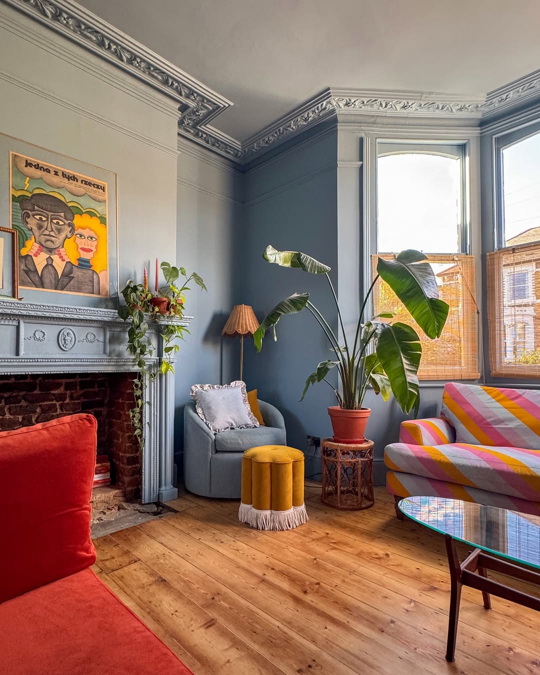 Image by thistimeincolour
This one’s giving Wes Anderson a side of vintage thrift find. Dusty blue walls let the real stars shine—like the pink-and-mustard striped sofa and velvet fringe stool. The ornate cornices and fireplace keep it grounded in its period bones, while plants and playful lighting bring it firmly into now. It’s quirky, but carefully so.
Expert tip by TCH –
“Don’t just dip your toe—dive in. I once went all in with a plum-painted ceiling, olive green walls, and mustard curtains. Sounds chaotic, right? But with warm wood floors and layered lighting, it turned into this jewel-toned cocoon. It’s my happy cave now.”
3. Pastel Palace, but Make It Smart
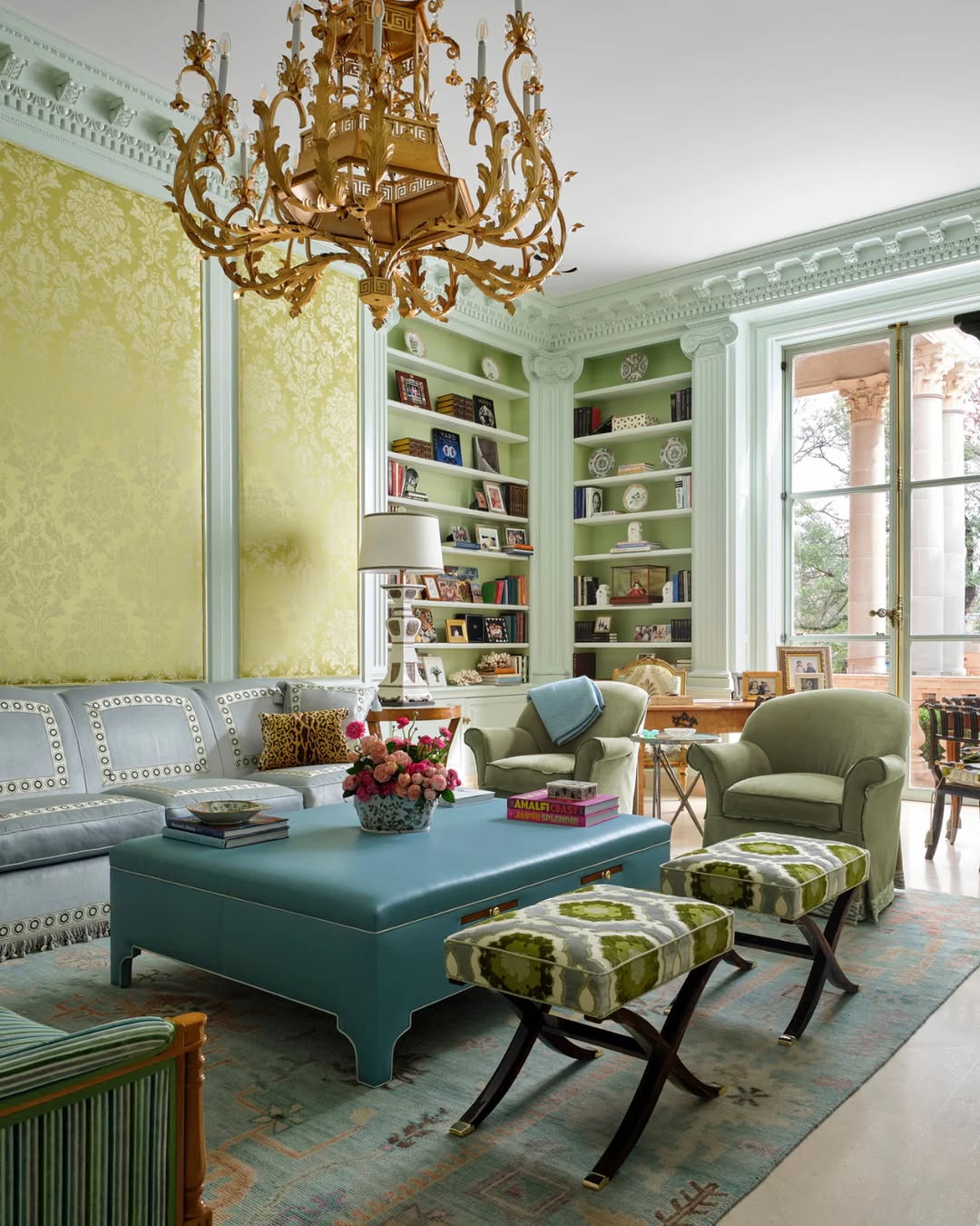
Image by samuelandsons
Pale mint walls, buttery damask panels, and a powder-blue ottoman pull off soft elegance without going sleepy. The gilded chandelier adds just enough drama to remind you this room has history. Meanwhile, the built-ins are stacked with books and personality—proof that pastels don’t mean precious. It’s like Versailles enrolled in grad school.
4. Paint It, Then Pattern It
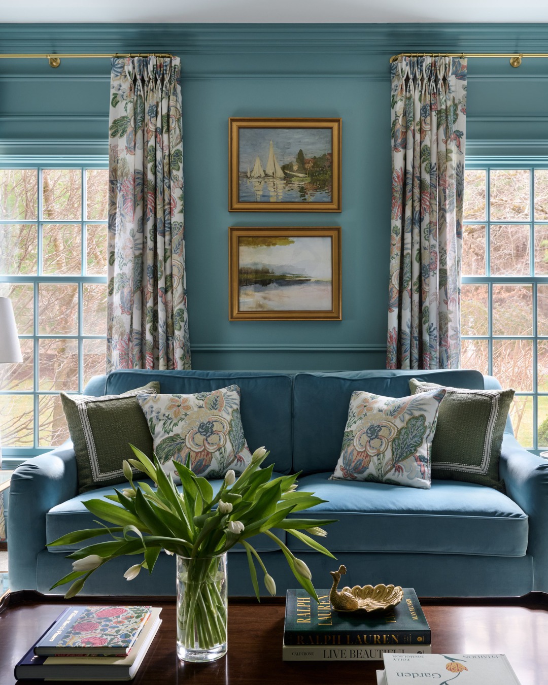
Image by oliverjames_interiors
Skip the white trim—this room goes all in on teal, from walls to window mullions. The tone-on-tone look feels cocoon-like, but the floral drapes and embroidered pillows break things up just enough. It’s a clever way to keep a monochrome scheme from feeling flat. Bonus points for the vase of tulips that mirrors the palette perfectly.
5. Corduroy And Cabernet, Anyone?
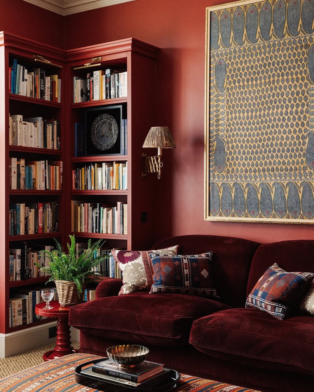
Image by thesofaandchaircompany
This room goes full-bodied in the best way. The oxblood walls and matching corduroy sofa feel rich, velvety, and a little moody—like your favorite vintage bookstore. Global textiles and a gold-framed textile art piece deepen the palette without overwhelming it. Pro tip: bookshelves in the same paint color = instant architectural polish.
6. Chintz And Shelves In Full Bloom
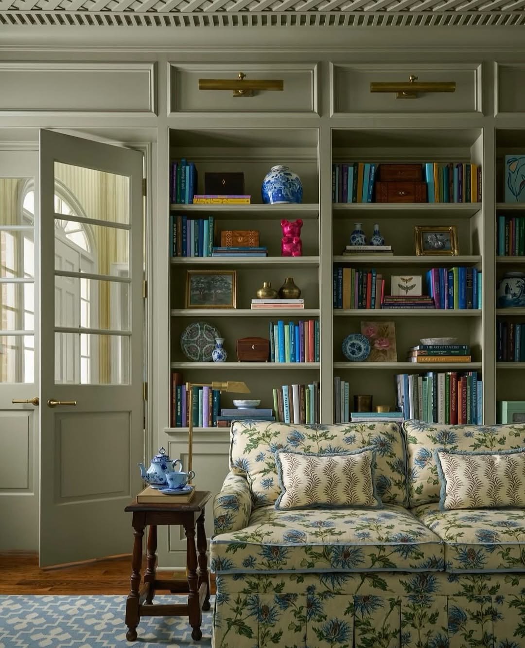
Image by claremontus
Granny-chic gets a modern refresh here, thanks to sage green paneling and a perfectly stuffed floral sofa. Even the built-ins lean into the scheme, their backs painted to match for seamless color flow. Pops of cobalt and coral from the book spines add a playful layer. It’s cozy, coordinated, and unapologetically charming.
Expert tip by TCH –
“Pick one main color and layer it like you’re dressing it for fall. My living room is drenched in different shades of green—sage on the walls, emerald on the sofa, olive in the throw pillows. It’s all the same family, but it keeps the space interesting. Like cousins who actually get along.”
7. All Hail The Golden Hour Glow

Image by edwardbulmerpaint
Golden ochre walls and matching upholstery cast everything in a warm, cinematic haze. The tonal palette feels rich, not loud—thanks to textured neutrals like jute rugs and velvet pillows. An oversized, moody painting balances the softness with a little grit. Even the books look better under this filter.
8. Powder Blue, But Make It Royal
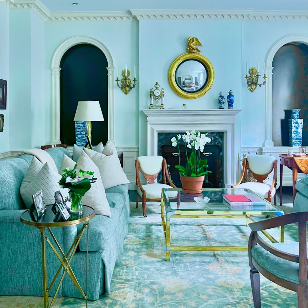
Image by garrowkdesigns
Powder blue gets the palace treatment in this refined setup. Monochrome walls and upholstery keep things airy, while brass, crystal, and chinoiserie details layer on the luxury. The neoclassical arches and crisp white trim give it backbone. It’s soft, but it stands tall.
9. Cream On Cream, But Not Boring
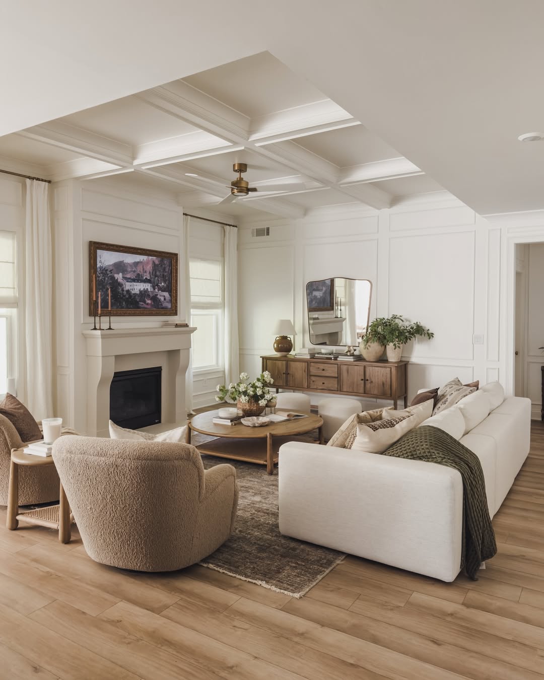
Image by alexisandraaustin
Tone-on-tone gets a tactile twist in this earthy, layered space. Soft whites meet warm woods and boucle textures, giving the room just enough contrast to feel alive. The coffered ceiling adds architectural heft, while the layout invites conversation—not just Instagram moments. Proof that neutral doesn’t mean flat.
10. Blue Crush, But Make It Textured
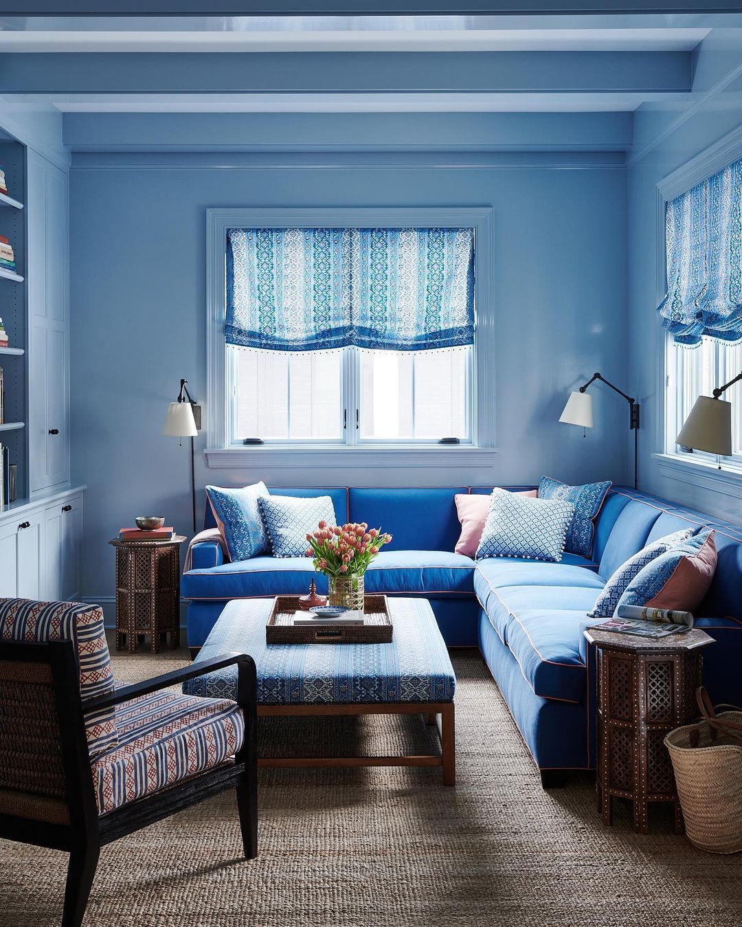
Image by farrowandball
Walls, windows, trim—every inch is drenched in a soothing periwinkle that somehow feels both crisp and cozy. The electric blue sectional with contrast piping dials up the energy, while block-printed fabrics bring in pattern and depth. A jute rug grounds all the cool tones without dimming their shine. It’s cheerful, cohesive, and a little bit beach house.
11. George Meets Glossy Aubergine
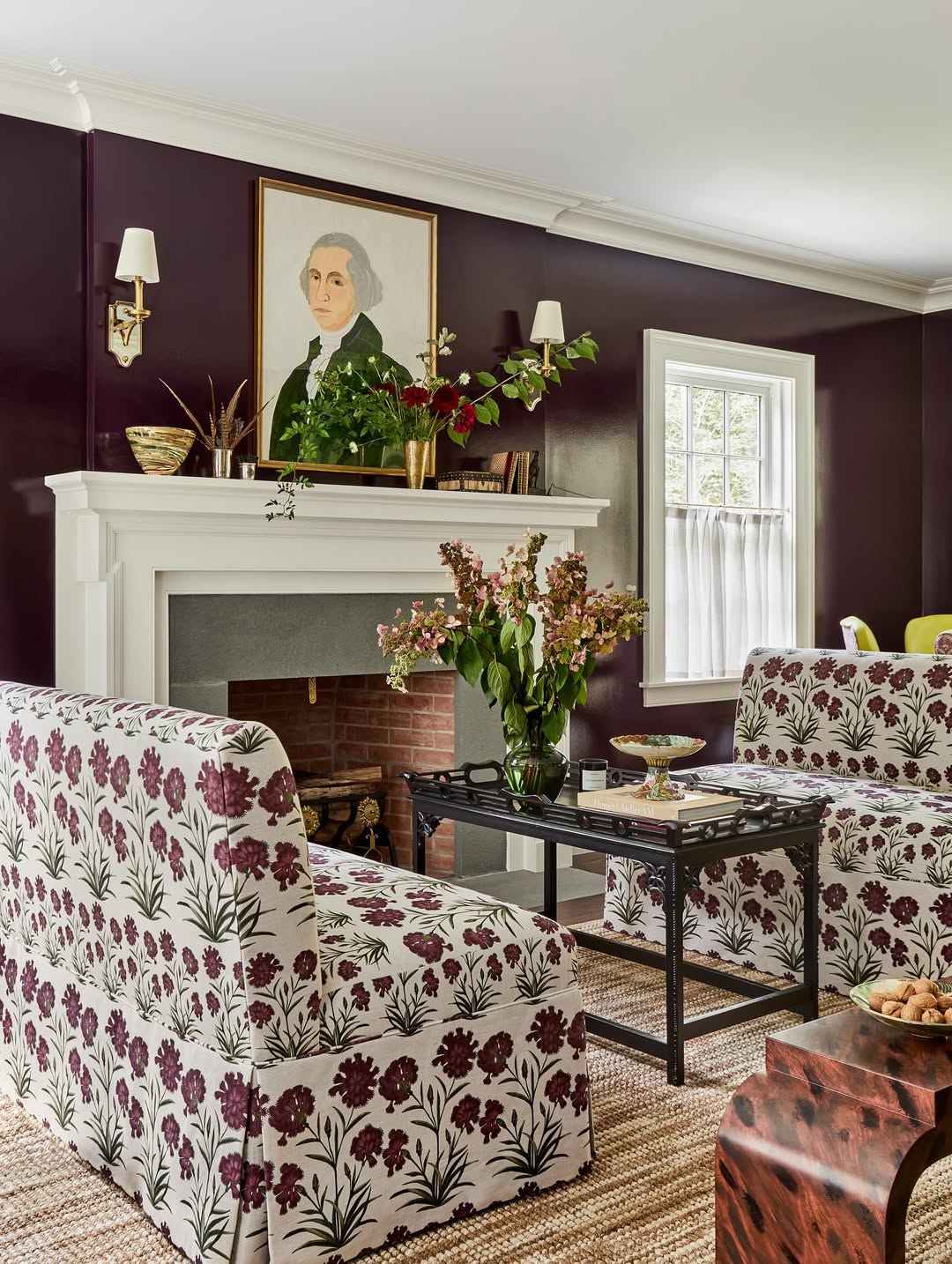
Image by jenniferbeekhunter
Deep plum walls set a moody, high-gloss backdrop for playful floral upholstery and antique accents. The all-over print on the chairs and settee ties back to the wall color without feeling matchy-matchy. A classic portrait over the mantel adds just the right amount of old-school charm. Think Mount Vernon… but with a design degree.
12. Teal Paneling, Zero Apologies
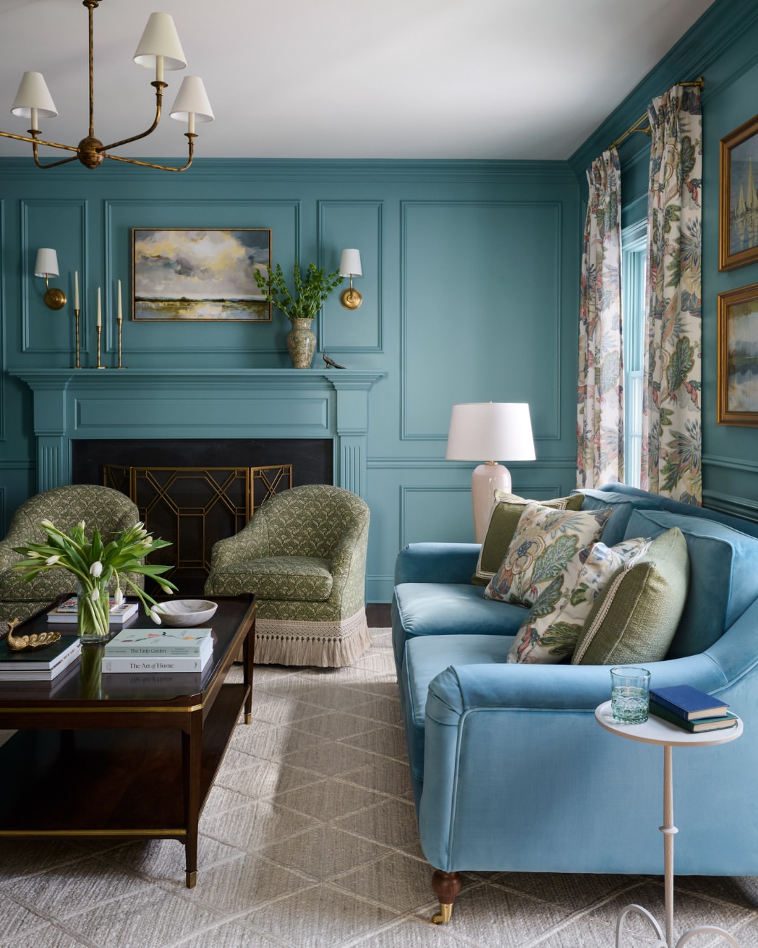
Image by oliverjames_interiors
Saturated walls and fireplace moldings create a rich, unified canvas that’s anything but shy. The icy blue velvet sofa and fringed olive chairs play off each other in a palette that’s bold but beautifully balanced. Floral drapes and layered lighting warm it all up. There’s color, there’s character—and plenty of places to sit.
13. Shades Of Olive, Layers Of Calm
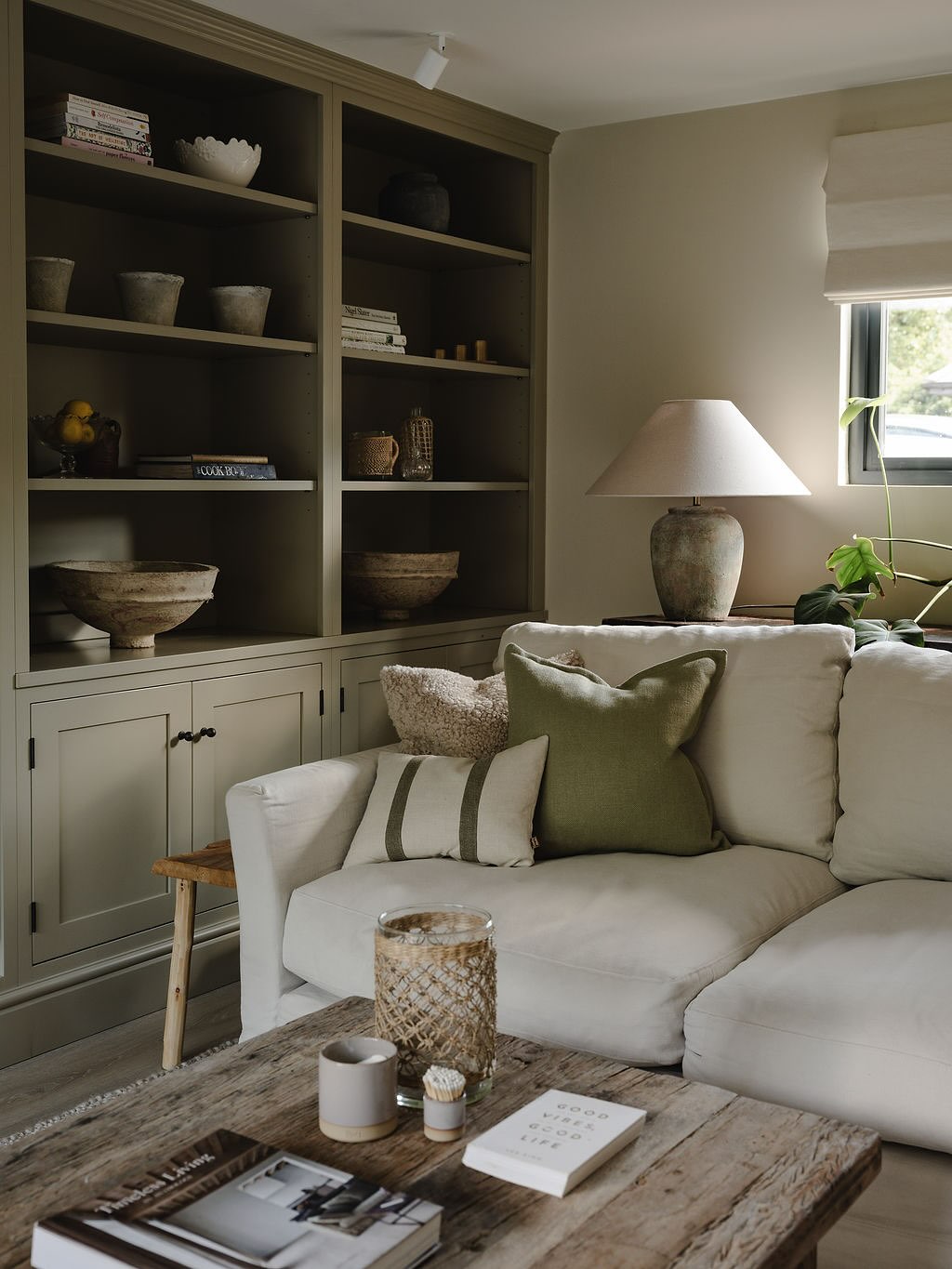
Image by theroe.studio
A lesson in tone-on-tone done right. Olive built-ins, taupe walls, and a soft linen sofa all blend into one serene, sun-dappled palette. The styling stays earthy and intentional—think rough pottery, woven textures, and just a whisper of green. It’s quiet luxury, minus the cliché.
14. Moody Blue, Pattern Crew
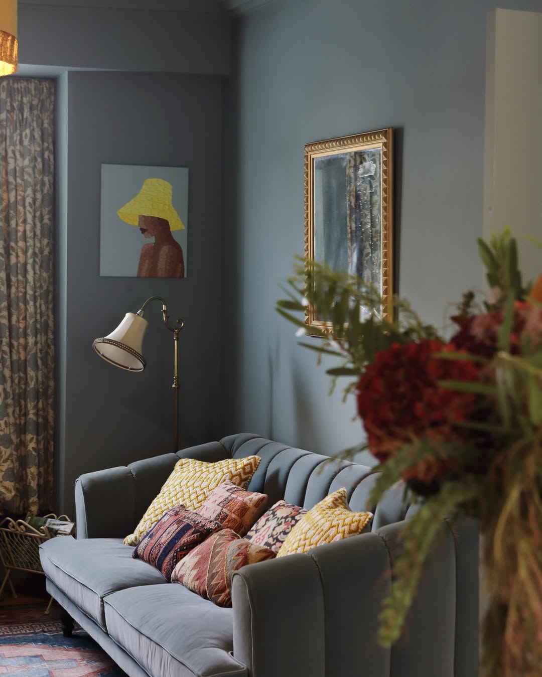
Image by lick
Blue-gray walls and a velvet sofa set the tone—literally—for this cozy, color-rich den. The real charm comes from the mix of patterns on the pillows: tribal, chevron, and a bit of retro, all in warm, sunlit tones. Even the art plays it cool while the textiles turn up the volume.
Expert tip by TCH –
“I used to think color was just for accents. Then I saw a photo of a coral living room and couldn’t stop thinking about it. I painted one wall… then the others. Now it’s this warm, sunlit blush box that makes even grey days feel cheerful. Sometimes color isn’t just a choice—it’s a mood.”
15. Velvet, Volume, And A Rainbow Wall
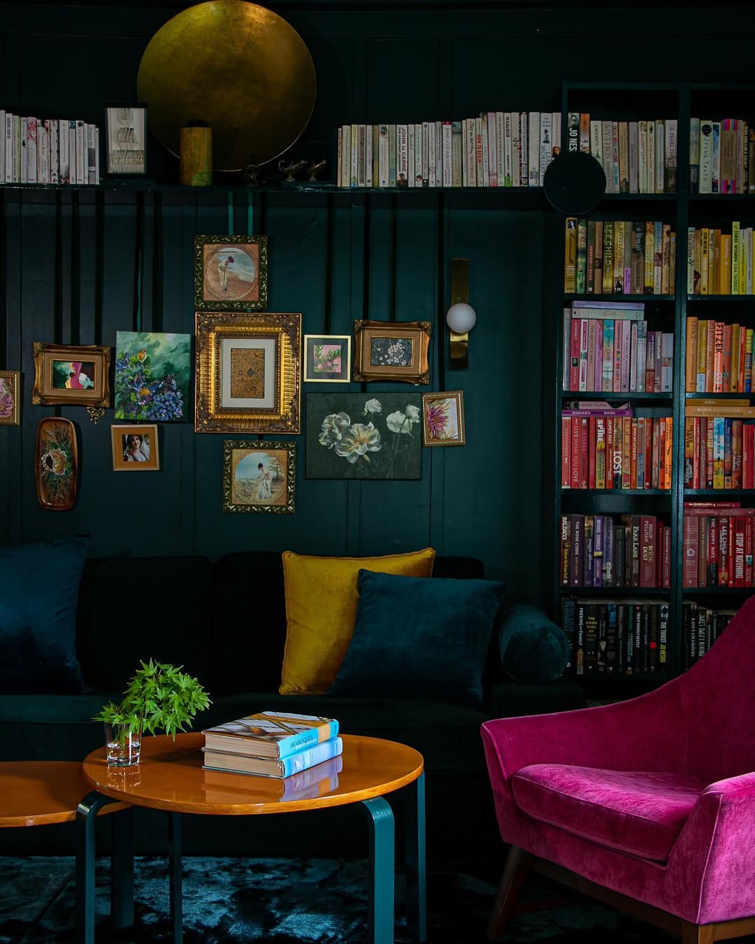
Image by jessicabellef
This room doesn’t whisper—it belts. Emerald walls go deep and dramatic, while a magenta velvet chair and sunshine yellow pillows bring full-throttle contrast. Books are sorted by color, turning the shelves into part of the palette. Tip: dark paint makes brights pop even harder.
16. Coral Crush, No Apologies
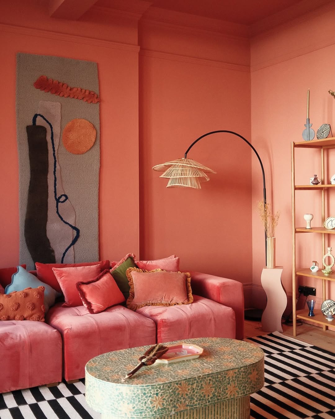
Image by lick
Walls, ceiling, and even the velvet sectional are dipped in unapologetic coral—and somehow it works without overwhelming. The monochrome backdrop lets the sculptural lamp, wavy shelf, and punchy rug steal the spotlight. A mosaic coffee table adds just the right amount of contrast. This room is not here to whisper; it’s here to flirt.
FAQ’s About Colour Drenched Living Room Ideas
Q: What does “colour drenched” mean in interior design?
A: Colour drenched design involves using a single hue—or closely related tones—across walls, trim, ceilings, and sometimes furniture. In a living room, it creates an immersive, dramatic look that feels bold, cocooning, and emotionally rich.
Q: Which colors work best for a colour drenched living room?
A: Deep, saturated tones like navy, forest green, burgundy, or terracotta work beautifully. These colors add depth and sophistication. For a softer approach, muted pastels or earth tones can still offer a full-colour effect without overwhelming the space.
Q: How do I prevent a colour drenched room from feeling too dark?
A: Use strategic lighting—wall sconces, floor lamps, and ceiling fixtures—to create warmth and balance. Incorporate lighter accents through textiles, art, or metallic finishes. Also, choose paint finishes carefully; eggshell or satin can reflect light better than matte.
Q: Can I still use patterns in a colour drenched space?
A: Yes, but keep them subtle and tone-on-tone. Patterns in rugs, cushions, or upholstery can add texture without clashing. Stick to prints that stay within the same color family or introduce just one or two complementary hues.
Q: What furniture works best in a colour drenched living room?
A: Go for pieces that either match the room’s dominant color or contrast softly—like wood, leather, or neutral-toned fabrics. Upholstered furniture in the same color as the walls can enhance the seamless, enveloping feel that makes this style so impactful.