Mauve Color offers a unique blend of subtlety and sophistication and this makes it an absolute favourite among designers. The different shades of mauve color palette combined with other colors can inspire creativity while bringing a fresh perspective to your visual content.
So whether you want to aim for a modern or vintage look, the following color combinations provide you endless possibilities.
Related articles –
- 10 Best Paint colors For Dark Rooms
- The Best Colors For Your Front Door? An Ultimate Guide
- What Does Experts Have About The Color Drenched Rooms? Learn About The Top 10 Colors Of 2025!
1. Use Pink and White for Professional Atmosphere
“We use a combination of pink and white to create a feminine, private yet professional atmosphere. Pink brings warmth and a touch of femininity, while white promotes a sense of calm and relaxation. This creates a cozy, welcoming environment and an organized space needed for productivity. Remember, your workspace is a reflection of your brand, so make it a place where you, your team, and your clients feel both relaxed and at ease.” – Diane Howard, RN and Founder, Esthetic Finesse
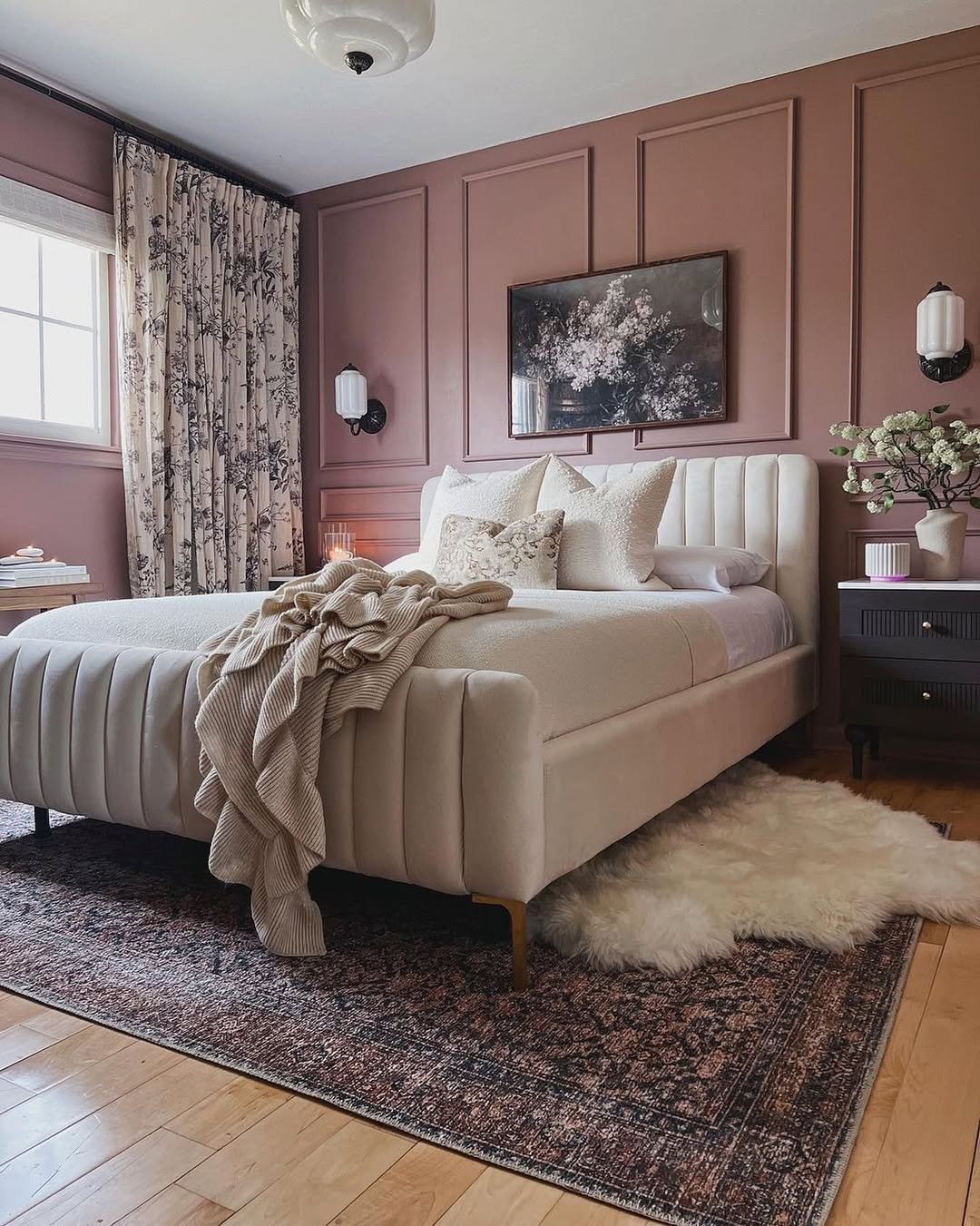
Image by loloirugs
2. Balance Mauve with Contrasting Colors
“To create a harmonious yet bold interior with mauve, balance its subtle elegance with contrasting colors. A successful example is a boutique hotel lobby featuring mauve walls paired with deep green furnishings and gold accents. This combination provides a tranquil backdrop, sophistication, and a touch of glamour, enhancing the luxurious feel of the space. Choosing complementary hues is key for emotional impact and visual harmony.” – Mohammed Kamal, Business Development Manager, Olavivo
Image by james_coviello
3. Pair Mauve with Charcoal and Champagne Gold
“Mauve is tricky–it sits in that in-between space where it can feel too muted if paired with the wrong colors or too overpowering if used incorrectly.
I successfully used it in a brand refresh for a boutique skincare company where we wanted to balance elegance with a fresh, modern edge.
The original branding relied too much on soft pastels, which looked outdated and didn’t stand out. Instead of scrapping mauve entirely, I leaned into a deeper, more grounded shade (think somewhere between dusty rose and muted plum) and paired it with charcoal gray and warm champagne gold. This combination gave the brand a luxurious yet approachable feel–mauve kept it feminine without being overly delicate, charcoal added sophistication, and the soft gold touches made it feel high-end.
One of the biggest wins? Packaging. We swapped their plain pastel labels for deep mauve backgrounds with embossed gold lettering and a hint of dark gray accents in typography. Sales improved because the new look didn’t just blend into the crowded skincare space–it commanded attention without feeling trendy.
My biggest takeaway? Mauve is a power color when balanced with structure. If you’re using it in branding, marketing, or design, pair it with strong neutrals (like deep gray or navy) and a metallic or texture that gives it depth. Too much light mauve alone feels washed out; contrast makes it bold.”- Austin Benton, Marketing Consultant, Gotham Artists
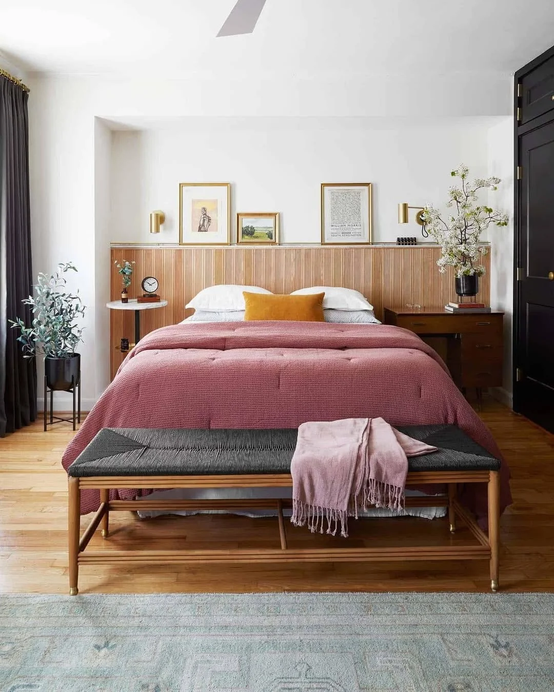
Image by luluandgeorgia
4. Combine Mauve Cabinets with Brass Hardware
“One of the most rewarding projects I’ve tackled involved incorporating mauve as a primary theme in a modern kitchen renovation. We paired mauve cabinets with a bold yet complementary matte brass hardware, creating a luxurious yet inviting ambiance. The flooring choice was crucial—opting for a dark walnut finish added warmth and contrast, grounding the overall aesthetic.
In designing, balance bold colors like mauve with neutral textures and materials to prevent overwhelming the space. Utilizing quartz countertops with subtle veining improved the hue without competing for attention. Layering in other elements such as a patterned mauve backsplash provided visual interest, further cohesifying the design.
For those considering experimenting with mauve, ensure it works with complementary accents to retain harmony. I recommend using elements like natural stone finishes or subdued metals, which Bonsai’s selection of kitchen products expertly provides, to maintain balance and sophistication. Such choices ensure the hues are bold yet harmonious, resulting in a space that feels both daring and cohesive.” – Kristin Hintlian, Owner, Bonsai Kithcen, Bath & Flooring
Image by kallaninteriors
5. Balance Mauve with Deep Forest Green
“I remember a friend gifted me a set of mauve-colored furniture covers, a sofa cover, pillowcases for throw pillows, curtains, and even a cloth cover for my coffee table. I used it on my living room furniture, but the space felt off. It needed a balance to avoid overwhelming the space, so I chose deep forest green for the accent walls and paired it with gold fixtures to keep the mood elevated but warm. The contrast between mauve’s softness and green’s richness created a really nice tension in the room, without one overpowering the other.
For anyone looking to work with mauve, I’d suggest starting small if you’re hesitant. Use it for throw pillows, rugs, or smaller furniture pieces, and experiment with complementary tones to see how they balance.”- Matt Little, Owner & Managing Director, Festoon House
Image by pathosbyfaizhira
6. Pair Soft Mauve with Deep Navy Blue
“In one of our recent projects, we undertook a kitchen remodel where mauve was used. The owner chose a soft mauve for the cabinetry, which set a warm and inviting tone. We paired it with deep navy blue accents in the backsplash tiles and rich brass hardware to create contrast and depth. The navy grounded the space and made the mauve pop, creating a striking yet cohesive look.
Start with a neutral base for those looking to experiment with this palette. Use whites or light grays to allow the mauve and its complementary colors to shine without overwhelming the space. Incorporating various textures, such as matte finishes for the mauve and glossy tiles for the navy, can also add visual appeal. Finish with natural lighting to enhance the mauve’s warmth while strategically placing artificial lighting to highlight the interplay between colors.” – Josh Qian, COO and Co-Founder, Best Online Cabinets
Image by thehome_life_
7. Combine Mauve with Muted Jewel Tones
“From my experience as an interior designer, I have used mauve with other hues to create a harmonious yet bold interior that’s both sophisticated and on-trend. A successful approach is to combine mauve with muted jewel tones, creating a rich and inviting palette. For example, in a recent project, a dusty mauve accent wall was paired with deep emerald green velvet armchairs and muddy blue curtains. This color-drenched approach, where the mauve was extended to the trim and doors, created a cohesive and impactful look.
To further enhance the space, rust-colored throw pillows and a butter yellow area rug were incorporated, adding warmth and contrast to the overall scheme. The result was a bold yet balanced interior that evoked a strong emotional response from the client (which you don’t see when creating an interior that is primarily gray and white).
For those looking to experiment with this palette, it’s important to start with mauve as your base color and build around it with complementary muted jewel tones. Consider the color-drenching technique for a more dramatic effect. Incorporating metallic accents, such as brass or copper, can add depth and sophistication. Use textured fabrics like velvet or linen to enhance the richness of the colors. Don’t be afraid to introduce unexpected pops of color, like butter yellow or sage green, to keep the palette fresh and interesting (especially in your appliances – this is expected to be a trend for 2025!)
Remember, the key is to balance bold choices with thoughtful coordination. By carefully selecting your color combinations and considering the overall mood you want to create, you can achieve a stunning interior that’s both on-trend and timeless.” – Sarah Kuchar, Creative Director, Kuchar
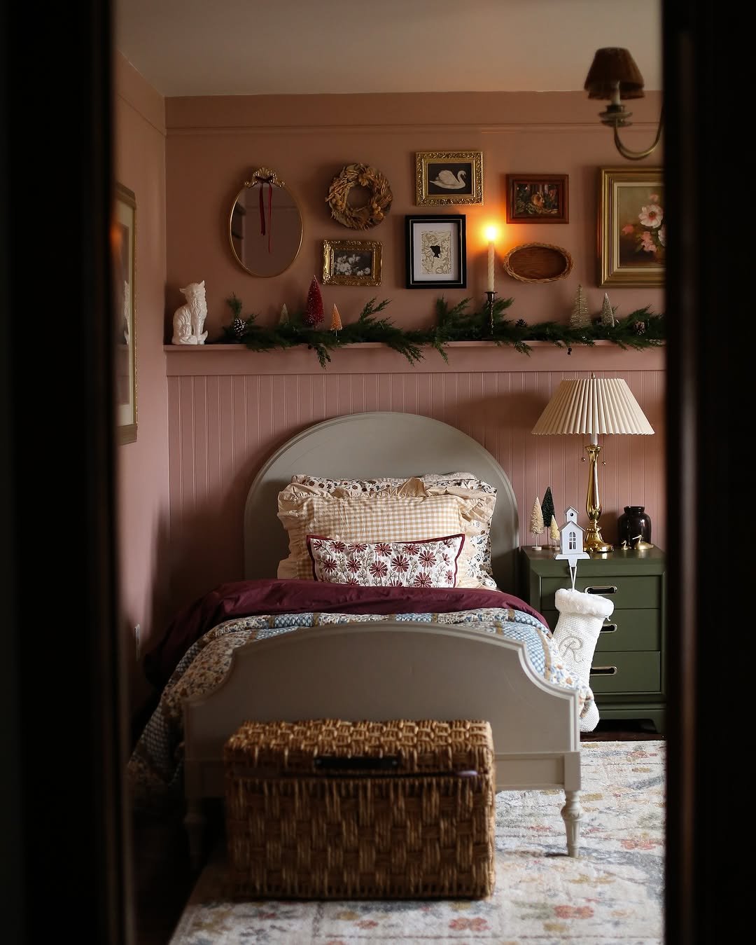
Image by kindredhomestead
8. Use Deeper Neutrals for Hygge Atmosphere
“Neutral colors and natural materials are key to creating a ‘hygge’ atmosphere because they work together to make a space feel grounded and authentic. Personally, instead of the traditional whites and beiges, I tend to play with deeper neutrals – clay or putty or mushroom – something earthier, more reassuring, and richer. Combine these hues with products such as unpolished oak, salvaged wood or even terracotta, and you are almost drawing the outdoors in, a sort of tangible and accessible indoors. It’s less polished and more about embracing imperfections, which is what ‘hygge’ is really about.
I recommend layered sources for lighting. Soft floor lamps with wooden cages, pendant lights with woven shade, and even Himalayan salt lamps for that warm glow are great for this atmosphere. Amber bulbs work especially well for hygge, as they dim it to the point where you are imagining that afternoon sun. This along with a full linen curtain or quilt makes the space feel more like a home, but without being fancy. The focus is to make it feel comfortable with subtle contrasts and have you sitting down and enjoying it, without being on the set of a magazine shoot.” – Jay Soni, Founder and Director of Sales and Marketing, Yorkshire Fabric Shop
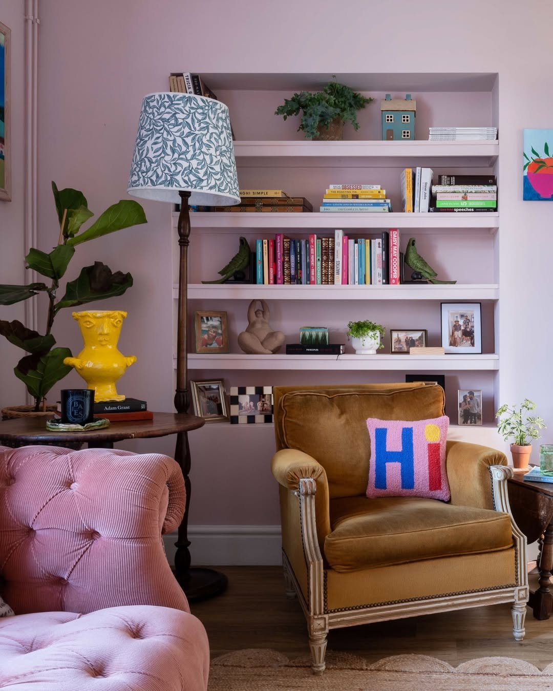
Image by lick
9. Pair Mauve with Deep Plum and Taupe
“Mauve is such a versatile color and can work magic when paired with the right shades. I remember working on a living room where I used mauve as the highlight color, and it really brought everything together. I paired it with deep plum and soft taupe. The plum added some richness while the taupe kept the vibe calm and balanced. The mauve really popped in that setting but didn’t overwhelm the space. It was bold yet subtle, kind of like a soft statement piece in a room full of calm.
If you’re looking to try out mauve, I would say balance is key. It works really well with darker neutrals, like charcoal or matte black. They help ground the room, letting the mauve shine without clashing. Adding some different textures, think velvet cushions or linen throws; helps break things up and gives the space a cozy, layered feel. Mauve is a bit of a showstopper, but when you pair it with the right tones, it adds just the right amount of pop without being too much.” – Denise Murray, Marketing Manager, Microdose Mushrooms
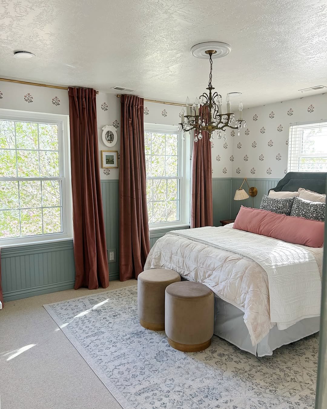
Image by andreatraylor_
10. Pair Mauve with Forest Green and Cream
“Mauve is a wonderfully versatile color that can bring a touch of sophistication and warmth to any space. In one of my recent projects, I paired mauve with rich forest green and soft cream to create a living room that feels both refined and inviting. The mauve served as the primary color on the walls, providing a soft, serene backdrop.
The forest green was introduced through major furniture pieces like the sofa and armchairs which anchored the room with a touch of nature’s calm. Accents in creamy white were spread throughout in the form of window treatments, lampshades, and throw pillows, which helped to balance the darker tones and add a light, airy feel to the space.
When working with mauve, it’s important to consider the mood you’re aiming to create. If you prefer a bold look, pairing mauve with vibrant colors like teal or mustard can really make the color pop and bring energy to the room. For those inclined towards a subtle palette, mauve works beautifully with shades of gray or softer blues, which maintain tranquility while still adding some depth to your interiors.
Always keep in mind the lighting in your space, as it can significantly affect how the colors appear. Experiment with different textures and finishes as well, since these can add layers and complexity to your design. In conclusion, don’t be afraid to play around with different combinations to see how they change the space; sometimes the most unlikely pairings create the most spectacular results!” – Alex Cornici, Writer, The Traveler
Image by flowbylara
11. Pair Deep Mauve with Matte Black Fixtures
“Mauve isn’t the first thing that comes to mind when talking plumbing, but I’ve actually seen it work well in bathroom designs. A client once had a deep mauve feature wall behind a freestanding bathtub, and we installed matte black fixtures to give the space a sleek, modern contrast. White marble-look tiles tied everything together, keeping it from feeling too heavy. The result was surprisingly balanced—warm yet bold, and it didn’t overwhelm the space. The client wanted something different from the usual whites and neutrals, and this did the trick.” – Caleb John, Director, Exceed Plumbing
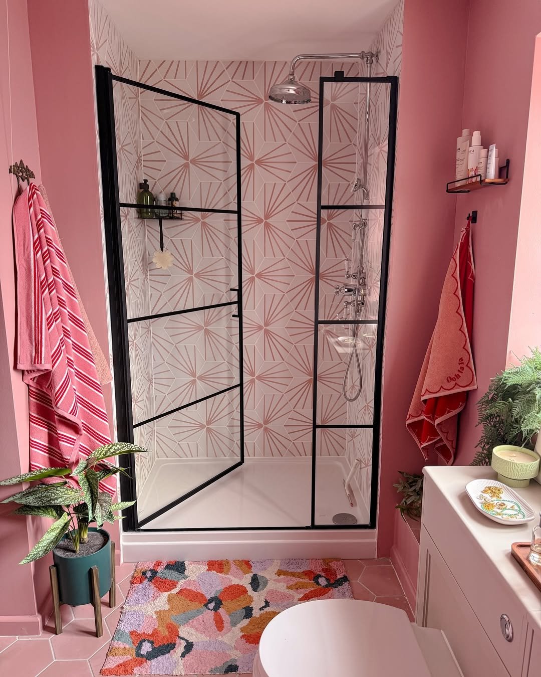
Image by overatno18
12. Pair Mauve with Earthy Grounded Colors
“Mauve works surprisingly well in large-scale spaces when paired with earthy, grounded colors. We worked on an outdoor pavilion where mauve was used in the tensile fabric for shade structures, complementing the natural greens and browns of the surrounding environment. The muted purple tones softened the industrial framework while still providing a striking visual element. The mix of warm wood paneling and cool steel accents kept the balance between contemporary and organic.
For those looking to experiment with mauve, it’s worth considering how lighting affects the color. In natural daylight, it can feel bright and airy, but under artificial lighting, certain shades might lean too pink or too dull. Pairing it with raw materials like wood, stone, or brushed metal keeps it from looking overly delicate. In functional spaces, muted mauve tones can provide a subtle touch of color without overwhelming the design.” – Barbara Robinson, Marketing Manager, Weather Solve
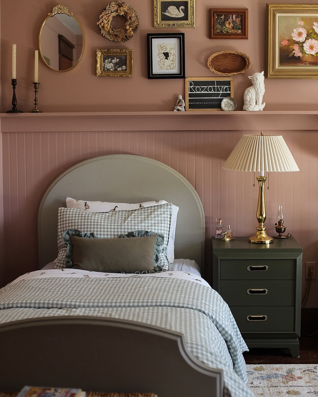
Image by kindredhomestead
13. Pair Mauve with Rich Leather Tones
“When it comes to pairing colors like mauve in interior detailing, my focus is on achieving a balance between sophistication and comfort. At Full Tilt Auto Body & Collision, we often extend our expertise to include custom interior work, which involves understanding color dynamics. For instance, using mauve with rich leather tones like deep browns or even slate gray can create a refined yet bold interior space.
During a project for a classic car restoration, we integrated mauve stitching with dark leather seating. The outcome was a timeless look that highlighted the vehicle’s character while maintaining elegance. My advice is to start with small accents of mauve, perhaps in stitching or small fabric inlays, to gauge how it interacts with existing hues. Always test your palette under different lighting conditions to ensure the colors resonate well both under natural and artificial lights.
Ensuring color harmony is not just about aesthetics but also about longevity. Proper color matching techniques, akin to what we employ for our paint jobs, ensure your choices won’t go out of style quickly. Use quality materials and consider the ambient lighting to ensure your color choices shine in the best possible way.” – Zac Ciaschini, Co-Owner, Full Tilt Auto Body & Collision
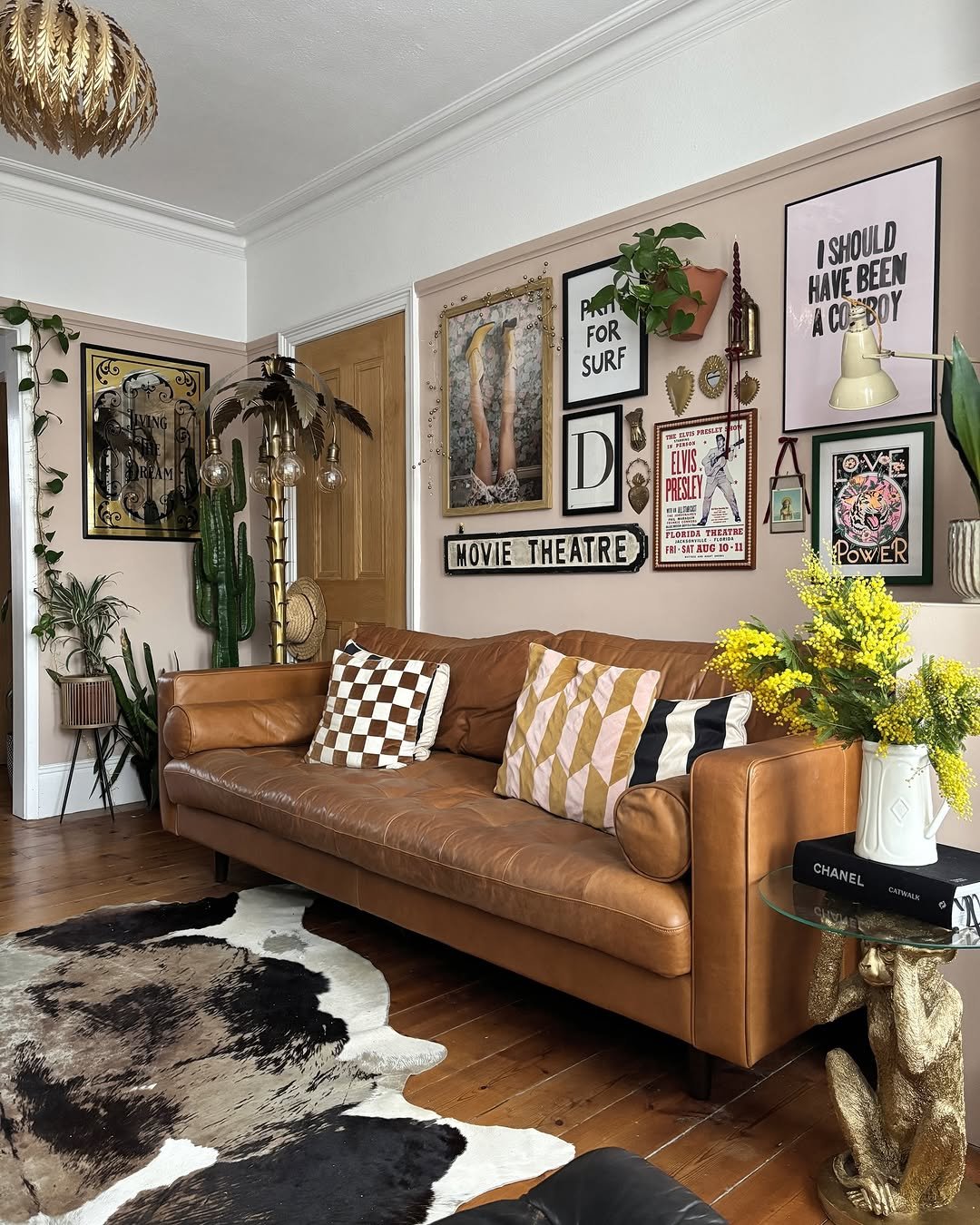
Image by leopard_print_stairs
14. Pair Mauve with Dark Moody Tones
“I’ve seen mauve work well in commercial spaces, especially when paired with dark, moody tones. One office renovation used deep mauve accent walls against charcoal furniture and brass lighting fixtures, giving the space a refined yet modern feel. The darker base kept the mauve from feeling too soft, while the metallic elements added a touch of polish. It was a smart way to add color without making the space feel too trendy or short-lived.
If someone wants to introduce mauve into a space without committing to large surfaces, smaller accents can do the trick. Upholstery, artwork, or even textured wall panels in mauve can bring warmth without overpowering. Pairing it with matte finishes helps maintain a contemporary look, while glossy surfaces can push it toward a more traditional feel. Testing it against different materials is the best way to figure out what works for the specific space.” – Nathan Mathews, CEO and Founder, Roofer
Image by trovebystudioduggan
15. Pair Mauve with Warm Neutrals and Navy
“A recent project featured a deep mauve accent wall in a primary suite, paired with warm neutrals and deep navy cabinetry. Contrast made all the difference. Crisp white trim and brass fixtures kept the mauve from feeling too soft, while navy anchored the space with depth. This mix avoided anything overly trendy or dated, making the design feel intentional. Colors like mauve work best when they have strong counterparts. Too much softness, and the space starts to feel washed out.
Layering in textures makes a difference, too. In that suite, we brought in a plush area rug with subtle mauve threads, velvet pillows, and matte black hardware. Those details pulled the palette together so it felt cohesive instead of random. That’s the trick. Mauve is not a feature color–it sets the mood but needs structure around it to shine. Pair it with bold contrast and varied textures, and it holds its own.” – Danny Niemela, Vice President & CFO, ArDan Construction
Image by nerointerieurs
Final Thoughts
In home decor and interior designing, mauve color palettes create a sophisticated and serene atmosphere. Pairing this wonderful color with neutral colors like gray and beige can add a touch of elegance to your home. Incorporating metallic accents can boost the overall aesthetic.
Ready to experiment with mauve and other color combinations for your next project? Elevate your designs to the next level with these stunning color combos.
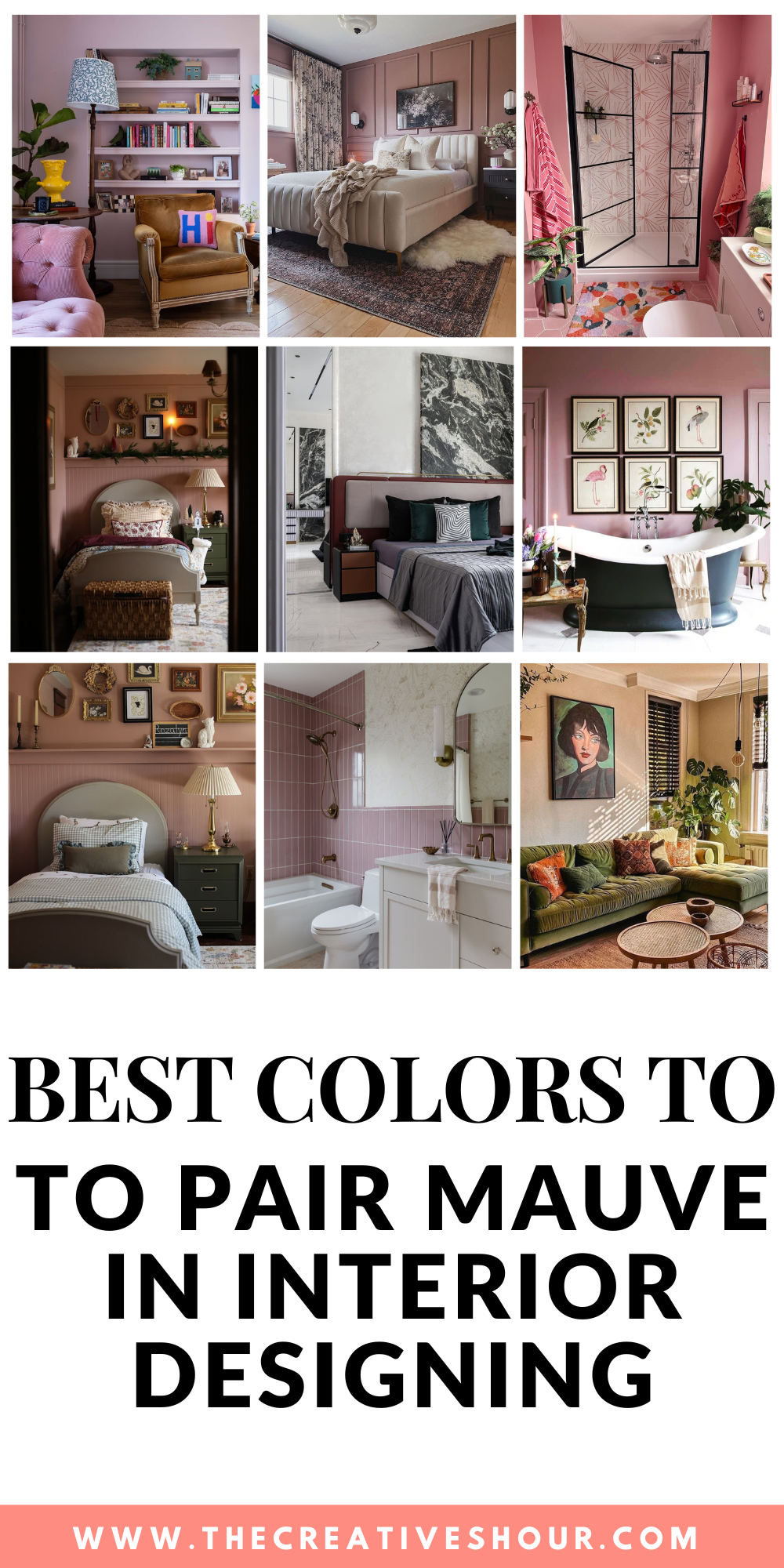
If you love these ideas, don’t forget to pin the above image to your “Home and Garden” board.