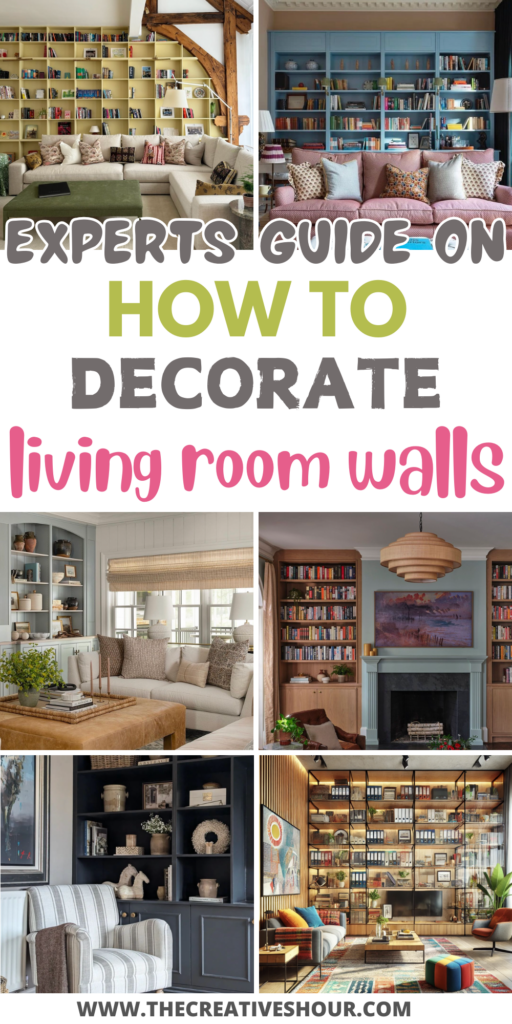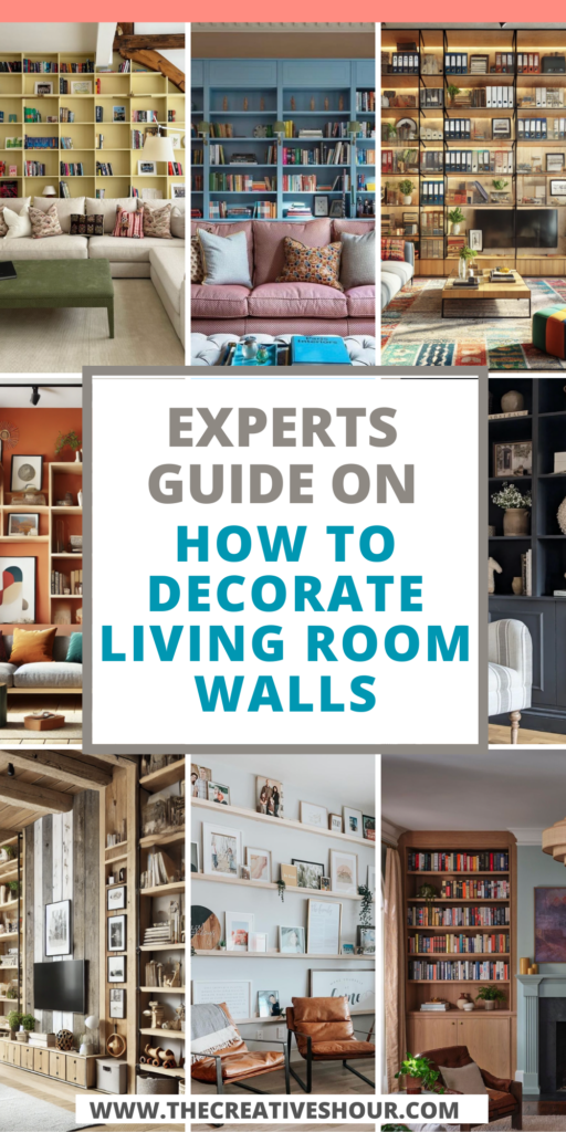
Built-in shelves offer a unique opportunity to showcase collections and artwork, but styling them can be more challenging than it seems. Overcrowding can lead to a chaotic look, while leaving shelves too sparse makes them feel incomplete.
To help you strike the perfect balance, we’ve gathered expert tips from seasoned designers and home stylists who know how to transform these shelves into stunning focal points. Whether you’re working with glass shelving, mixing materials, or creating visual zones, their advice will guide you in making the most of your built-ins.
From using lighting to highlight your favorite pieces to incorporating wallpaper for added texture, these creative methods will ensure your shelves look both stylish and cohesive.
1. Disperse Decor Throughout the Space
“When styling built-in shelves, one mistake people often make is loading them up with every piece of decor they own. This creates a cluttered, chaotic look that feels unbalanced because the rest of the room is left bare.
The key is to spread your decor throughout the entire space, not just the shelves. For example, you can place a small statue on an end table, display artwork on the walls, or add something to the windowsill.
The idea is to avoid displaying everything in one ‘clump,’ and instead, let the decor breathe and flow through the room.” – Rick Berres, Owner, Honey-Doers
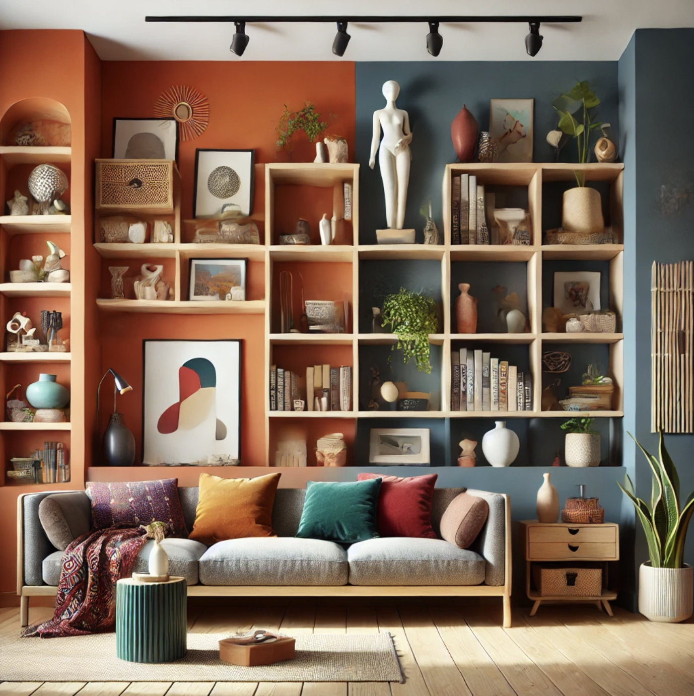
Rick’s advice encourages a more thoughtful approach to styling by dispersing decor across the room. This helps avoid clutter while creating a cohesive design. His emphasis on balance ensures that your built-in shelves enhance the overall aesthetic without overwhelming the space.
By following his suggestion, you can achieve a well-organized, visually appealing room that feels curated and intentional.
2. Innovate with Glass Shelving
“As an architect, I find glass shelving and partitions an innovative way to style built-ins while maintaining cohesion. The transparency of glass allows collections to be prominently displayed without seeming cluttered or bulky. For a client’s home office, we installed frameless glass shelving between wooden supports along one wall.
The glass shelves hold books, files, and awards without hiding the beautiful wood wall behind. The client can arrange items at varying heights, creating a balanced focal point that feels custom to their needs.
The openness provided by the glass shelving gives the illusion of a more spacious room.” – Pam Hutter, Principal, Hutter Architects
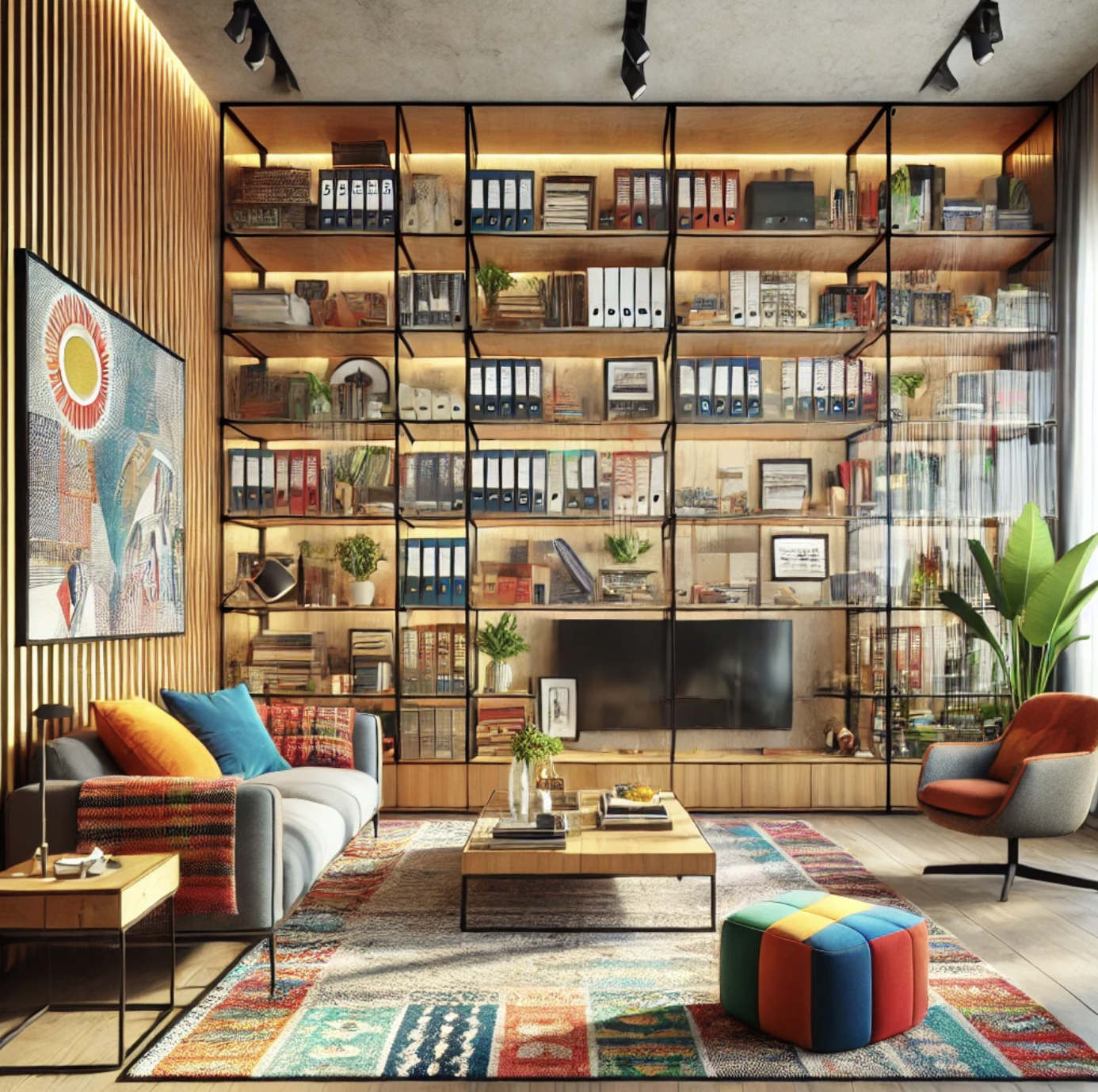
Pam’s approach demonstrates how glass shelving can transform built-in shelves into functional yet elegant focal points. Its transparency allows collections to shine while keeping the room feeling open and uncluttered.
If you’re struggling to achieve this balance, decluttering first and adding items thoughtfully will ensure a cohesive design that highlights what matters most.
3. Create Visual Zones for Cohesion
“One innovative way I’ve styled built-in shelves is by creating visual ‘zones’ for different collections. For instance, on one shelf, I showcased my collection of vintage cameras, and on another, I displayed framed artwork and small sculptures.
To keep everything cohesive, I repeated colors and textures already present in the room, such as natural wood tones and black accents that echoed the furniture.” – Jacob Rhodes, Owner and Chief Engineer, TrueTrac
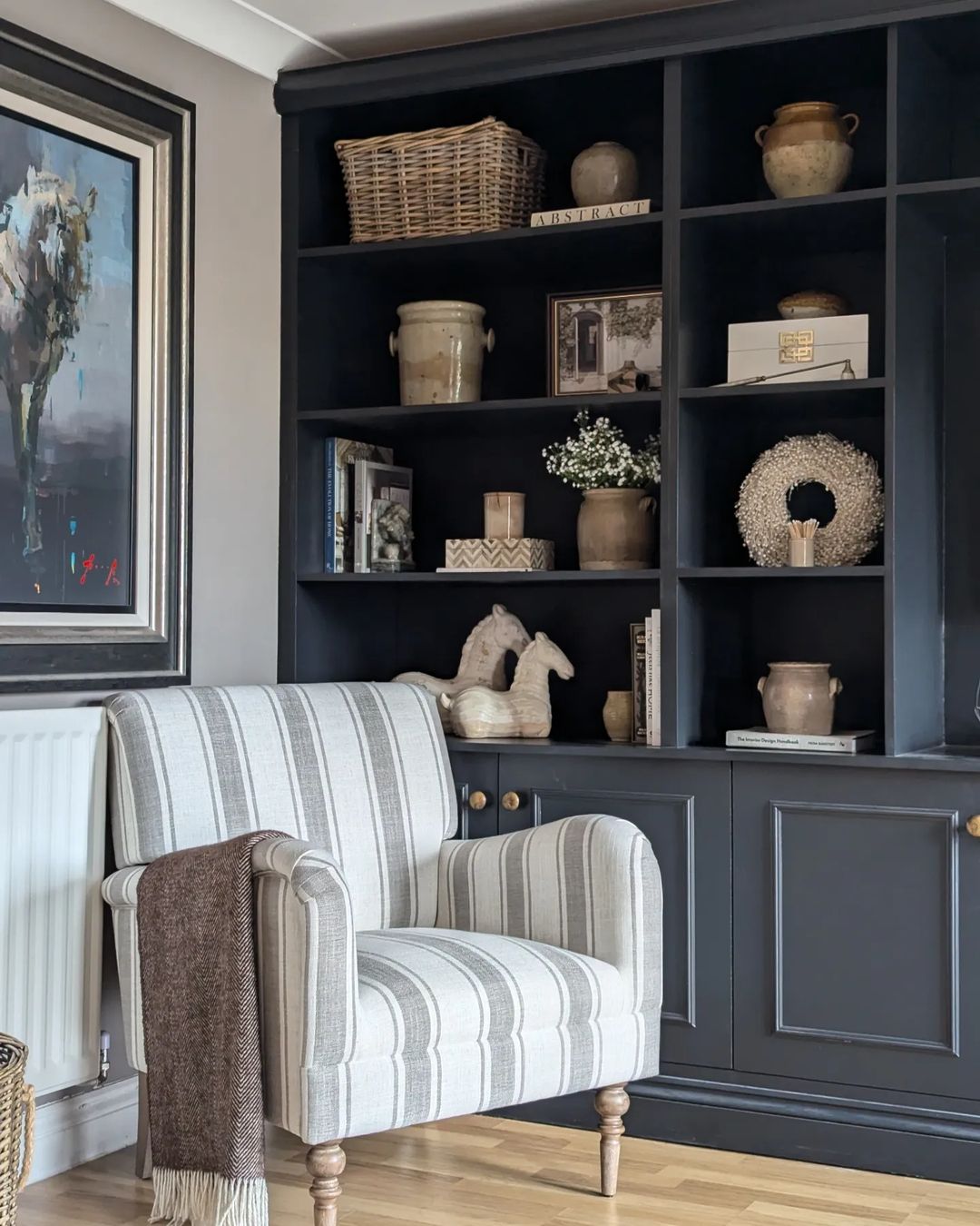
Image by lottiebownhome
I’ve tried this approach myself when styling my own built-ins, and it makes a world of difference. Dividing the shelves into smaller zones gives each collection its own space to shine, rather than having everything blend together.
I also found that stepping back to assess the overall look as I went helped me stay focused on balance and flow. Like Jacob suggests, keeping a limited color palette and allowing for negative space made the shelves feel curated rather than cluttered, adding a personal touch to the room.
4. Mix Wood and Metal for Custom Style
“I’ve found an innovative way to style built-in shelves is using wood tones and metal accents that complement the room’s decor. For example, in a rustic living room, we installed reclaimed wood shelves with black iron brackets. The wood added warmth, while the metal grounded the look, achieving cohesion and a custom feel.
For a client struggling with an eclectic home office, we used white oak boards and chrome rods for a sleek set of wall-to-wall shelves. The mix of wood and metal matched the contemporary and retro pieces in the space. We grouped items by type and size to give the shelving visual balance despite the variety.
Another trick is choosing shelf sizes based on what’s being displayed. For a kids’ playroom, short but deep shelves housed baskets of toys and games at eye level. Higher up, shallow shelves displayed favorite books, creating zones for different types of items. This organization helped contain clutter in the whimsical space. 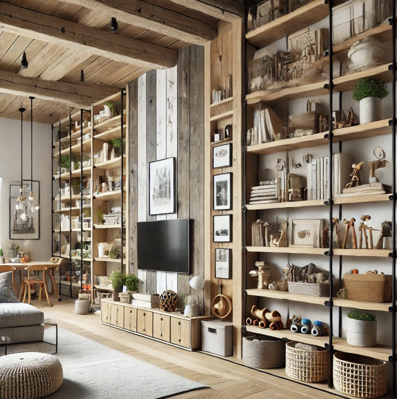
Homeowners struggling to balance collections and decor should start with an overall vision for the room. Then determine how shelving can complement that style in a custom way. Don’t be afraid to mix natural and industrial materials or group items attractively. With the right structure and styling, built-ins can highlight what you love while keeping a room cohesive.” – Richard Garrett, Managing Member, RG Construction Services, LLC
Richard’s strategy of mixing wood and metal accents is a great way to bring a custom feel to any room. The combination of warmth from wood and the grounding effect of metal creates a balanced yet striking design that ties in with various decor styles. Whether it’s in a rustic or eclectic space, this method can help homeowners create a personalized, functional, and cohesive look for their built-ins.
5. Start with a Unified Color Palette
“I always recommend starting with a color palette that complements the room. This creates a unified foundation, even when you’re displaying a variety of items. For example, if your room has a soft, neutral tone, try to stick with similar hues for the main pieces on your shelves—think white ceramics, muted picture frames, or a stack of linen-bound books. Then, use your personal items, like travel souvenirs or family photos, as accent pieces that provide pops of color or unique textures.
A great trick is to mix items of different heights and shapes. A small, framed artwork can sit beside a taller vase or sculpture. Varying the scale of objects helps the eye move naturally across the shelves, giving a sense of balance and interest. For homeowners who struggle with this balance, my advice is to start with a ‘less is more’ approach. Begin with a few meaningful pieces that you love, and build from there, layering in different textures and colors gradually. Don’t be afraid to edit—sometimes taking something away can make a bigger impact than adding more.” – JD Lloyd, Business Development Manager and Project Manager, Bella Virtual Staging
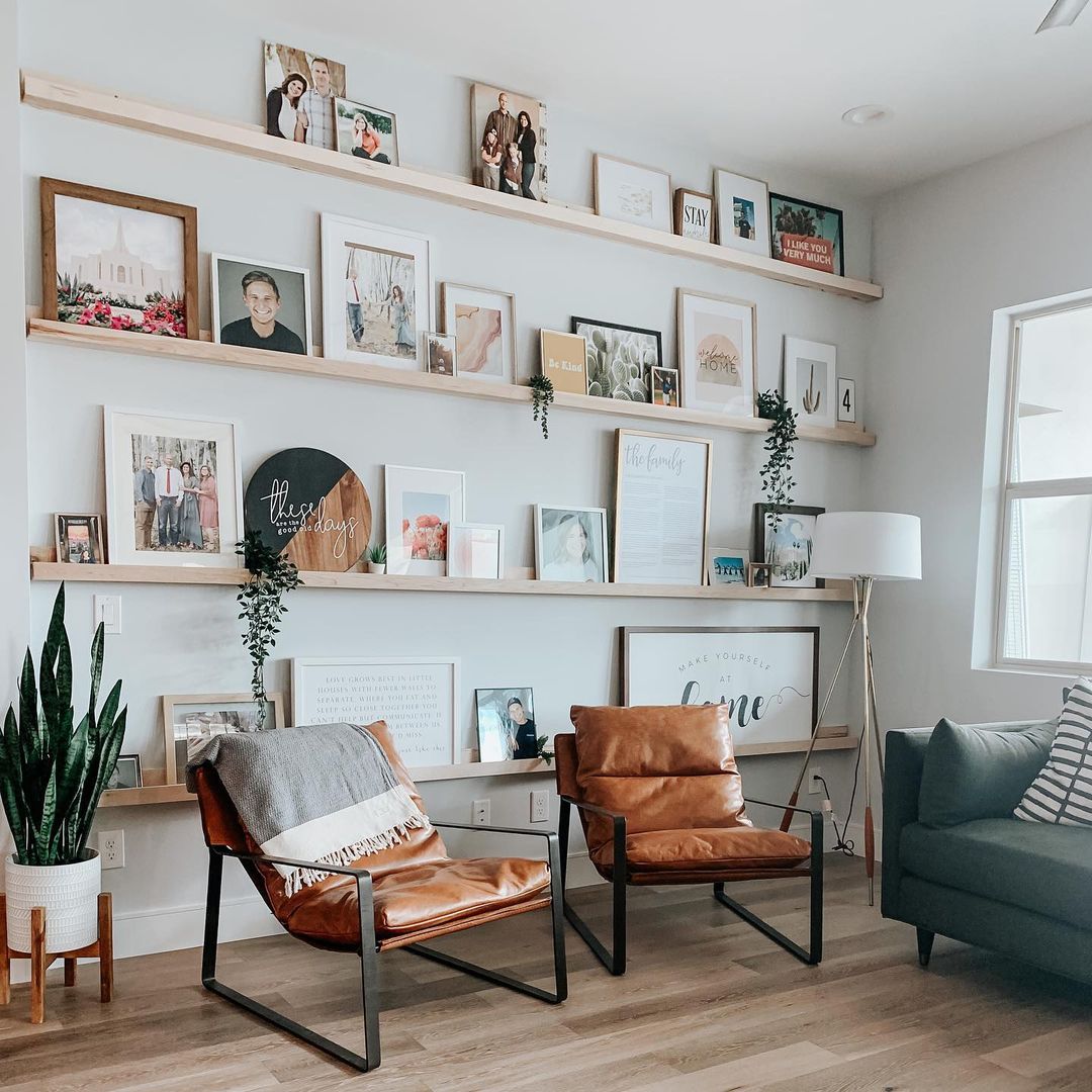
Image by homecrushdesignsllc
JD’s advice to start with a unified color palette is a smart way to ensure your shelves feel cohesive and organized, even with various items. Sticking to similar tones for larger pieces and using personal items for accent colors allows for a curated yet personal touch. Mixing different shapes and heights adds dimension, making your shelves both functional and visually appealing.
6. Custom Glass Shelving for Open Design
“I’ve found that custom glass shelving has been an innovative solution for many of our clients. We recently crafted glass shelving for a client’s bathroom to display her collection of succulents and cosmetics. The glass gave the space a spa-like feel while keeping it open and airy. She arranged her belongings at varying heights for visual balance and an uncluttered look.
Another client wanted to showcase his rare book collection without it seeming cluttered. We designed corner glass shelves in his library that graduated in size. The glass allowed the embossed covers to shine through, making the space feel cozy yet spacious.
For struggling homeowners, start by decluttering built-ins. Add back collections one by one, reviewing the look after each addition. Don’t hesitate to ask an expert for guidance. The result will be a custom focal point that reflects your unique style.” – Rich Main, Owner, Vista Glass
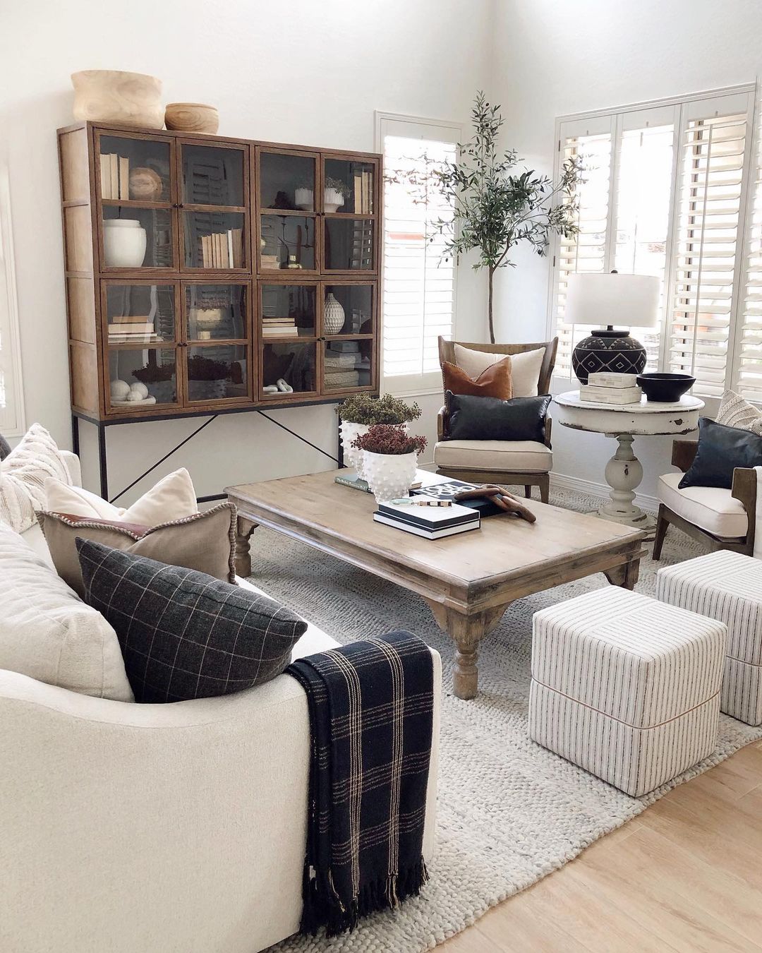
Image by desertdecor
Rich’s approach demonstrates the elegance of glass shelving in creating an open and airy design. The transparency of the glass not only allows collections to stand out but also blends effortlessly with surrounding decor.
By varying display heights and maintaining a minimalistic approach, homeowners can achieve a clean, cohesive, and spacious feel in any room, from bathrooms to personal libraries.
7. Use Wallpaper and Grouping for Impact
“Sorting, grouping, and choosing which pieces to display together and in which locations is a love of mine. I like to start by using wallpaper, or peel-and-stick wallpaper, as a backdrop to open shelves, which makes them feel like an element of their own, while still being part of the room as a whole. Think seagrass wallpaper for a soft, neutral room, or a deep color with a very tiny print (which makes it easier to match seams and creates a backdrop that doesn’t compete with your collectibles) for color-drenched rooms.
Next, ground your shelf corners by placing large pieces in the four corners, and create symmetry by matching a similar element here, whether it’s color, shape, size, or texture. Finally, fill in your shelves by grouping some similar pieces together in some areas, and placing single, larger pieces of interest in others.
Remember to vary the heights: placing three small sculptures next to each other will feel like a row of Hot Wheels—not what you want in your living room! Instead, add an object with height and try placing one or two sculptures on top, and another grouping on the shelf next to it.
My favorite trick is to search flea markets and thrift shops for unique lacquered or bamboo boxes, but any other flat element to create this height, such as several books stacked on their sides, will do.
Finally, shelf styling is very much like completing a puzzle; you’ll need to try a piece to see if it fits, and if it doesn’t, try it in another spot until you like what you see!” – Zeenat Siman, Professional Organizer and Productivity Consultant, Firefly Bridge Organizing.
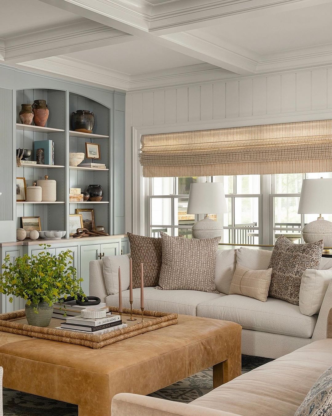
Image by julialongchampsdesign
Zeenat’s approach to using wallpaper and grouping decor adds depth and personality to built-in shelves. By grounding the corners with larger items and varying heights of smaller pieces, she creates a balanced yet visually interesting display. Her creative trick of using flea market finds to elevate decor adds an extra layer of charm and individuality.
8. Style with Triplets and Complementary Colors
“When styling built-in shelves, using items in triplets is always nice. Use varying sizes. You can use one color for each grouping or different hues in the triplet. Display things that have meaning for you, such as travel souvenirs or family heirlooms. Don’t be afraid to turn items at angles or lay books sideways for dramatic effects.
Different patterns can always be used in decorating, as long as the same colors are used. Maybe choose no more than three. You can mix and match stripes with polka dots, florals, and paisleys, as long as you remember the colors you want to accentuate.
But for styling shelves in the same built-in, you need to be mindful of colors that go together with the rest of your displayed items. Knowledge of the color chart is suggested to learn about complementary colors.” – Cori Cann, Home Stager and Interior Decorator
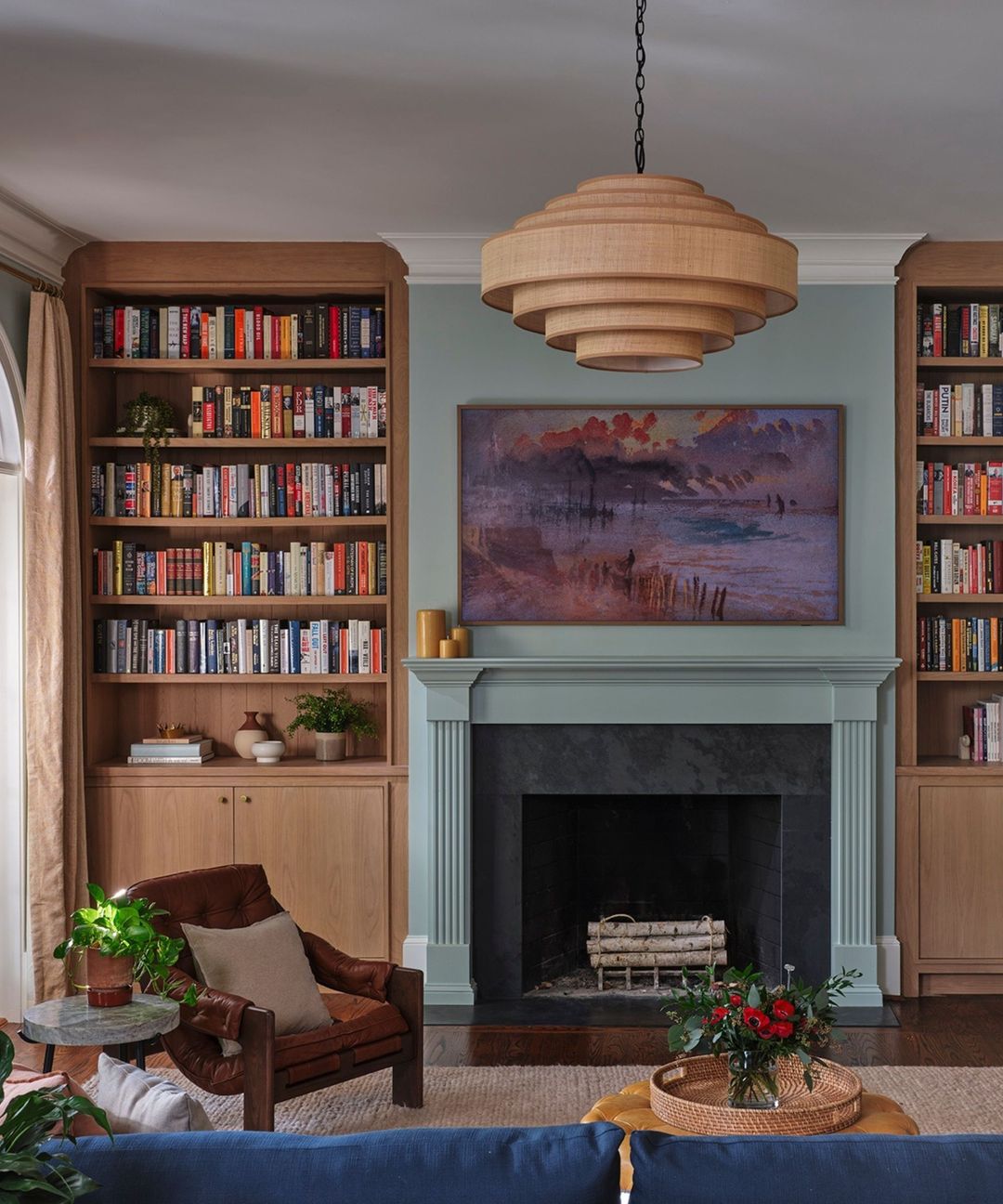
Image by homesandgardensofficial
Cori’s approach to using triplets and complementary colors adds a creative yet structured touch to styling shelves. Grouping items in sets of three with varying sizes keeps the display interesting, while paying attention to complementary colors ensures that everything flows well together.
Using patterns and bold arrangements can add dramatic effects without overwhelming the overall design.
9. Maximize Lighting for Artwork Display
“It all depends on the collections or artwork you want to showcase. Personally, I prefer built-in shelves because they give the collection a sense of permanence and stability. No matter the decor, a collection or artwork requires good lighting. Without it, items just blend into the shelving.
Clean, white shelves or glass shelves also help to shed light on the artwork. White shelves, although they might seem stark, are modern, crisp, and clean. There is nothing to draw the eye away from the collection. Glass shelves can be either modern or traditional. In either case, light shines through each shelf, giving maximum brightness to the collection.
If you cannot have built-in shelving, make it look like built-ins with pieces of trim to blend into the walls. If possible, go floor-to-ceiling to maximize usable space and consult a cabinet maker who specializes in custom cabinetry.” – Sara Getzkin, Professional Organizer & Owner, Hands On Organizing Services
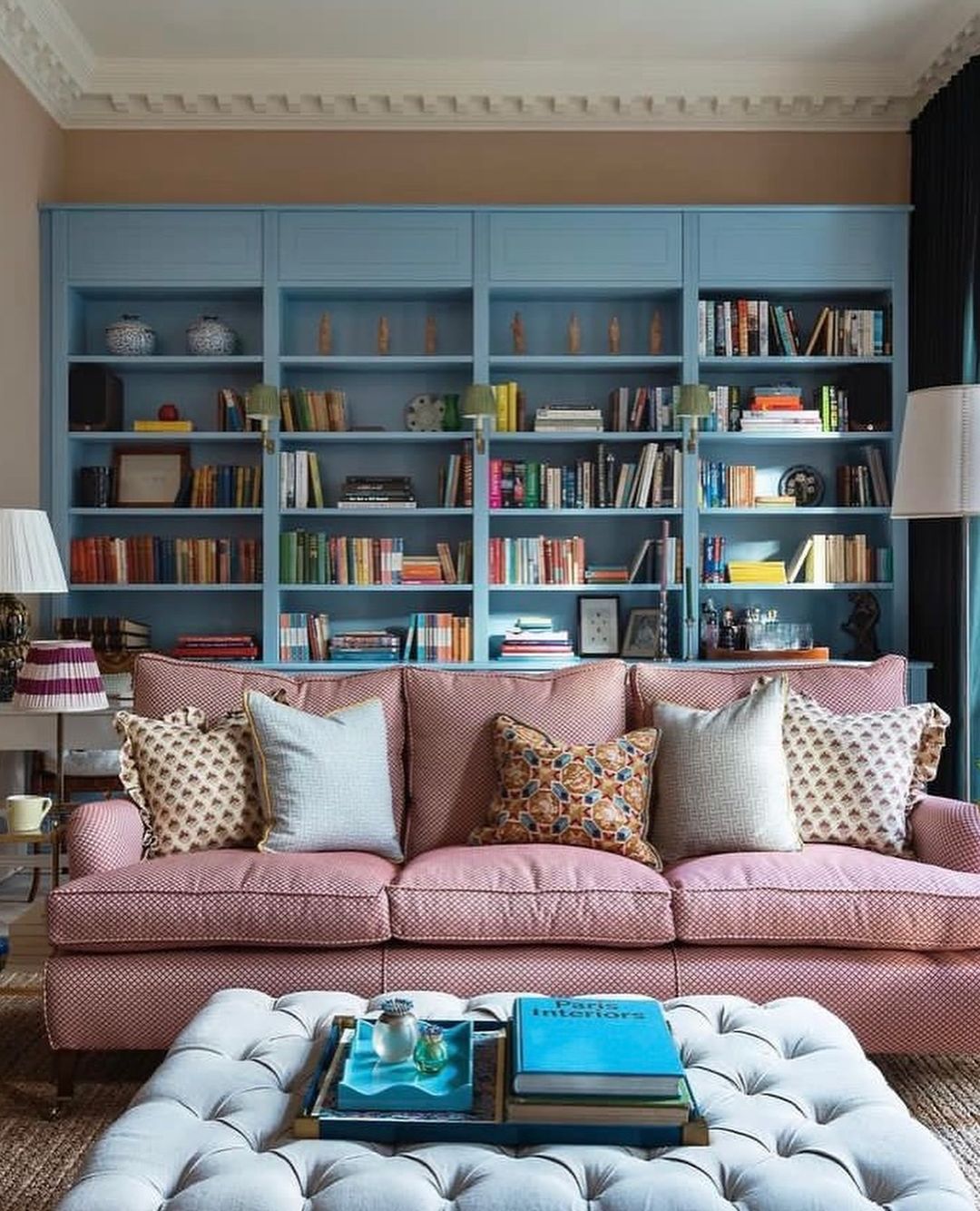
Image by haverhill.home
Sara’s focus on lighting highlights how crucial it is to properly illuminate artwork and collections. Using white or glass shelves allows the light to enhance the items on display, ensuring they stand out. For those without built-in shelving, mimicking the look with trim and maximizing space from floor to ceiling creates a sleek, functional display that can still highlight your pieces beautifully.
10. Paint Shelves and Use Wallpaper for Unity
“Collections do not need to look out of place or disconnected from the rest of your room. First, paint the shelves a color that complements the room decor to tie them into the rest of the space. Then, apply peel-and-stick wallpaper to the back of the built-in behind the shelves. The wallpaper should pull in some of the colors that exist throughout the rest of the room, as well as a unique color or two. This provides a cohesive look but also indicates that the space is something special. I did this in my own home, and visitors always call it out!
When arranging artwork, invest in a few battery-operated picture lights to call attention to the important pieces. This can give a very high-end, gallery look.
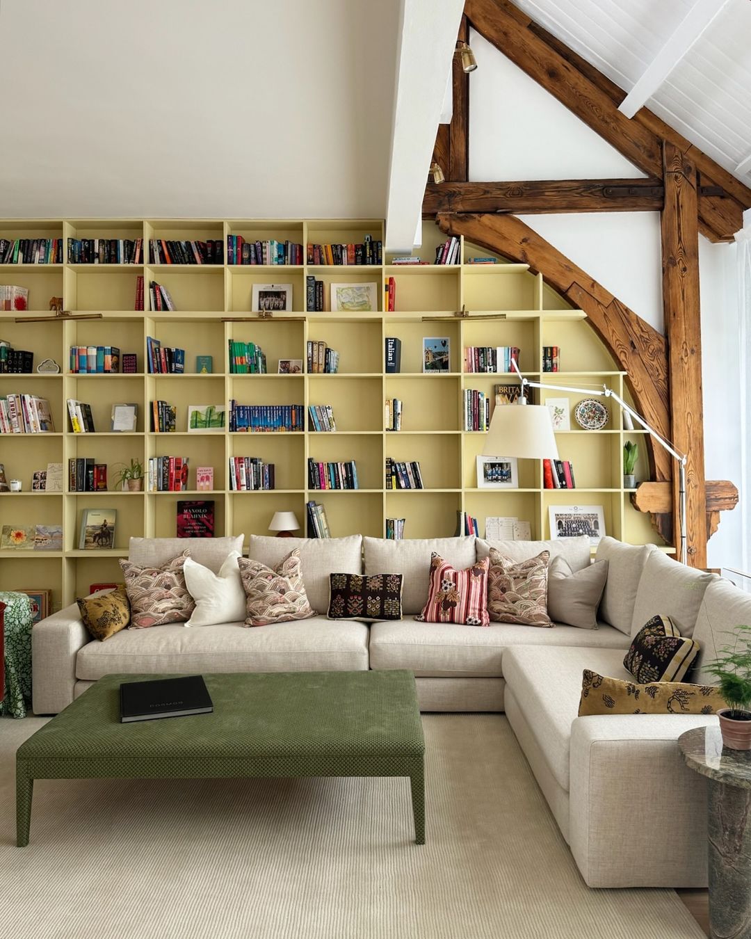
Image by goodboneslondon
To best showcase collectibles or figurines, raise them up so not everything in your collection is on the same level. One way to do this is by using a pedestal with a cloche. Another is to situate the item on a small stack of books. Remove any bright book jackets and make sure the covers are similar muted colors so the focus remains on the collectible. Even minimal elevation will subtly highlight the collectible.
My advice to homeowners struggling to achieve this balance would be to not overdo it. Select only key pieces of your collection and leave open spaces on the shelves. To showcase more pieces, periodically rotate out the collectibles or artwork on your shelves.” – Kristin Aldridge, Professional Organizer & Owner, Haven Home Organizing
Conclusion
Styling built-in shelves can turn them into a standout feature in your home. Using ideas like spreading decor throughout the room, adding glass shelves for a light, open feel, and creating visual zones can make a big impact. I’ve tried some of these methods myself, like starting with a unified color palette or mixing wood and metal accents, and it really transformed my space. Even small changes like adding wallpaper behind the shelves made them feel more connected to the room.
These expert tips are a great guide for getting creative with your shelves. Don’t hesitate to try different ideas, whether it’s playing with heights, textures, or adding personal items that mean something to you. A little experimentation goes a long way in creating a cohesive and personal look that will make your shelves a focal point in any room.
