
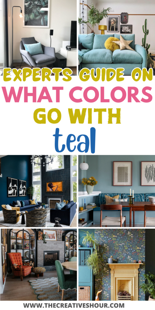
Teal—it’s that magical color that manages to be both bold and calming at the same time. It brings a pop of energy to a room without feeling too overpowering, making it a favorite for living room makeovers.
Whether your style leans modern, coastal, or somewhere in between, teal can be the perfect anchor to ground your space.
But here’s where it gets tricky—teal is bold, and pairing it with the right colors is crucial to maintaining that balance between vibrant and cozy. Too much, and your room feels overwhelming; too little, and it loses its charm.
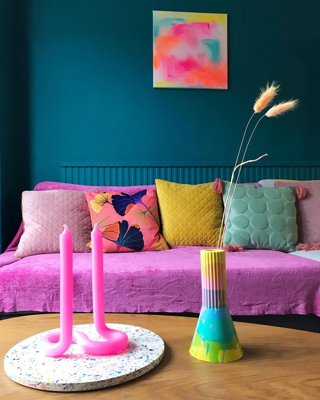
Image by nia_does_diy
That’s why I turned to a few interior design experts to help crack the code on pairing teal with the perfect complementary shades. They’ve shared tried-and-true palettes that not only make teal shine but also create a harmonious, stylish space.
So, whether you’re thinking of adding teal through paint, furniture, or decor accents, these expert tips will give you the confidence to go bold and still keep your living room feeling balanced and inviting.
1. Pair Teal with Warm Earth Tones
“In one of our recent projects, we paired teal with warm terra-cotta and muted gold accents to create a vibrant yet soothing atmosphere. This palette not only complemented the teal but also brought out its depth and versatility.
For anyone looking to balance bold colors like teal, I recommend using neutral tones or warm earthy colors to create harmony and continuity. These combinations can transform a space into a serene yet dynamic environment, perfect for modern living rooms.” – Brad Smith, CEO & Interior Designer, Omni Home Ideas.
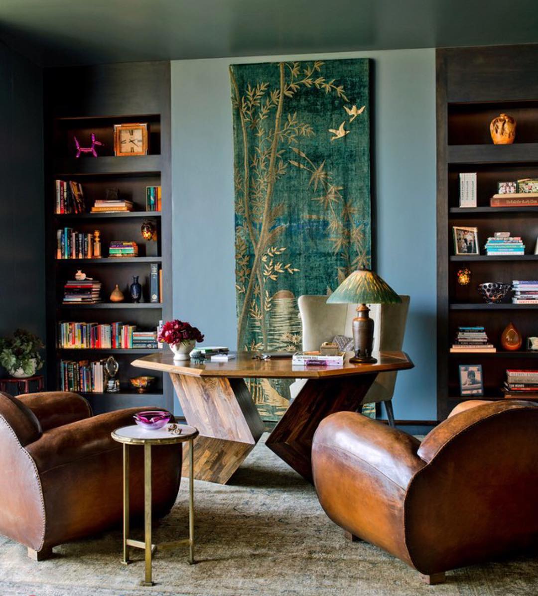
Image by kristenrivoli_interiordesign
Brad’s use of earthy tones like terra-cotta and gold is a game-changer for those hesitant to work with teal. These warm accents don’t compete with the boldness of teal; instead, they highlight its richness, creating a beautiful balance.
I couldn’t agree more with his advice—when working with strong colors, it’s essential to introduce neutrals or softer hues to ground the space.
If you’re aiming for a room that feels lively yet relaxed, consider incorporating these earthy shades through cushions, throws, or even a rug. The result will be a living room that feels both inviting and elegant without feeling too loud.
2. Teal and Sand for Coastal Vibes
“As an architect specializing in sustainable home design, I often recommend color palettes featuring shades of teal paired with warm neutrals. For a teal living room, I would suggest light tones of sand, cream, or beige.
In one project, we used ‘Seafoam’ teal walls with accents of creamy white on the trim and ceiling. The neutral backdrop allowed the teal walls to shine while keeping the space bright and airy. For contrast, wood furnishings in a natural finish warmed up the look.
My advice is to choose a warm neutral base, adding pops of teal through decorative accents. Keep the teal bold but balanced. A neutral canvas gives teal room to be the star, while wood tones ground the space. The pairing of teal and sand creates a coastal, relaxed feel that is energizing yet soothing.” – Pam Hutter, Principal, Hutter Architects.
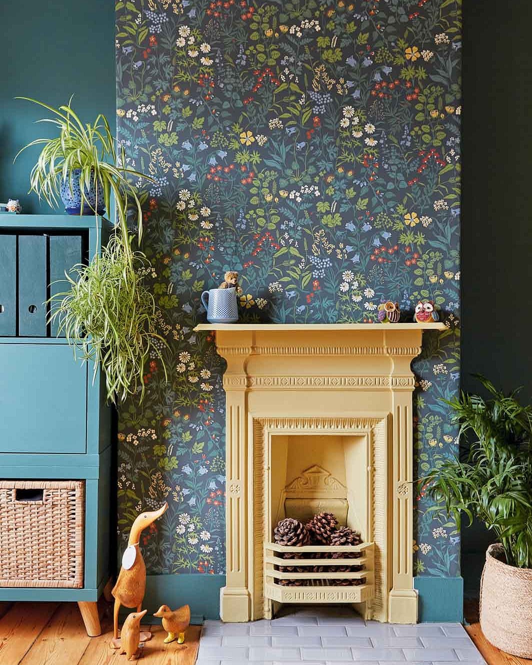
Image by homestylemaguk
Pam’s approach is perfect for anyone seeking that breezy, coastal vibe in their living room. The combination of teal with soft sand or cream tones immediately conjures up images of peaceful beach escapes.
I love how she suggests using wood furnishings to add warmth—this is a subtle but powerful way to bring texture and coziness into the space.
If you want to evoke that fresh, seaside feeling without going full-on nautical, try adding sandy-toned rugs, creamy pillows, and wooden coffee tables. The teal will stand out beautifully against these neutral, natural elements, creating a relaxing yet vibrant coastal retreat.
3. Balance Teal with Light Gray and Orange
“My favorite colors to combine with teal include light grays and bright oranges.
The combination of light gray and teal creates a very modern yet serene atmosphere. It also has just enough brightness to add energy to the space without overwhelming the occupants.
I add bright orange to the mix to add even more energy and to create focal points. For example, adding bright orange pillows in a predominantly teal and gray living room draws attention from guests, inviting them to have a seat and stay as long as they’d like.
With that said, the best way to balance any bold colors with teal is to use it very sparingly. Teal is already a fairly bold color, so too much of another bold color can ruin any cohesion in the space. Save the bold colors like orange for small focal points.” – David Silva, Interior Designer, HomRem LLC
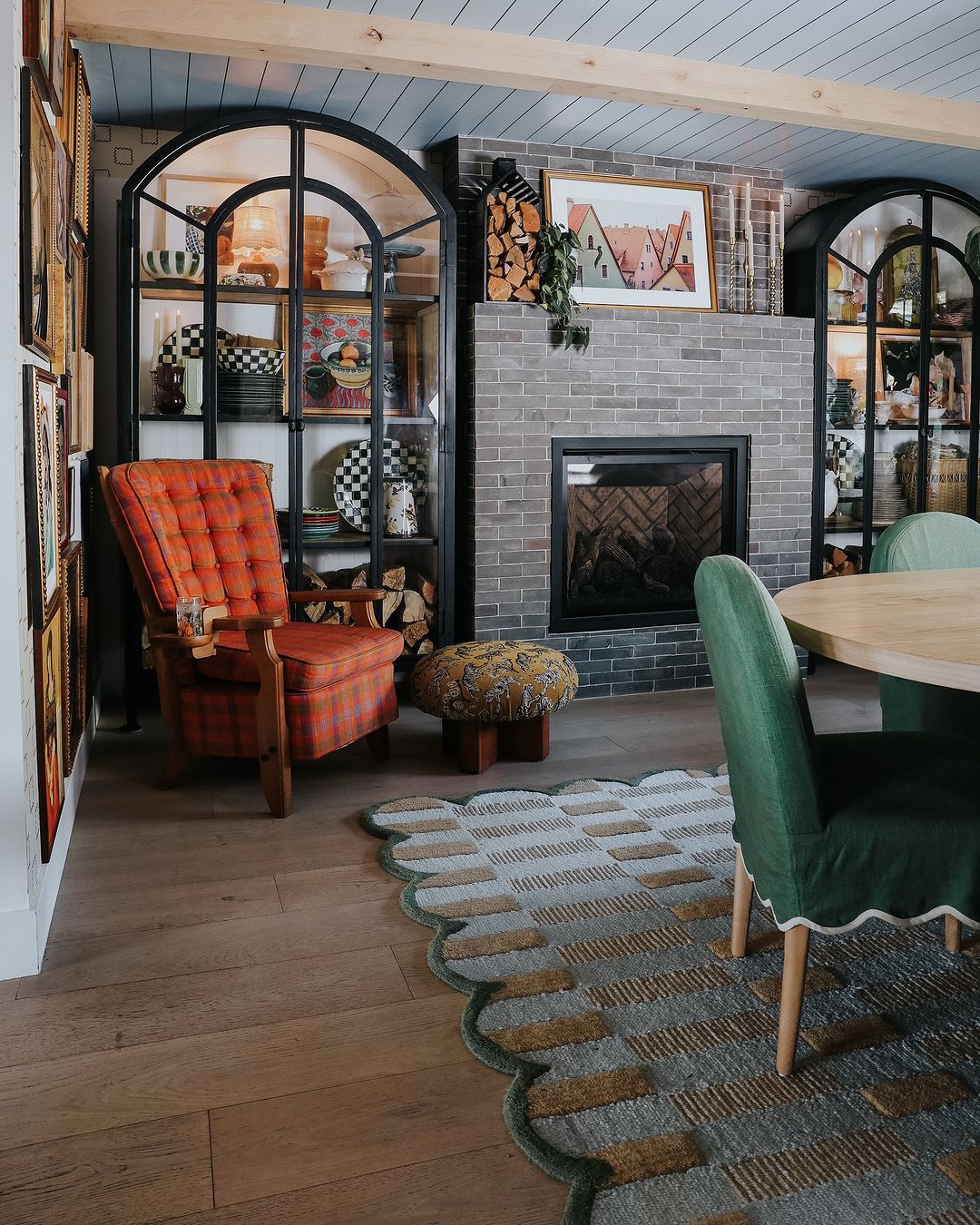
Image by nestingwithgrace
David’s suggestion of pairing teal with light gray creates a sleek, modern vibe that’s perfect for those who want an understated yet dynamic look. The addition of bright orange as an accent is genius—it injects energy without overpowering the room.
I agree with his advice to use bold colors sparingly, especially when working with already vibrant hues like teal.
If you’re trying this at home, think small accents: an orange throw pillow here, a vase there. Keeping the pops of orange minimal will ensure your space stays balanced while adding just the right amount of playful energy.
4. Contrast Teal with Burnt Orange and Mustard
“As an expert in building ADUs, I often suggest color palettes to clients that provide visual contrast while keeping spaces cohesive. For a teal living room, I would pair it with warm shades of burnt orange and mustard yellow.
In one project, we used “Pumpkin Orange” on an accent wall with teal furniture. The bold orange anchored the space while the teal popped. For a muted look, terra-cotta or golden yellow work well with teal. The warm undertones harmonize as the teal focal point.
My advice: Choose one vibrant accent color and use it sparingly, like on an accent wall or through decor. Keep other walls neutral, allowing teal to shine while balancing warmth. Start with a palette you love, adjusting as you add furnishings and art to achieve a bold and cozy atmosphere.
The contrast of teal and warm hues creates an energetic yet grounded space.” – Richard Garrett, Managing Member, RG Construction Services, LLC
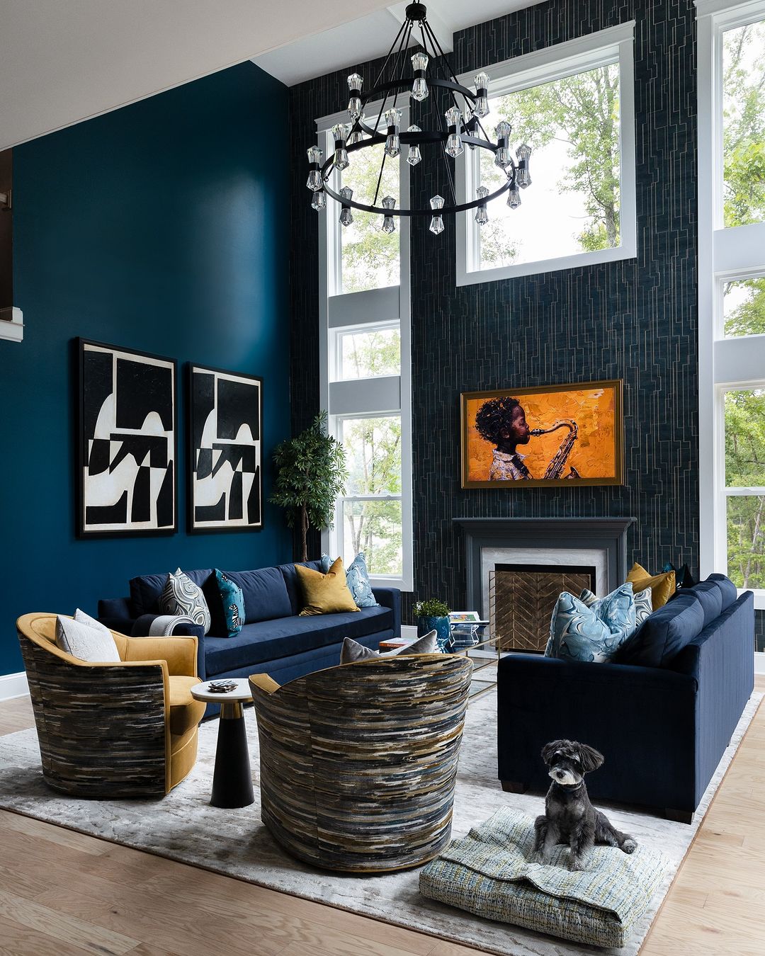
Image by randrinteriordesign
Richard’s use of bold colors like burnt orange and mustard to contrast teal is a fantastic way to add warmth and depth to a space. I love the idea of using these rich hues sparingly to avoid overwhelming the room.
If you’re looking to try this at home, consider starting with an accent wall or a few statement pieces, like a burnt orange armchair or mustard throw. Keeping the rest of the room neutral ensures that teal remains the star, while the contrasting colors add a playful and sophisticated touch.
5. Complement Teal with Neutrals and Navy
“Last year, I purchased and flipped a house in Lakewood, WA, that had teal walls in the living room. Initially, I was a bit hesitant about the color choice because it is such a bold and vibrant hue. However, after some research and experimenting, I found a specific color palette that worked incredibly well with teal in the living room design.
I selected a color palette to complement the teal walls, featuring warm neutral tones—beige and cream—accented by vibrant mustard yellow and deep navy blue. This combination not only balanced out the boldness of the teal but also created a cozy and inviting atmosphere in the living room.
The mustard yellow added a touch of warmth, while the navy blue provided depth and contrast. The overall effect was stunning, attracting numerous compliments from potential buyers during open houses, and the property was quickly sold.
When working with bold colors like teal in a living room design, don’t be afraid to experiment with different palettes until you find one that suits your taste and style. Remember to balance out the intensity of the bold color with warm neutrals and use it as an accent rather than the main focus.” – Keith Sant, Founder & CEO, Kind House Buyers
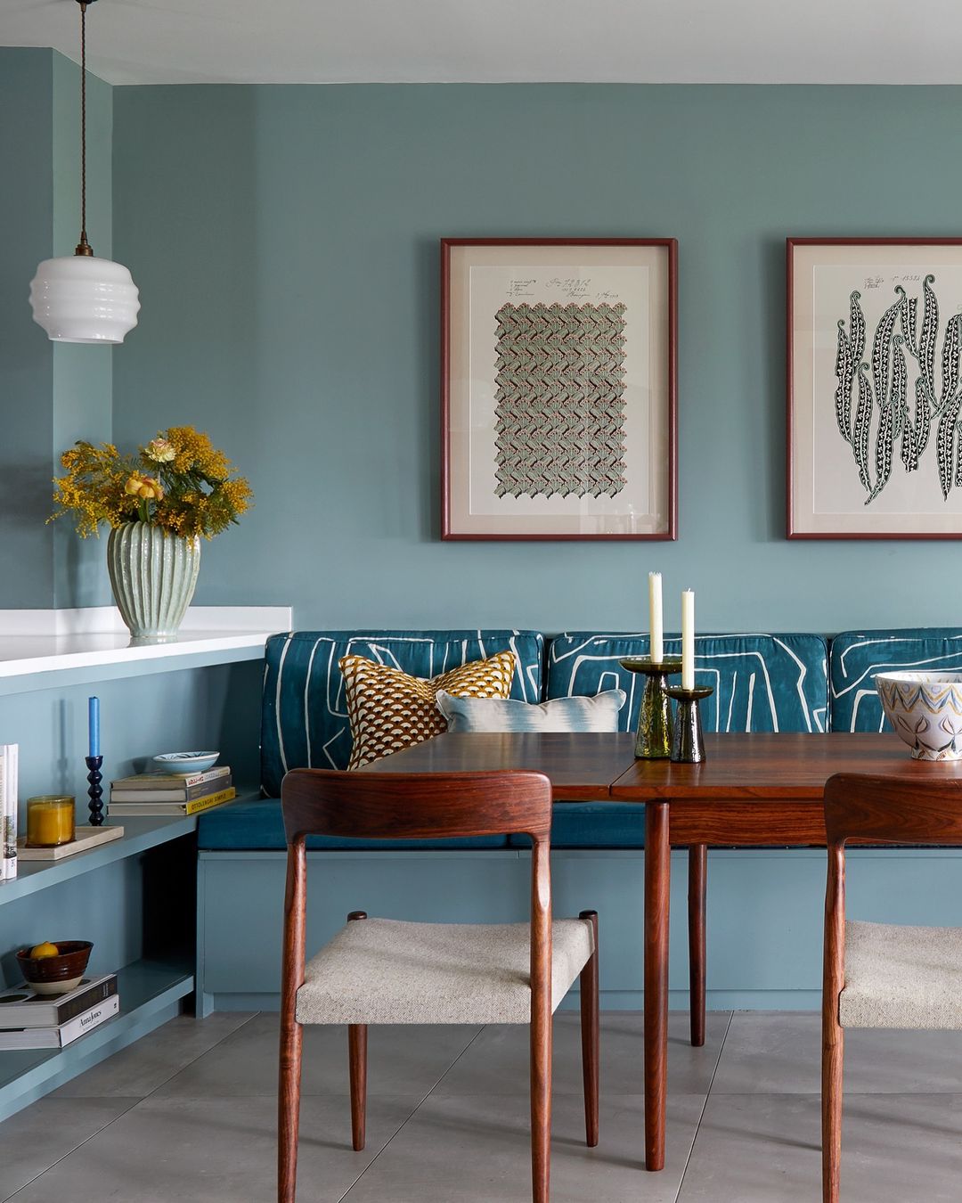
Image by lick
Keith’s use of deep navy and warm neutrals like beige with teal is a wonderful example of how contrast and cohesion can work together. The navy adds depth and sophistication, while beige softens the space, making it feel more inviting.
I agree with Keith’s advice on experimenting with palettes—sometimes the perfect balance is found through trial and error. If you’re nervous about using bold colors, try adding navy through smaller decor items like cushions or rugs, and use beige as a backdrop.
This way, you can adjust the intensity of the colors until you find a mix that feels just right.
Tips for Styling Teal in Your Living Room
Teal is a bold, eye-catching color, but styling it the right way can make all the difference in creating a balanced, beautiful space. Whether you’re adding subtle teal accents or going all-in with teal walls, these tips will help you work with this versatile color and bring out its best qualities.
1. Start Small
If you’re just dipping your toes into the world of bold colors like teal, it’s best to start small. Try introducing teal through decorative accents like pillows, rugs, or artwork before going all-in with a painted wall. This allows you to get a feel for how teal fits into your space without making a big commitment.
Plus, it gives you the flexibility to swap out pieces if you decide to change the palette later.
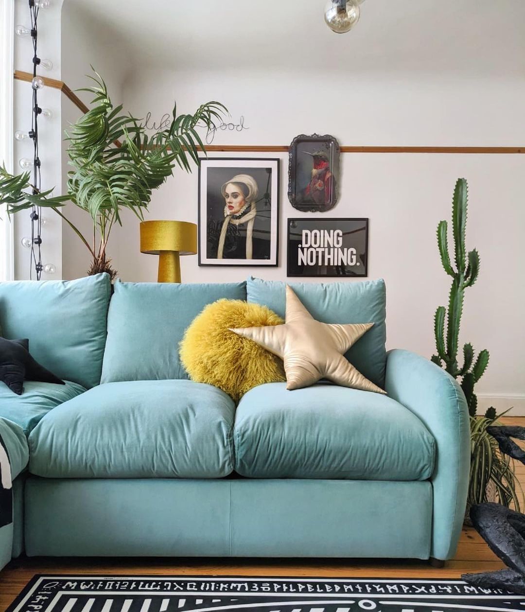
Image by snugsofa
2. Use Lighting to Your Advantage
Teal is a chameleon when it comes to lighting—it can look completely different in natural versus artificial light. During the day, it may take on a vibrant, lively tone, while at night, it can appear deeper and moodier. To make sure you love the way teal looks at all hours, consider the lighting in your space.
Test out how teal behaves with your room’s lighting before making major changes. This way, you can ensure the color will work beautifully throughout the day and night.
3. Mix Textures
Teal pairs beautifully with a variety of textures, and adding different materials into the mix can really elevate the look. Try velvet teal cushions for a luxe, cozy feel, or use a teal glass vase for a sleek, modern touch.
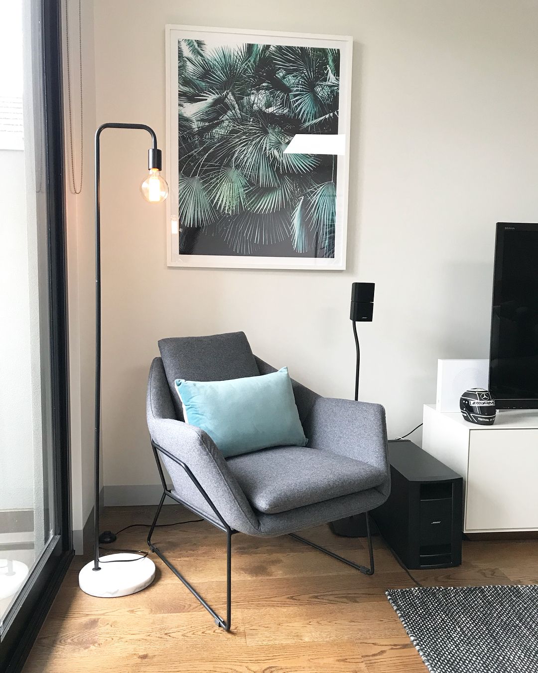
Image by alx.sstudios
Mixing textures not only adds depth to the room but also softens the boldness of the color, making the space feel more dynamic and inviting.
4. Balance with Natural Elements
Teal looks incredible when paired with natural elements like wood, plants, or woven baskets. These organic materials help ground the boldness of teal and create a harmonious balance in the room.
Consider adding a wooden coffee table or incorporating plants with rich green tones to enhance the natural feel of the space while still letting teal shine.
Conclusion
Teal offers a world of possibilities when it comes to elevating your living room’s design. Whether you opt for the soothing contrast of warm earth tones, the coastal vibes of sandy neutrals, or the striking combination of bold accents like burnt orange and mustard, teal’s versatility allows it to shine in any setting.
The expert insights provided show just how adaptable teal can be when paired thoughtfully.
Now it’s your turn to get creative. Don’t be afraid to experiment with different palettes and combinations until you find what feels right for your space.
Whether you go for subtle accents or a full teal statement wall, the perfect color balance can make all the difference in transforming your living room into a beautiful, personalized retreat.