

Red is a bold and beautiful color that can instantly make any space feel warm and inviting. But choosing the right shade is often overwhelming, considering there are so many options to choose from—like soft terracotta to deep burgundy.
To make it easier, we’ve gathered 9 expert tips to help you pick the perfect red paint for a cozy, welcoming atmosphere.
1. Dynamic Red Shades for Versatile Impact

Image by edwardbulmerpaint
“I have found that specific red paint shades such as Benjamin Moore’s “Caliente,” Sherwin-Williams’ “Cayenne,” and Farrow & Ball’s “Incarnadine” stand out for their versatility and impact. Each of these shades carries slightly different undertones–ranging from warm, earthy notes to vibrant, jewel-like richness–that can dramatically influence a space’s ambiance.
For example, I worked on a contemporary dining room project where homeowners sought a lively yet elegant atmosphere for social gatherings. After discussing their preferences and lifestyle, I chose Sherwin-Williams’ “Cayenne,” a sophisticated red with burnt orange undertones, for the focal wall color. Here is how I executed the project:
1. Lighting Conditions: This room received ample daylight but relied on warm LED lighting in the evenings. “Cayenne’s” earthy undertones softened any harshness in bright daylight while creating a glowing warmth under evening light. I tested large sample swatches at different times of the day to ensure the color achieved the desired mood.
2. Room Purpose & Psychological Impact: Red, known for energizing and stimulating appetite, is ideal for dining spaces. However, overly saturated or bluish-reds can feel overpowering. “Cayenne” balanced vibrancy and approachability, adding character while maintaining a grounded feel.
3. Existing Decor & Contrast: The room’s walnut furniture and neutral-toned rug harmonized beautifully with “Cayenne’s” orange undertone. This created cohesion while allowing the red to stand out without overwhelming the space.
A key takeaway from this project was the importance of pre-application testing. Lighting drastically affects red tones, so observing swatches in different lighting conditions is essential. Striking a balance between bold red and complementary tones prevents a chaotic or overwhelming atmosphere.
Advice for Homeowners Considering Red as a Focal Point:
1. Start Small: Experiment with red on an accent wall or furniture piece before committing to an entire room.
2. Test Samples: Apply paint swatches directly on walls and observe them over several days under varying lighting conditions.
3. Balance with Neutrals: Pair red with whites, grays, or soft beiges to ground its intensity and maintain balance.
4. Understand Undertones: Reds carry undertones–cooler shades hint at blue, while warmer ones lean toward orange or brown. Choose a shade that complements existing furniture, flooring, and fixtures.” – Seymen Usta, CEO, Interior Design Specialist, Modern Chandelier
2. Creating a Warm Entryway with Radicchio
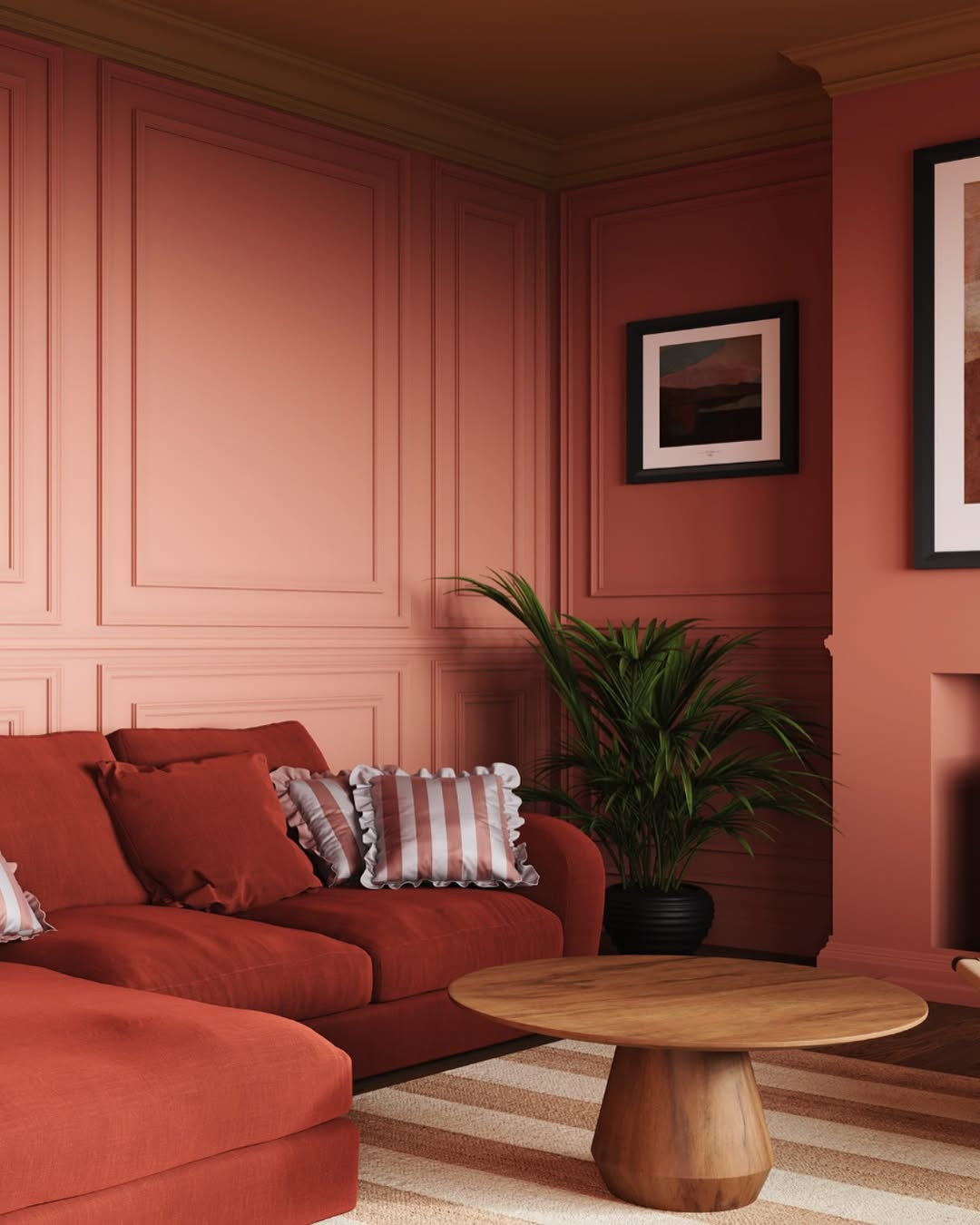
Image by yes.colours
“In my role as co-owner and lead designer at Bonsai Kitchen Bath and Flooring, I have worked extensively on creating inviting yet dynamic spaces, particularly through color choice. One of my favorite red shades to use is ‘Radicchio’ from Farrow & Ball. It’s a deep, luxurious hue that beautifully complements both traditional and modern settings, making it ideal for spaces like an accent wall in living rooms or entryways.
In a past project, we applied Radicchio in a client’s entryway to create a warm and welcoming first impression. The space had moderate natural lighting, which helped to soften the intensity of the color, highlighting its richness without becoming overpowering. We balanced it with softer neutrals and varied textures in surrounding decor to prevent the room from feeling too intense. My key advice when using red is to evaluate the lighting throughout the day and pair it with furnishings that don’t compete but improve the warmth of the hue.” – Kristin Hintlian, Owner, Bonsai Kithcen, Bath & Flooring
3. Transforming a Dining Room with Caliente

Image by deco.dwelling
“The secret is selecting a shade depending on the lighting, size, and general atmosphere you like to create for the room.
One of my favorite projects was transforming a boring, uninspired formal dining room. The homeowners wanted a place that felt classy yet promoted active conversation. After assessing the room’s limited natural light and modest size-but with high ceilings-we decided on Benjamin Moore’s Caliente (AF-290), a deep, rich red with just enough warmth to feel welcoming without overpowering the space.
We used warm brass accents and gentle white wainscoting to counter the strong color. This gave the area a classic, timeless feel and prevented it from becoming overly dark. Making sure the red didn’t tilt too strong in the evening under artificial lights presented one surprising difficulty. We added soft-glow warm LED lighting to combat this, which kept the area feeling pleasant instead of austere.
Consider the undertones. Some reds lean too orange or too blue; try swatches under various conditions to make sure the tone remains balanced all day. Use contrast to ground your items. Red used with neutral trims, gentle textures, or natural wood tones helps to avoid it from feeling overwhelming. Lastly, consider the use of the space. Reds are great for accent walls, dining rooms, and doors but could be too energizing for a bedroom or office.” – Matthew O’Grady, Director, Thomas Matthew Kitchens & Furniture
4. Balancing Red with Lighting and Trim
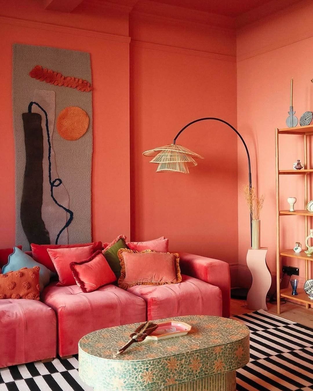
Image by interiorsocialclub
“Red can be tricky if the balance is off. A strong color like that needs to work with the room’s size, natural light, and surrounding finishes. In this case, keeping the trim and ceiling light helped prevent the space from feeling closed in. Homeowners looking to use red should test a few swatches in different lighting before committing.
Deep, earthy reds work better than bright, fire-engine tones when trying to create a space that feels bold but still inviting. We once used a rich brick red in a formal dining room remodel, paired with warm wood paneling and soft gold accents. The space had high ceilings, so the deeper red helped ground the room without making it feel overwhelming. The trick was making sure the lighting was warm–cool LEDs would have made the red feel harsh. At the end of the day, red works best when the undertones complement the space instead of fighting against it.” – Danny Niemela, Vice President & CFO, ArDan Construction
5. Cranberry Accent Wall in Open-Concept Space

Image by theexpert
“Sherwin-Williams Cranberry’s vibrant yet warm hue creates an inviting, dynamic, and cozy atmosphere. We decided to use this color as an accent wall for a recent project involving a spacious open-concept kitchen and dining area.
The selection process was guided by several criteria: the room’s size, the amount of natural light it received, and the desired mood. The kitchen had large windows that flooded the space with light, so the cranberry shade popped without overwhelming the senses. We strategically placed this color on the wall behind the dining table, making it a focal point that drew the eye and encouraged conversation during meals.
The importance of balance was paramount for this project. To ensure the red didn’t dominate the space, we paired it with soft, neutral tones for the cabinetry and countertops to create a harmonious contrast. Various textures, like a wood dining table and metal accents, add depth.
For homeowners thinking about introducing red into their interiors, I advise carefully considering the surrounding colors and materials. The palette should be cohesive and highlight the red without making it feel isolated. Testing samples on the wall and observing how they change throughout the day can also prevent surprises.” – Josh Qian, COO and Co-Founder, Best Online Cabinets
6. Combining Red with Elegant Nuances

Image by lucidasnforddeisgn
“Red almost always creates a dynamic feeling in the home, but it can also easily feel overwhelming.
In fact, it seems that red has been around forever, before all the millions of off-tones were even discovered.
Because of its long history and years of abuse, you have to be very careful not to make it feel ordinary or Moulin Rouge.
So whether it is a pure lipstick red or a more lobster coral, a blood orange or oxblood, you always want to combine it with an elegant, understated nuance.
For example, I used cerulean blue, but lighter blues like baby powder or milky sky are great counterparts to tone down the red.
If there is a dampening counterpart to the red, like a soft blue, you can easily bring in black and white for an even more extravagant look.” – Daniela Gottschalk, Interior Designer, Tinzeltown
7. Caliente for a Cozy Dining Room
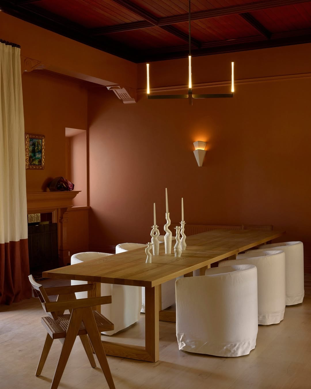
Image by VogueLiving
“One of my favorite red paint shades for creating a dynamic yet inviting space is Benjamin Moore’s ‘Caliente AF-290.’ It’s a bold, rich hue that feels energetic yet warm. I recently used it in a dining room to create a lively, conversation-friendly atmosphere.
The room had ample natural light, which softened the intensity of the red and brought out its warm undertones. The dining furniture was kept neutral with black and white accents to balance the vibrancy of the walls. My selection criteria revolved around the room’s size; it was moderately spacious but not overly large, so the red created a cozy, intimate feel rather than overwhelming the space.
One essential tip for homeowners considering red as a focal point is to test it under various lighting conditions to see how it interacts with both natural and artificial light. Also, pairing red with complementary colors or textures can help strike the right balance. Red is bold, so less is more when it comes to additional decor elements in the room.” – Ketie Zhang, Founder, Ketie Story
8. Terracotta Cabinets for Vibrant Kitchens

Image by paintandpaperlibrary
“In my role at G&M Craftsman Cabinets, I’ve learned that color choices in designs can significantly impact the ambiance of a space. While cabinetry is our primary focus, color integration plays a vital role in achieving harmony. For creating dynamic yet welcoming environments, a pragmatic approach is to balance bold colors with neutral or earthy tones. One project involved a client seeking a vibrant yet cozy atmosphere. We chose a rich terracotta shade for cabinetry, which provided a warm, inviting contrast to natural wooden countertops.
The key to making bold colors work is ensuring they complement the space’s existing features and natural lighting. In this terracotta project, we observed how the color’s warmth played against the incoming sunlight throughout the day, enhancing the kitchen’s lively yet homely feel. My advice to homeowners considering bold focal colors is to test different shades with their existing elements and observe how lighting influences the color dynamics. This method helps maintain a balance between vibrancy and warmth, ensuring the color choice improves the room’s function and mood.” – Brent Goschnick, Director, G&M Craftsman Cabinets
9. Deep Reds for Smaller, Well-Lit Rooms

Image by em_henderson
“For a welcoming but dynamic feel, I recommend deep reds like “Burgundy” or “Crimson.” These colors work well in smaller rooms with lots of natural light, where they add warmth without feeling too intense. In one project, I used a red accent wall in a living room with soft lighting and neutral furniture, creating a nice balance. When using red, think about the room size and lighting—too much red in a dark space can make it feel heavy. Pairing it with lighter colors helps keep it cozy.” – Thomas Whiteacre, Home Buying Specialist, Hamilton House Buyers
Final Thoughts
Red paint can make your home feel warm and cozy, but you need to pick the right shade. Always test colors in different lights and match them with soft or neutral tones.

If you love these tips, don’t forget to pin the above image to your “Home and Garden” board.
